Feltron annual reports…

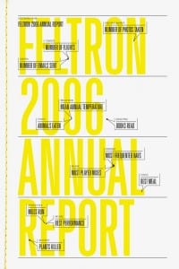
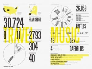
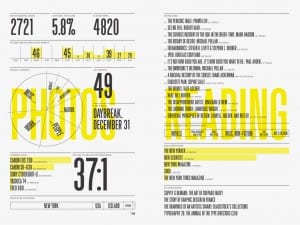
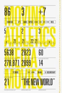
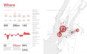
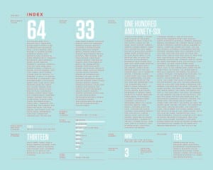
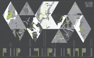
Nicholas Felton thinks a lot about data, charts and daily routines and below are some examples of this in some of his ‘Personal Annual Reports’. Using data from all sorts of things he has done in that year he creates graphs, maps and statistics.

I want to ‘expose’ my life through a publication and this is a great example of the sort of thing I want to achieve, but with my own style to represent me, rather than being a bit cold, helping to get a feeling of who I am…

The sort of things Nicholas Felton lists in his reports were personal to his life and some were facts that related to everyone. Some were subjective feelings towards things and others were objective truths about his life…

Some of these give a glimpse into what sort of person Nicholas is like music, others like where he travelled don’t so much…

Topics included (more detail in back up work):

  • Work
  • Travel
  • Music
  • Photos
  • Books
  • Food and drink
  • Films / TV
  • Places
  • Shopping
  • Miscellany


2006:

feltron 2006 feltron 2006 b feltron 2006 c feltron 2006 d


2008:

feltron 2008


2009:

feltron 2009


2010:

feltron 2010


From: http://feltron.com


ABOUT FELTON’S ANNUAL REPORTS…

FELTON ANNUAL REPORT 2012:

‘If you were to know your friends based upon the facts they reported alone, then you’d assume they ate nothing but Michelin-level dining, witnessed nothing but beautiful sunsets, and heard nothing but amusing one-liners on the train.

The latest Feltron Report, along with Reporter, make for a particularly fascinating counterpoint to the self-reported social media experience.’

– This article made me think how we select and expose what we WANT people to see, showing a picture that’s not necessarily who we are. Do your friends really know you? Do my friends really know me? Some things they will know but others they don’t. Felton exposes who he is even the mundane…

From: http://www.fastcodesign.com/1672108/nicholas-felton-unveils-his-latest-annual-report


‘Nicholas Felton spends much of his time thinking about data, charts, and our daily routines.

Felton: ‘There’s a universe of personal data around us. The thing I’m trying to do with my work is connect people with the footprints or data they create. I’m hoping, in some way, to liberate this data…” ‘

– Daily routines may seem boring but collecting the data and showing it helps us understand ourselves and who we are better… Liberating the real him. with facts.

From: http://thegreatdiscontent.com/nicholas-felton


He catalogued and collected information of the mundane moments of his life, from what was first curiosity.

it also him discover and monitor negatives in his life… (spend too much time on, think too highly of. Realise when you expose good and bads) What falls short of goals.

He said: ‘People became self-reflexive, wanting to track food they’ve eaten, travel locations…’etc

Mr. Felton says that all the data he collects seems mundane to some people, but might become the norm in the future.

– He encourages other to view their own lives realistically not just what we want people to see. What we show online isn’t real representation but this is… using introspection

From: http://bits.blogs.nytimes.com/2010/02/09/an-annual-report-on-one-mans-life/?_php=true&_type=blogs&_r=0


He used self expression to beautifully present information about himself each year.

From: http://99percentinvisible.org/episode/episode-31-the-feltron-annual-report/


‘Feltron personal annual report’ 2005 – himself

Summarised year in document that appeared online

Intended for friends and family to get idea of where travelled, what listened to, eaten…

From: https://poptech.org/popcasts/nicholas_felton_tracing_our_lives


On Facebook you have lot of control over how you present yourself and how you are perceived…. (I don’t want to do that) We can approve pictures of ourselves etc. Lie about job etc, who you are to some extent…. The challenge to be ourselves today.

– I want to present myself realistically, almost a ‘profile’ in a document.

Investigate and interrogate and visualise myself/ info

Compile life/happens to you… summary of me/year

From: http://vimeo.com/70340564


Annual Report

With my idea of creating a ‘Publication of Me’, I thought about the idea and format of an Annual Report. Like how companies sell themselves, including financial reports and showing what they are etc, I could do the same, with me!

I didn’t know much about Annual Reports, so I researched a bit about them…


Definition:

1. An annual publication that public corporations must provide to shareholders to describe their operations and financial conditions. The front part of the report often contains an impressive combination of graphics, photos and an accompanying narrative, all of which chronicle the company’s activities over the past year. The back part of the report contains detailed financial and operational information.

2. In the case of mutual funds, an annual report is a required document that is made available to fund shareholders on a fiscal year basis. It discloses certain aspects of a fund’s operations and financial condition. In contrast to corporate annual reports, mutual fund annual reports are best described as “plain vanilla” in terms of their presentation.

1. It was not until legislation was enacted after the stock market crash in 1929 that the annual report became a regular component of corporate financial reporting. Typically, an annual report will contain the following sections:
Explanation:-Financial Highlights
-Letter to the Shareholders
-Narrative Text, Graphics and Photos
-Management’s Discussion and Analysis
-Financial Statements
-Notes to Financial Statements
-Auditor’s Report
-Summary Financial Data
-Corporate Information2. A mutual fund annual report, along with a fund’s prospectus and statement of additional information, is a source of multi-year fund data and performance, which is made available to fund shareholders as well as to prospective fund investors. Unfortunately, most of the information is quantitative rather than qualitative, which addresses the mandatory accounting disclosures required of mutual funds.

Why Annual Reports are important to you:

An annual report can give you a lot of important information about a company. When you’re a regular stockholder, the company sends you its annual report…

You need to carefully analyze an annual report to find out the following:

  • You want to know how well the company is doing. Are earnings higher, lower, or the same as the year before? How are sales doing? These numbers should be presented clearly in the financial section of the annual report.
  • You want to find out whether the company is making more money than it is spending. How does the balance sheet look? Are assets higher or lower than the year before? Is debt growing, shrinking, or about the same as the year before?
  • You want to get an idea of management’s strategic plan for the coming year. How will management build on the company’s success? This plan is usually covered in the beginning of the annual report — frequently in the letter from the chairman of the board.

Your task boils down to figuring out where the company has been, where it is now, and where it’s going. As an investor, you don’t need to read the annual report like a novel — from cover to cover. Instead, approach it like a newspaper and jump around to the relevant sections to get the answers you need to decide whether you should buy or hold on to the stock.

Why do we need an annual report?

Annual reports can:

  • communicate not just your activities, but your accomplishments during the past year;
  • convince existing supporters that their funds are being well spent and help you raise money by attracting new donors;
  • educate community leaders and influential decisionmakers about your work on important issues;
  • recognize special people including donors and volunteers; and
  • serve as a historical record of your progress.

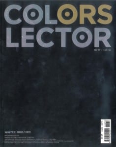
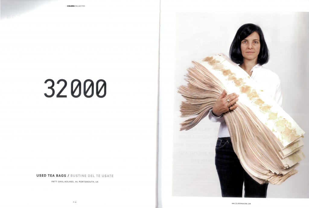
Colors Collector

Issue No. 79 / 147 234 – Winter 2010 / 2011

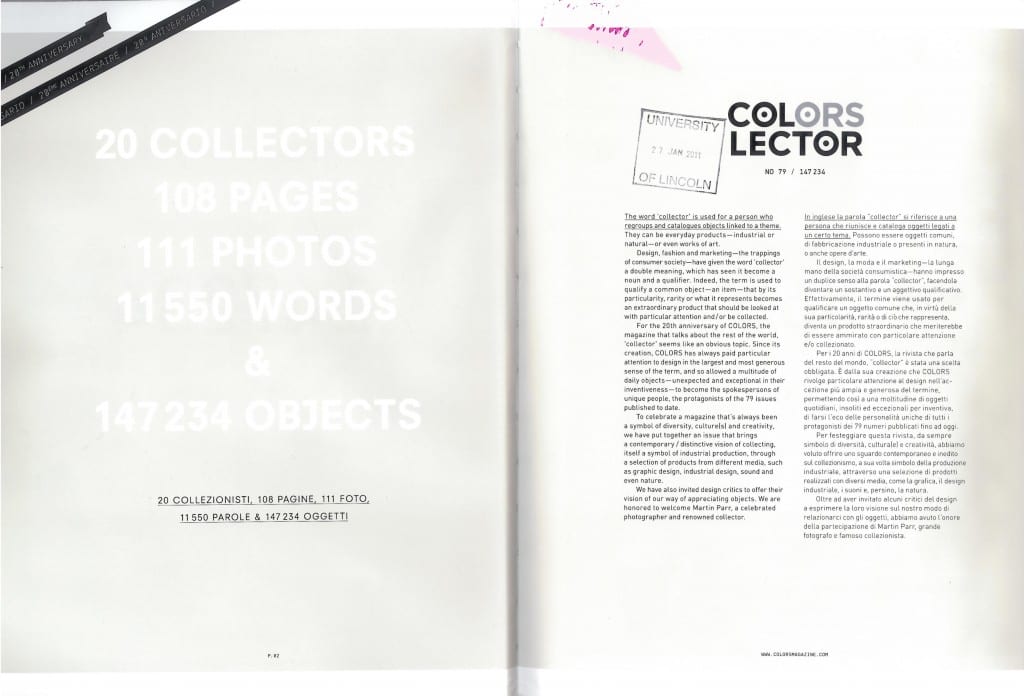
I began looking at how people collect objects, usually because they have some value to them and this idea led me to finding this magazine and using it for research into the subject. Here are some interesting quotes from the magazine that link to my project/ideas:


Introduction –

The word ‘collector’ is used for a person who regroups and catalogues objects linked to a theme. They can be everyday products – industrial or natural – or even works of art.

… a common object – an item – that by its particularity, rarity or what it represents becomes an extraordinary product that should be looked at with particular attention and/or be collected.


There’s an intense & perverse identification that occurs between people and their things. Design Critic. (Cristina Morozzi) –

There’s an intense and perverse identification that occurs between people and their things. The things we love and collect tell our stories truthfully. Words can be guarded and false; things, on the contrary, are honest. They cannot lie. They tell our stories, despite us…by displaying them [we] expose [ourselves].


With collections it pays to be a little bit mad. Design Critic. (Pierre Doze) –

The volume and variety of information and products that fill our daily lives is constantly growing. Whether virtual data or solid objects, we seem to accumulate them almost despite ourselves.


colors collector2colors collector colors collector3


Source: The magazine itself


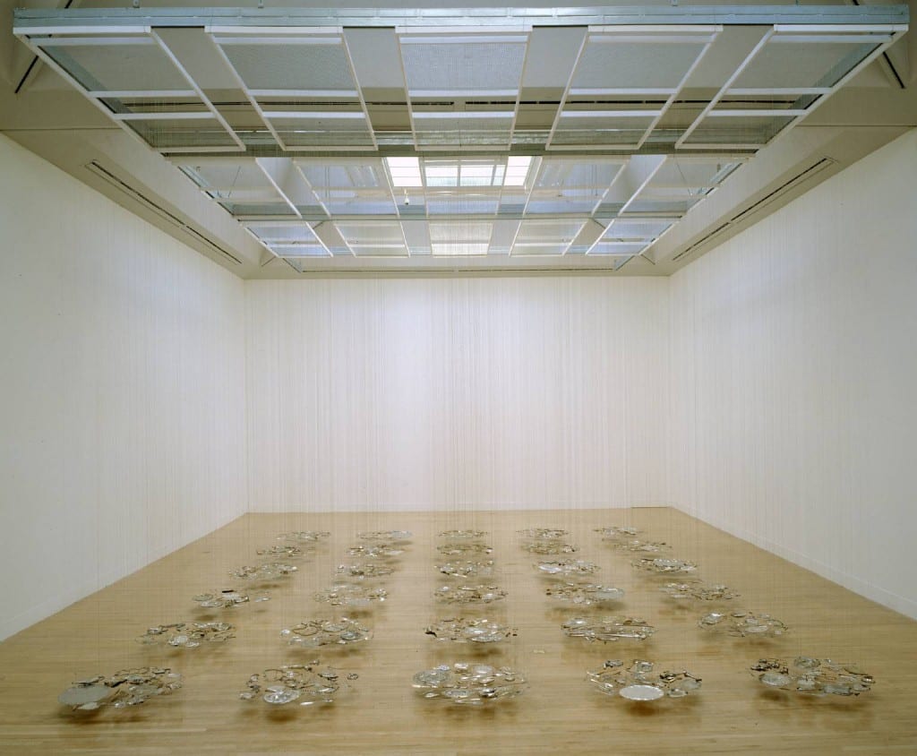
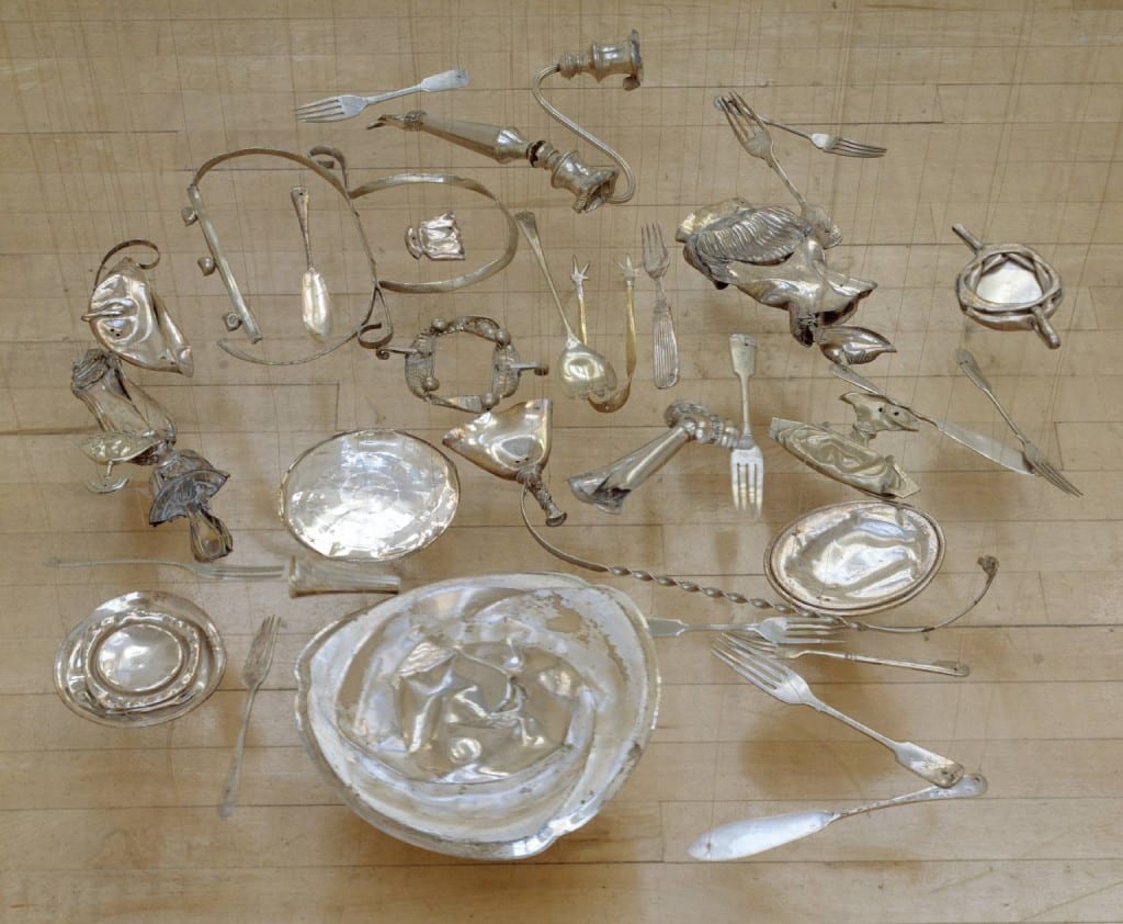
Thirty Pieces of Silver

Cornelia Parker – 1988-9

Thirty Pieces of Silver 1988-9 by Cornelia Parker born 1956 Thirty Pieces of Silver 1988-9 by Cornelia Parker born 1956

This installation piece included over a thousand silver objects, including plates, spoons, candlesticks, trophies, cigarette cases, teapots and trombones. They were crushed and arranged into disc shaped groups, suspended a foot from the floor by fine wires. The title relates to the biblical story when Judas Iscariot betrayed Jesus for thirty pieces of silver.

Cornelia Parker wanted to change the objects meaning, visibility, worth and by flattening them she did this literally. She thought that the silver had more potential when crushed and their everyday meanings had gone. This piece is about materiality and anti-matter.

From: TATE

– This piece has made me think about objects in a different way. How deforming them can give them a different, but still notable meaning.

Michael Landy – ‘Breakdown’

Man ‘destroys’ life for art

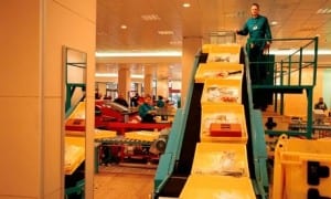
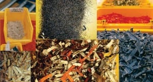
Michael Landy is an installation artist who  got rid of everything he owned for his exhibition in 2001 called ‘Break Down’. He shredded or granulated things from socks to family photographs, leaving him with no possessions for the sake of ‘art’. The reason for the piece being an examination of society’s romance with consumerism.

The title isn’t just about the breakdown of the objects in Michael Landy’s life, or the breakdown of the materials that create them, but it also reflects the emotional breakdown Landy will face.

He made an inventory of everything he owned, from socks to cds, even his car, amounting to 7,006 objects and 10 people were needed to assist in the destruction. Landy didn’t just destroy everyday objects, he also got rid of his valuable art collection too.

From: BBC NEWS


Michael Landy’s inventory of his possessions also included every item of furniture, every book, every piece of food, every cat toy, taking three years to complete the final inventory, containing 7,227 items. They were classified into 10 categories: Artworks, Clothing, Equipment, Furniture, Kitchen, Leisure, Motor Vehicle, Perishables, Reading Material and Studio Material.

He used a large bespoke machine and with a team of people reduced every object to shredded or granulated material. It was on display for two weeks in former C&A store on Oxford Street, London, described as ‘Landy’s consumer nightmare’.

From: Art Angel


Once complete, Landy said: “When I finished I did feel an incredible sense of freedom,” he says, “the possibility that I could do anything. But that freedom is eroded by the everyday concerns of life. Life was much simpler when I was up on my platform.”

From: The Guardian


Michael-Landys-Break-Down-008

The Guardian


breakdown michael landy

From: http://spyridongiasafakis.blogspot.co.uk/p/research-paper.html


– Sounds like Michael Landy did an extreme spring clean of his life, perhaps a way to free himself from the consumerism that we are all drawn to. He wasn’t just getting rid of his possessions, but things that define who he is, a part of his identity, gone.

– This links to the theme of collecting and holding on to things we don’t need, but value.

– But did Landy go too far in destroying other artists works? Was this experience really freeing or restraining?

Credits / Contributions page

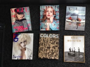
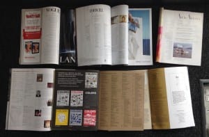
For our magazine I am sorting, editing and creating the credits/contributions page. To help me do this I have looked at this section from a selection of modern, well designed magazines to see what is included and how they design it…

The Magazines I looked at were:

Vogue, L’Officiel, Art in America, I-D, Colors and Bau Meister. All credited but varied in theme, audience and design.

Photo 05-03-2014 11 43 26

Photo 05-03-2014 11 42 32

Photo 05-03-2014 11 42 48

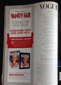
– Vogue –

This contributions page only uses half a page, but this is probably due to advertisements, which we aren’t including in our magazine. They have separated each section, centred the type and use of horizontal lines to create hierarchy.   This design is quite conventional and simple. A method to consider, but more spaced out.

Photo 05-03-2014 11 42 51

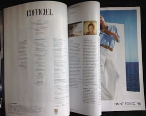
L’Officiel –

I like how the credits are in 3 columns here, simple, but laid out well using hierarchy with bold text. In this magazine there’s also a separate page which focuses on who the contributors are, like a profile. I like this idea but need to consider if it will enhance the magazine or is an unnecessary contribution.

Photo 05-03-2014 11 42 54

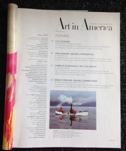
– Art in America –

Here the credits are placed on the same page as the contents. It’s laid out well, but we have agreed not to do this as we think it would work better to be placed on separate pages. The layout is well done and very similar to the ones previously looked at.

Photo 05-03-2014 11 42 58

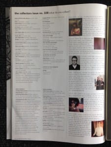
– I-D  –

The contents page here is very simple in design, using bold type to create hierarchy, ranging left. It also includes pictures of contributors and gives you information on them, which I quite like. It also is different from the others I’ve looked at as each person is asked to contribute an answer to a question relating to this particular issue: ‘What do you collect’. Using this approach makes you more inclined to look though this page than flicking past it, which is what most of us do when we reads a magazine. I like this approach , butI think it only works if you have a question or topic in mind that fits with the magazine or issue.

Photo 05-03-2014 11 43 03

– Colors  –

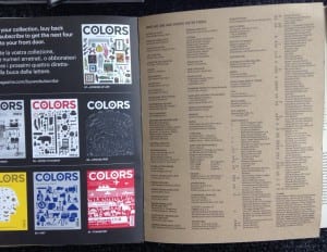
in this magazine the credits are on the very last page at the back. I like this idea, as it’s easy to find, but I also like when magazines have it placed with the contents page, as this is where you would expect to find the credits page. Hierarchy here is done by line spacing and alternating between capital letters and lowercase. This is a simple idea. I like it but I wouldn’t want to produce a credits page quite as simple. But it shows how even subtle changes create a clear hierarchy.

Photo 05-03-2014 11 43 08

– Bau Meister –

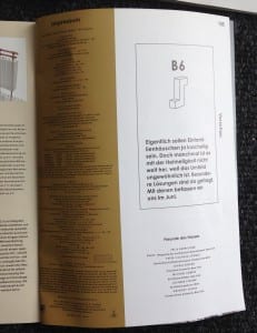
This layout is very similar to Vogue’s design. Although in comparison, Bau Meister’s looks quite wordy and harder to read. But I like how each section is separated using spacing.

Looking at these credits/contribution page designs has helped me think about how I will put this pages together, in content and design. Most stick to a conventional approach with subtle changes specific to their magazine. This is not a page to over-design or be experimental with, but just place what needs to be on the page, as this is in essence a reference page. I will consider the approaches used above when designing the credits/contributions page.

Photo Shoot Visual Research

Ideas and inspiration for the photo shoot for my article (models, mannequins and body image):


Giuseppe Mastromatteo Part of the ‘Indepensense’ 2009

Giuseppe Mastromatteo Giuseppe Mastromatteo 2

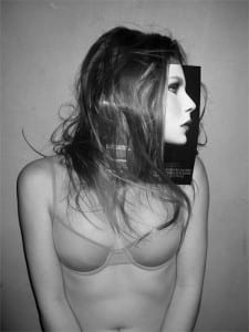
This is a really clever and interesting surreal style of photography. It’s inspired me with ideas for the photos in my magazine article… I could have women holding up images of the ‘ideal’ body or a mannequin’s torso and ripping it to show rebellion against the media’s perception of the perfect figure.

Source: Giuseppe Mastromatteo


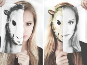
Disguise by Ilse Noordhof

de50058ae2c804810e735403b51d0d8a

Again here’s someone holding up images over and inline with her face. I quite like the idea of the photo being held up being in black and white and the actual photo being in colour to create contrast. Also this could work conceptually, as the idea of holding up an image of what you’d rather look like is quite negative, as it’s showing people not being happy with their own body/appearance.

Source: http://500px.com/photo/55427062


JOHN STEZAKER surrealist collage

6a61009d12b9ed3f899ad3eb744bd15b

Presenting a distorted person split down the middle into two faces. Could be used to represent before and after photoshop. Showing the same person but how they look naturally and how they look after altering their face, whether digitally or in real life. Interesting angle too, inline with surreal theme and kind of geometric. It’s also showing some of face, rather than covering all, showing contrast.

Source: http://10collective.wordpress.com/2010/11/22/john-stezaker-collages/


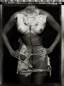
Mannequin by Brian Bowen Smith Contemporary Artist


6c1d0737d8ed0c16d692ddb83b8a4aa7

This image is of two different bodies, could be hiding your own body behind the body you want, but physically/literally rather than with just a photo.

Source: http://www.artspace.com/brian_bowen_smith


Dagmar Keller and Martin Wittwer – Thought-Provoking Photos of Fashion Ads Superimposed Over Real Bodies

eacd9629445b9f21ad36b658f20db56f

Another example of a photo covering the face, but this time the scale doesn’t fit the actual head, but perhaps this adds to the distortion and could be considered in my photos.

Source:  http://flavorwire.com/321432/thought-provoking-photos-of-fashion-ads-superimposed-over-real-bodies/3/


By Georges Antoni

acd781395d24ee0180c21c3441a169fe

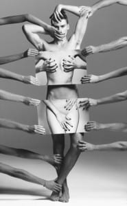
I quite like the idea here of images being held over the persons body by other people and almost tugging at the skin, as if to say they are telling him what’s wrong or right about his body and he feels he’s being told how to look to conform and meet up with societies standards…

Source: http://www.maricazottino.com/blog/georges-antoni/ 


Pierre Beteille

499e3f21cc1fc109b35786399260e158

The forced perspective works well in this image, just another example of a photography covering the face/body. Perhaps could be more interesting using black and white photo? Something to try…

Source: http://www.pierrebeteille.com/photos/self/

Research for article

For our magazine design brief I am writing an article on mannequins and models and their effect body image. I have looked at the following websites for research into the topic and might quote some of the articles too.

Below I have summarised each source, to show how it has informed me in writing my article:


Depleting Body Image: The effects of female magazine models on the self-esteem and body image of college-age women.

This article was a study on women at a University in America, ages 18-24 and the effects models in magazines have on their view of their own bodies, with facts and figures to show findings. Many women wanted to look the magazine models but knew that to have bodies like theirs would be unhealthy and that these women rarely portrayed an unrealistic body image for women.

Authors: Mary-Signe Chojnacki, Christina Grant, Kathryn Maguire, Katie Regan

Source:  http://www.ssc.wisc.edu/~jpiliavi/357/body-image.htm


Fashion industry has forced unrealistic image on women, says leading designer

This article shares how designer, Giles Deacon criticised the fashion industry’s obsession with skinny models and believes they portray an unrealistic view of women. He shared that characteristic should be more important, in his opinion.

By Kate Finnigan and Patrick Sawer – 12 Feb 2011

Source: The Telegraph 


It’s an ad, but Dove’s Real Beauty campaign is a gamechanger

Dove’s campaign for real beauty challenged women’s perceptions of themselves, to stop being their own worst enemies and start loving their bodies/see the positives. The article shares how there is a lack of “real women” advertising clothes etc and this campaign was a good example of using ‘real’ women in adverts, encouraging women not to conform to an idealised beauty and enjoy life.

By Lianna Brinded – Sunday 21 April 2013

Source: The Independent


Will an Agency for “Normal Sizes” Models Actually Work?

Few women see themselves reflected in adverts, we see skinny models and plus size models, this article asks, what about the women in between?

by Cheryl Wischhover – January 30th, 2012

Source: Fashionista


The fall and rise of mannequins that look like real women

This BBC article about mannequins and their history is very interesting background reading and shares how Debenhams are beginning to use size 16 mannequins, a more realistic female body shape? We want to see models and mannequins that look more like themselves, because that sends a more positive message about body image.

By Lucy Wallis – 22 January 2014

Source: BBC news


These disabled mannequins will make you rethink beauty

A video was created to show mannequins of disabled models to see how people reacted.  This was very interesting in seeing how we respond to being faced with mannequins/models that don’t adhere to the standards we’re used to.  It also challenged people that is mannequins and models show the ‘ideal’ bodies, then are these people the wrong body shape? Or are we just very superficial?

By Joe Shute – 09 Dec 2013

Source: The Telegraph 


‘Disabled’ Mannequins Remind Us That Beautiful Doesn’t Mean ‘Perfect’

Following on form the last article, this one asks why can’t mannequins be based on real people, as it raises awareness of people with disabilities, especially in this industry. It’s a very thought provoking campaign.

By Ellie Krupnick & Rebecca Adams – 12/03/2013

Source: Huffington Post 


Why Mannequins must reflect us

This article shares how we are sold unattainable beauty and that most women don’t fit the narrow ideal body shape of the models and mannequins we are surrounded by. It includes the outcome of a study that showed women react better to mannequins that look more like themselves, which they can identify with, concluding that mannequin size affects consumers and their purchasing intentions.

by Sharon Haywood – 2011

Source: Horizons (Women’s news and feminist views)


Fashion vs. Unrealistic Body Images

This blog begins stating that models today weigh much less than the average woman, than they did twenty years ago. The fashion industry bombards us with the message that we’re not the right size and need to be thinner. We judge ourselves by the beauty industry’s standards, who show the female body as an objects that needs to be perfected. Beauty becomes an artificially created impossible standard used to sell products to women who feel insecure about the way they look.

By: Montana Sclavos

Source: Fashion vs Unrealistic Body Images 


Victoria’s Secret model feels guilty for promoting unattainable body ideal:

Cameron Russel is a Victoria Secret Model who realises that in her job, she promotes a beauty standard that most of us fail to attain and that young girls shouldn’t hope to be models, but smart and accomplished.

By Samantha Chang – March 29, 2013

Source: The Examiner


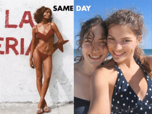
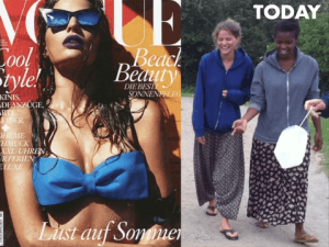
Looks aren’t everything. Believe me, I’m a model:

Cameron Russel’s Ted Talk, which is what the above article was taken from, shared how pictures of her on photo shoots are not ‘of her’, but constructions created by professionals. She also commented that models are the most physically insecure women, because they have to think about their bodies and looks constantly.
Screen Shot 2014-02-17 at 18.38.48   Screen Shot 2014-02-17 at 18.39.28

Cameron Russell – Jan 2013

Source: Ted Talks


Body Gossip puts spotlight on models and body image

A campaign group are challenging retailers to use a wider range of models and trying to get the government to support young women with this. They don’t point blame on the models, but those making the decisions to use very skinny models that are everywhere we go and it effects how young women (especially) look at themselves. The article includes a quote from ‘Body Gossip’ co-ordinator, Natasha Devon, that they want to see models of all body types, not just skinny and plus-size.

By Jane Martinson – Friday 11 October

Source: The Guardian 


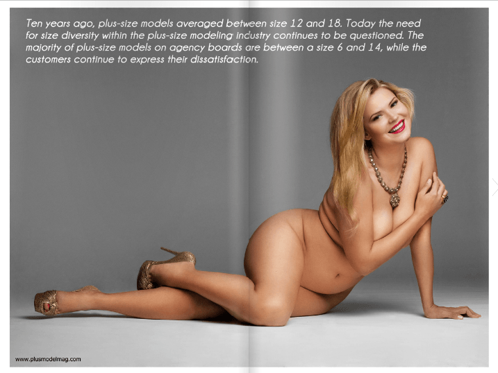
Plus-Size Model Editorial Says Runway Models ‘Meet the Physical Criteria for Anorexia’

by Cheryl Wischhover – January 10th, 2012

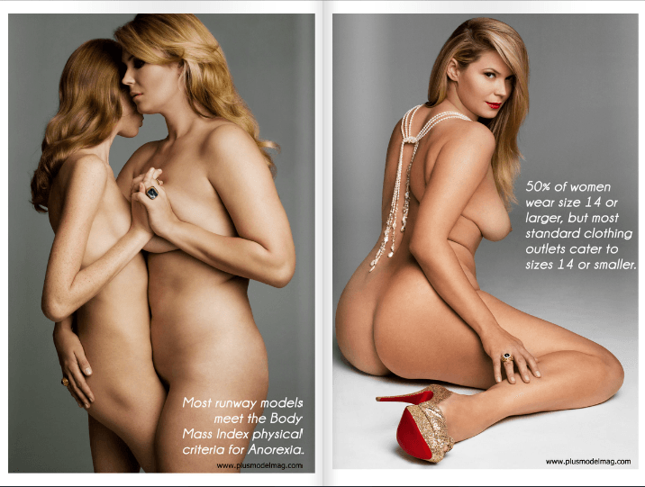
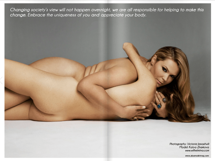
In 2012 ‘Plus Model Magazine’s January issue controversially showed images of a small and plus-sizes model embracing, naked. This was to challenge how we think about models and body image and came off the back of much recent discussion on model’s size, age and gender.

Source: Fashionista 
Screen Shot 2014-02-17 at 22.53.15 Screen Shot 2014-02-17 at 23.01.33 Screen Shot 2014-02-17 at 23.02.00

Images/spreads from: issuu


Healthy is the New Skinny

Katie Halchishick, a plus-sized model and founder of ‘Natural Model Management’ was on ABC news promoting her campaign to build a better body image. That we should alter our mentality to focus on being healthy, rather than wanting to be skinny and like the models we see. She believes that a way to alter this mentality is through using models that are a variety of sizes, helping women to be happier with the body size they are.

Katie Halchischick – 01/19/2012

Source: ABC news


Models vs. Real Women: Growing Body Gap

A news report on ABC exploited the fact that standard fashion models today are getting thinner and thinner and that 80s supermodels wouldn’t meet the standards these models have to meet. It seems crazy that as the average American woman gets bigger, fashion models get smaller and the fashion industry is perhaps to blame.

01/12/2012

Source: ABC news 


WHY SHOP MANNEQUINS DON’T REPRESENT AVERAGE WOMEN

A cosmetic company’s blog asked women if it  frustrates them when clothes fit mannequins so well, but don’t look as appealing on themselves. Although they use this to promote their products, they raise a good point that we can’t even try to compete with shop dummies in size and shape, as we are various sizes and some things we can’t change.

19 November 2013

Source: Liberate Cosmetic Surgery 


Is fashion FINALLY getting realistic-looking models? Meet the beauties signed to the first agency that doesn’t distinguish between sizes

JAG, A new modelling agency in New York in 2013 made a policy to not distinguish between sizes and represents women who are larger than the standard model size. One of their models was used in a H&M swimwear campaign showing positive changes in modelling when it comes to ‘the right size’. Why do we even have ‘plus-size’ models and not just ‘models’? JAG know that women want to see ‘real’ and more ‘normal’ models, sending a message of confidence instead of insecurity.

article-2398057-1B61A2EC000005DC-136_634x704

By Margot Peppers – 20 August 2013

Source: Daily Mail


The WOW Factor:

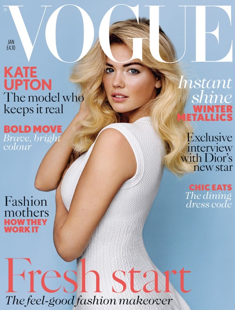
‘Kate Upton – down-home girl, Youtube sensation, bombshell – is taking on the world of high fashion. Prepare to be amazed, says Sarah Harris. Photographs by Alasdair McLellan.’

Inside Vogue UK’s January 2013 issue contained an article on model Kate Upton, who stands out from conventional fashion models for her size and height. She became an ambassador for a healthier model look, promoting a healthier approach to body image in the fashion industry. For these reasons it was quite exciting to also see her face (and body) on the cover of this issue also.
kate-upton-vogue-uk-january-2013-01

Source: Vogue: January 2013 issue
Art Direction

The Art Directors Handbook of Professional Magazine Design is a great book on how to do magazine design, with many great examples. It’s helped me think deeper about how I go about designing magazines, which I hope to apply to my design and art directing.

Sketching:

  • It’s important to sketch ides and layouts, but it helps to read the text your designing for and have a precise concept too.
  • Things to think about when using photography: which pictures should you put first, is there a logical order, will they be grouped and how, do the colours go together, is the sequence too repetitive, does it add something new???

Layout variations:

  • The choice of opening picture sets the mood for the rest, and the typography has a decisive influence on this mood. (Important to remember!)

Grid systems:

  • The number and width of columns influence the character of a magazine.
  • The right layout of columns is immensely important for the structure of a magazine page.
  • Lines should have roughly sixty characters = better readability.
  • The content should also influence what layout you chose.
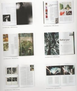
  • Here are examples of how different magazines have used grid systems well in various ways (page 19):

Scan 84


Source: ‘The Art Directors Handbook of Professional Magazine Design: Classic Techniques and Inspirational Approaches’ – Horst Moser (Thames and Hudson, London)

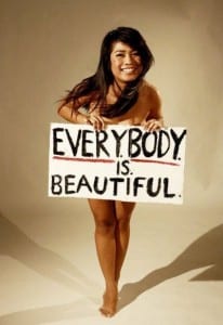
‘Everybody is Beautiful’


tumblr_lx6wdrciYj1qd39dro1_400

I came across this photo on a blog and loved the idea for my photo shoot. In an article about body image, it could look good to have photos of women holding  up words perhaps saying things like ‘confidence’ etc, things that are more important than a skinny waist, also by holding it over their bodies this is reiterated. Simple idea but could look good if done effectively…

Source: End of the line.. The Waist line


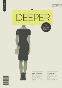
Deeper Magazine

‘A mock publication design for a Luxury fashion magazine.’ by Aakansha Kukreja

Deeper Deeper 2 Deeper 3

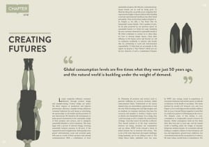
this publication is very minimal yet bold and quite surreal too.  I really like the composition and the art direction, with clear use of the grid throughout. There is a clear overall style and design ethos, which is coherant throughout, including use of space, type faces and images. The cover has great use of white space and is quite inviting. Although I like the minimal style and want to use it, I don’t want it to be this plain, using brighter colours and more interesting images too.

Source: Aakansha Kukreja 

Photography & Surrealism

The magazine brief’s aim is to contradict the conventional woman’s magazine in favour for a more clean cut, surrealist/ geometric style to reflect the nature of the content… so I’m looking at Surrealist style photography/photo editing for inspiration…


surrealist photography

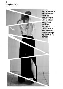
This is part of a fashion spread by Hamish Duda. I like how the photography has been cut and cropped, making it look less conventional.

Source: Hamish Duda


geometric photo


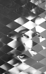
I love this geometrically manipulated photo and how it has been edited to mess with your mind a bit.

Source: Tumblr…


geometric photo 2

Another example of geographic manipulation, this time using more than one image, to create an interesting and quite surreal composition.

Source: Tumblr… 


Luciana Urtiga

Luciana Urtiga is a photographer who’s work has a very surrealist style to it. (Here are a selection of her photographs)

Luciana Urtiga Luciana Urtiga 2 Luciana Urtiga 3 Luciana Urtiga 4 Luciana Urtiga 5

Many of Luciana Urtiga’s photos use Surrealist ideas and styles, including juxtaposition and dream/unconscious elements. all these photographs include images of the body, most in abnormal way, this style could be used to provoke people’s thinking in how they see the body and could alsobe used to narrate and display ideas of body image, beauty and how we perceive ourselves and others.

Source: Luciana Urtiga


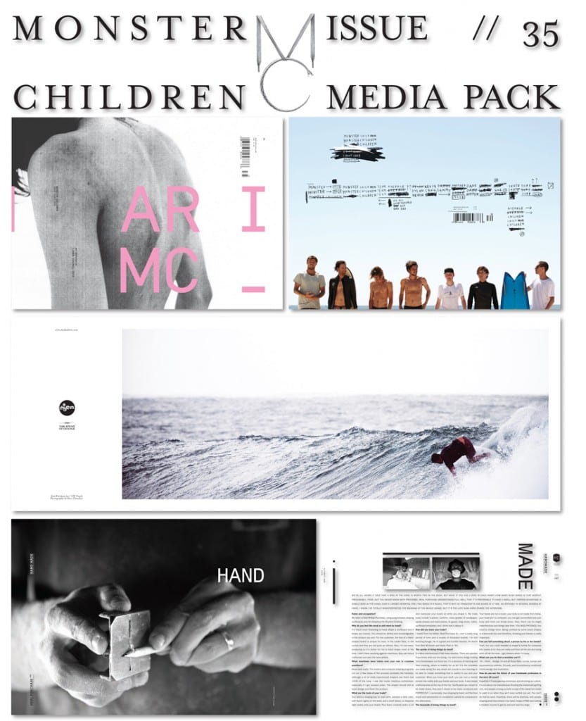
Monster Children Magazine

Monster Children Magazine is a quarterly lifestyle publication with a focus on surfing, skating, art, music, photography, and more…

Monster children magazine Monster children magazine 2 Monster children magazine 3Monster children magazine 4

Although the covers are varied issue to issue, within each issue is the style is coherent. Something different about this magazine is that they sometimes play with the orientation of type and image. Also the magazine is landscape, which works well with the images used. The type is often experimental, which lifts the spreads from quite ordinary to visually engaging.
Also the two designs with women on provoke potential thoughts & ideas linking with the chosen theme of the magazine.

Sources: Image 1 & 2 – issue #41 & #40 covers, Image 3 – issue #35, Image 4 – spread.
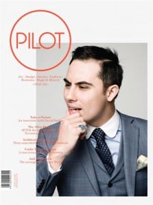
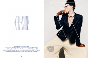
Pilot Magazine

Pilot Magazine 3 Pilot Magazine 2 Pilot Magazine

These images are taken from Issue 6 of Pilot Magazine.

Pilot magazine uses a lot of overlapping in its design. This is done very well and adds to the aesthetics of the design. It’s quite simple with use of colour and in its style, but this works very well and accompanied by black and white photographcs, the colours are bold and engaging. As the deisgn is simple, the bold, decorative typeface (used for titles in the spreads) doesn’t clutter or over shadow the rest, but work in harmony with it.
Source: Blogspot…

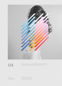
Anthony Neil Dart

Anthony Neil Dart is a designer who’s designed many magazines. I’ve looked at some of his designs that interest me and inspire ideas of our magazine design project.

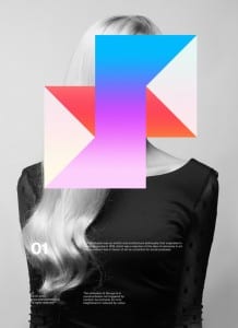
Anthony Neil Dart - Metode 2 Anthony Neil Dart - Metode

Metode

These designs are both for Metode magazine and use contrasting black and white photography with brightly coloured shapes to create intriguing cover designs, accompanied by a few lines of text. I like the composition of these designs and the contrast is engaging. I would like to try these attention grabbing techniques and contemporary ideas with my project.


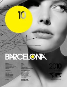
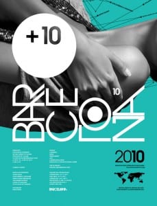
Anthony Neil Dart - Barcelona Anthony Neil Dart - Barcelona 2

Barcelona – Show us your type  Exhibit 2010

These two designs again use bold colours with black and white photography. The bright yellow and turquoise colours really stand out against the black and white and the type hierarchy is done very well. There is also a bit of a surreal look to these covers, which I think works quite well.

Source: Anthony Neil Dart on Behance

Magazine Spread design

Some examples of magazine spread design I like:


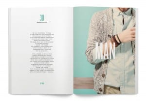
springfield-lookbooksspringfield-lookbooks2springfield-lookbooks3springfield-lookbooks4springfield-lookbooks5

Design of seasonal lookbooks for Springfield by Luis B Hernandez.

I love the minimalistic, clean-cut style in these spreads. they are very readable and eye-grabbingly simple. Also, the page numbering is done very differently to conventional magazines, in quite a contemporary, yet aesthetically pleasing way. This style may be considered for the magazine.

Source: Luis B Hernandez


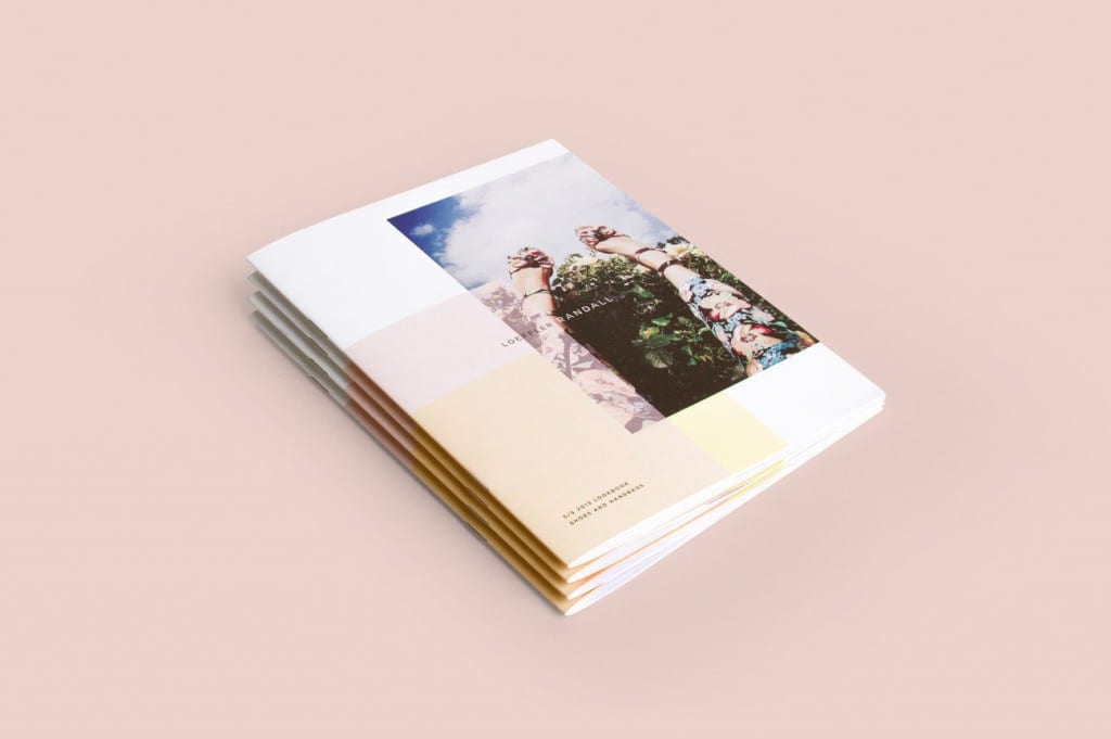
RoAndCo_LoefflerRandall_Branding_05-1299-xxx_q85RoAndCo_LoefflerRandall_Branding_06-1299-xxx_q85

Loeffler Randall by Ro and Co

These spreads are not for a magazine, but part of a branding and packaging brief. The design again is quite contemporary and minimal. I like this style as it’s not too cluttered and attention grabbing, as it’s unlike the ‘in your face’ covers magazines often have. The contents uses collage and handwritten type, looking more authentic and friendly, and contrasts the clean cut cover.

Source: Ro and Co Studio


Magazine covers using the same Masthead design

For the group magazine project, all 6 of us must produce a front cover using the same Masthead design. So I have looked at some examples of

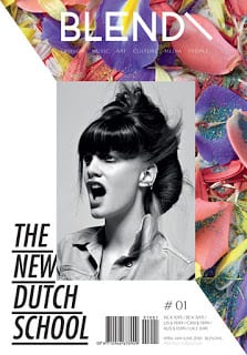
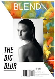
blend_magazine_coverblend_magazine_cover2

magazines that use the same masthead design, yet keep each cover exciting and different to the last…


Blend magazine (Dutch, established 2004, alternative lifestyle media)

Blend magazine have an obvious cover style as their magazine has developed, helping readers to recognise them instantly. It’s quite a contemporary and modern themed cover, using bright colours with black and white photographs of women to attract their audience.

Source: http://cadenceandclementine.blogspot.co.uk/2012/01/blend.html

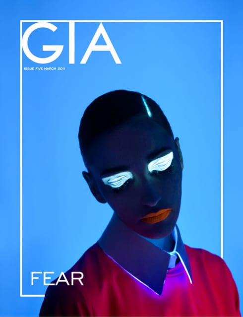
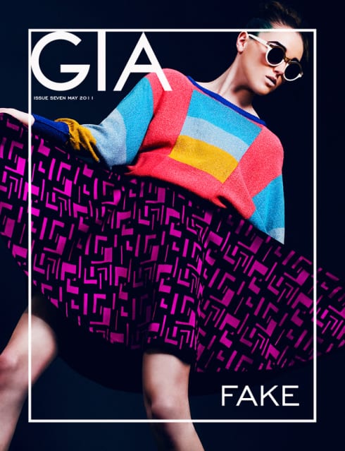
gia-issue-five-march-2011-matilda-starz-by-milen-radev gia-issue-seven-may-2011 gia-8-summer-2011


GIA magazine 

Gia magazine has various themes/titles, yet keep to the same layout and style theme on the cover of each issue. Bold colours behind photographs of posed women is clearly a consistent cover theme.

Source: http://art8amby.wordpress.com/tag/gia-magazine/


Victorian/Edwardian Wallpaper design

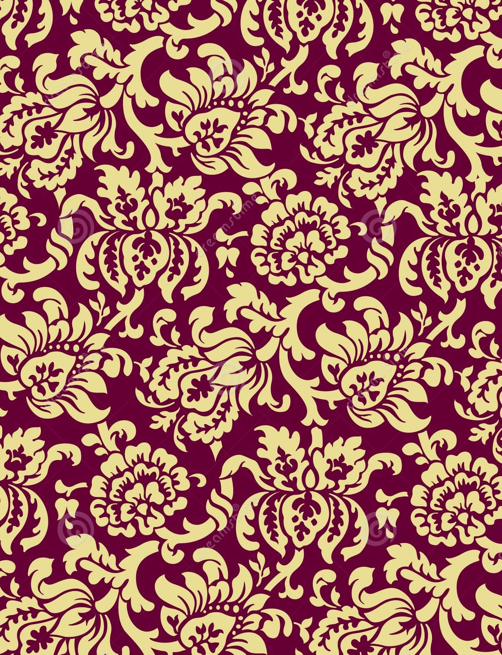
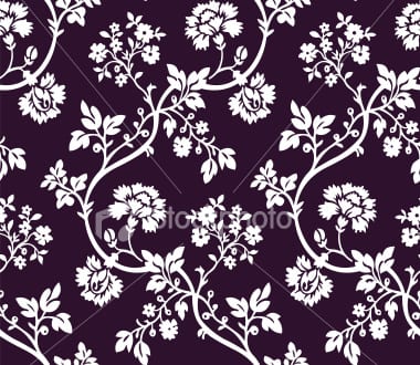
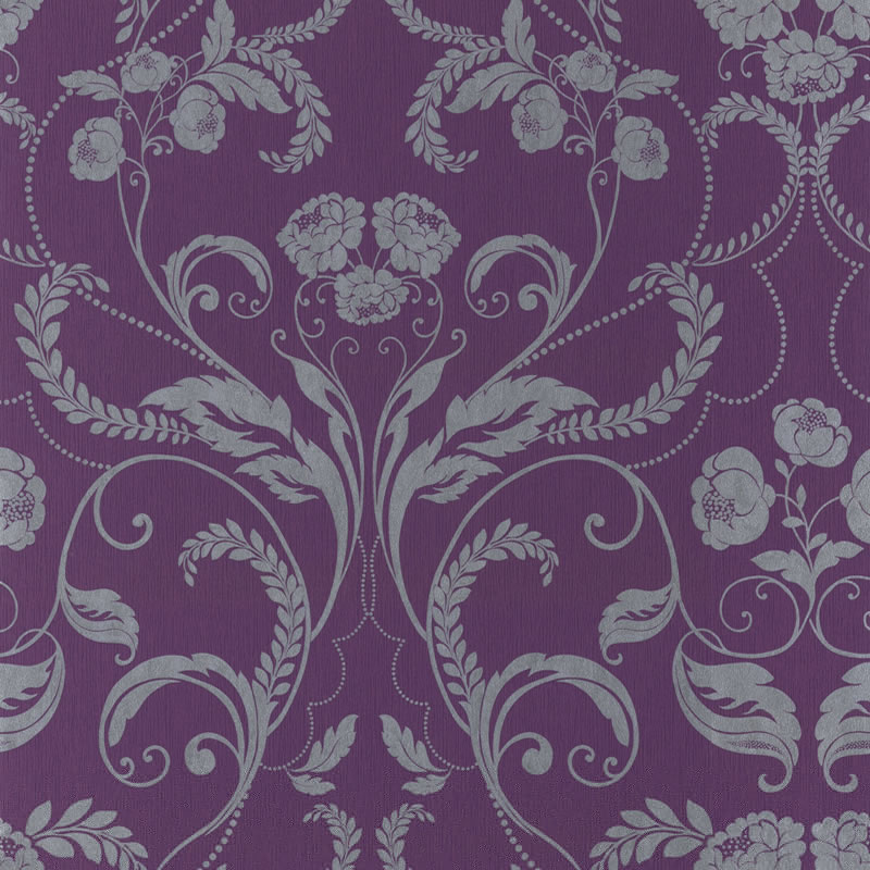
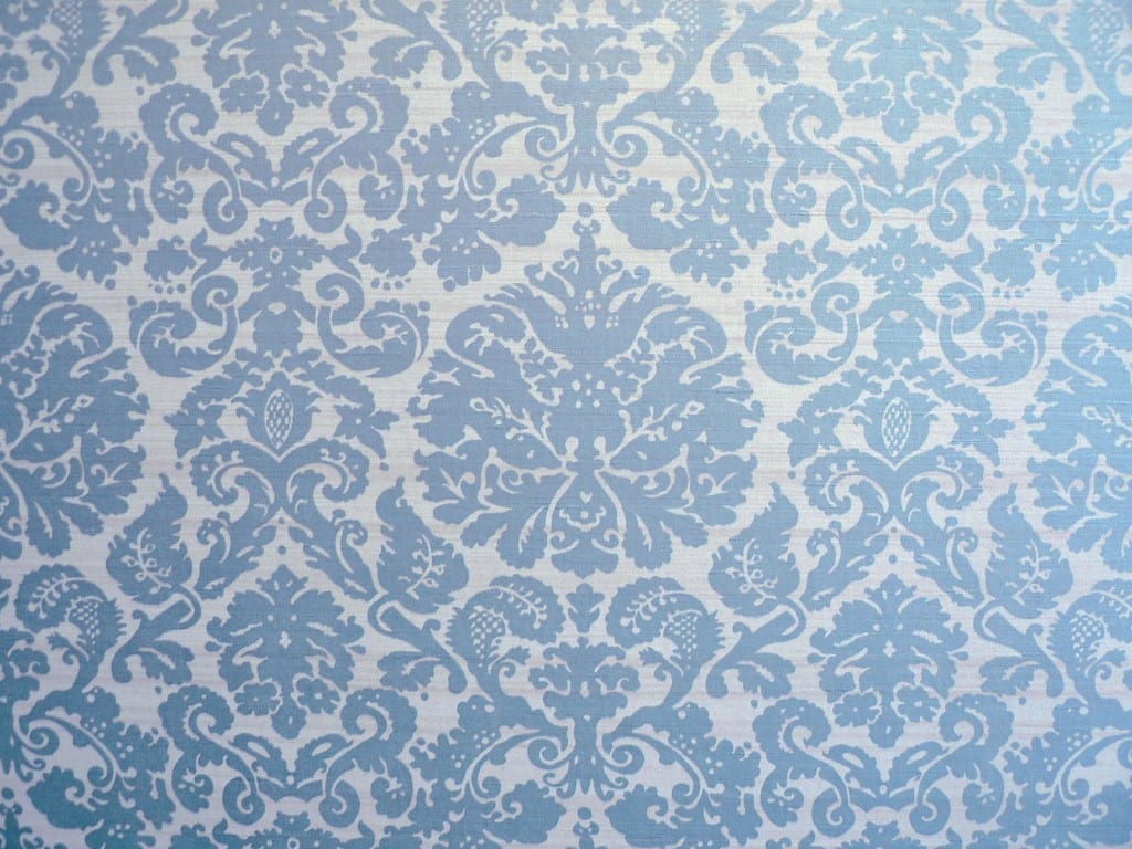
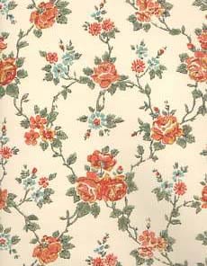
For my experience and concept document I have wallpaper projected to represent how women were perceived at the time. Beautiful and too delicate to be involved with ‘the dirtiness of politics’, but the wallpaper rips via the projection and motion sensors as people enter the centre of the room. I’ve looked at Victorian and Edwardian style wallpaper designs as visual research to help me decided what I want my wallpaper design to look like.

17583-amazing-modern-warmth-victorian-wallpaper istockphoto_5538664-seamless-floral-wallpaper

twiggy-edwardian-wallpaper-104501-purple-by-muriva-10060-ppattern-vintage_002725402

pic


Source:

By Hand: Handmade elements in graphic design

Handmade design:

Despite advances being made in digital technology, we still love analogue/hand produced designs.They feel and look more ‘human’, we want nostalgia and realness. This way of producing design work seems more original as there are many ways to do it and you’re not relying on a computer but doing things for yourself.

I would like to produce something by hand to create an original piece, even if the design is digital, perhaps for the form to be hand produced.

These two original designs are contemporary analogue design created using collage:


Scaan


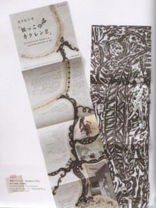
An Exhibition Flier for Yokohama Museum of Art by Surmometer inc.

This piece is quite crude in layout but it works well. It’s unique and the markings left are part of the piece, contributing to its originality. The layout works well too. I really like how printmaking and colour have also been used. It’s quite decorative and the hierarchy also works well, separating the title and exhibition information format he body copy. This has made me think about using handmade graphics to produce my piece perhaps.


Scan

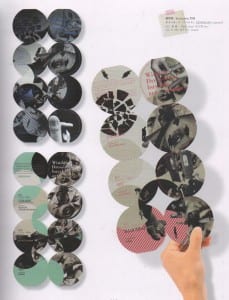
An Invitation for DESPERADO [Aparrel] by LOOK inc

I really like how circles have been used to create this piece, they work really well and so do the circles designed and collaged on. By only using a few colours the piece is quite simple, but very bold and effective. I also like how the text follows the circles and takes you through the piece and guides you where to go. Heirachy with text, again works well here, separating titles and information from body copy clearly. Some titles are harder to rea don different backgrounds though, I will try to avoid this in my piece. But I want to experiment with using circles, especially as my object, a coin is also a circle.


Source:

  • ‘By Hand: Handmade elements in graphic design’. (Pie Books, Tokyo Japan, 2009)

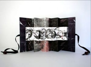
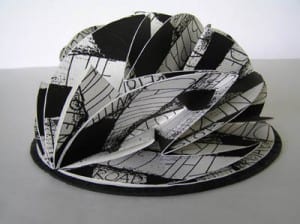
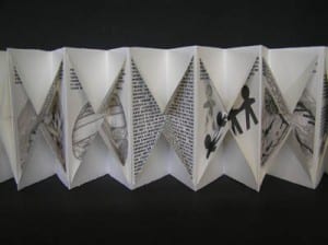
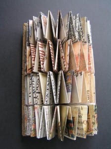
Concertina/Origami book Ideas

I liked the idea of creating a book by concertina/origami methods and so looked at some different pieces to give me inspiration and ideas of what I could do and how I could represent my experience using these methods:


DSCN1251[1] DSCN1256[1]


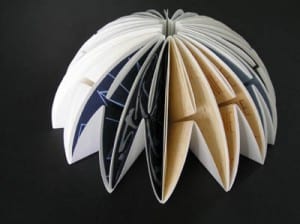
I like how this piece folds out and is a fun, engaging piece.


codedSilenceinFashion

Anna Mavromatis creates decorative, original pieces, and rethinks how books, origami and concertinas can be created and used, using printmaking techniques.


OLYMPUS DIGITAL CAMERA 4593_2009653937Battle_Within_400x299pix OLYMPUS DIGITAL CAMERAOLYMPUS DIGITAL CAMERA


I really like these pieces made by Helen Malone. They have inspired me to experiment with different types of origami book making. Each one is unique and shows off the art/design inside it well. they are very engaging, interesting and visually exciting and enticing pieces.


Sources:

Things I have learned in my life so far

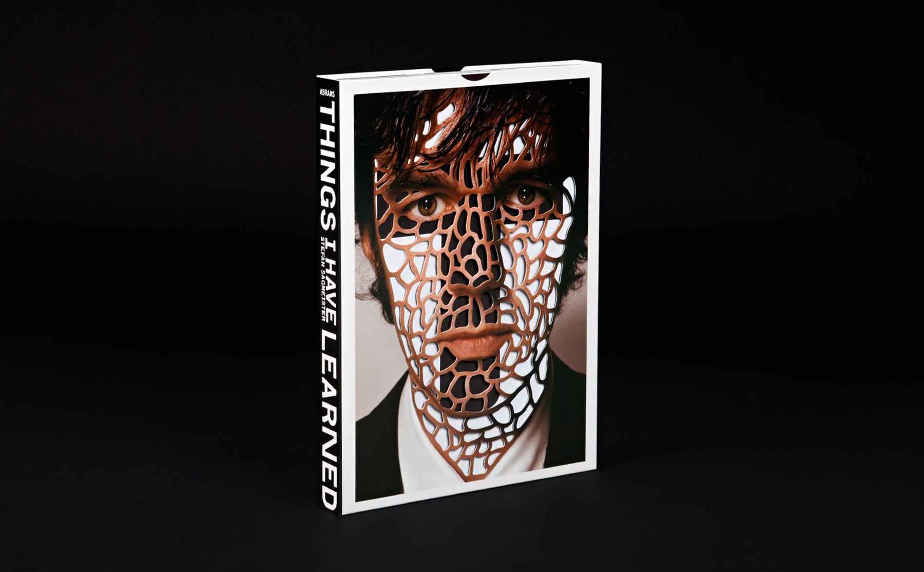
Stefan Sagmeister

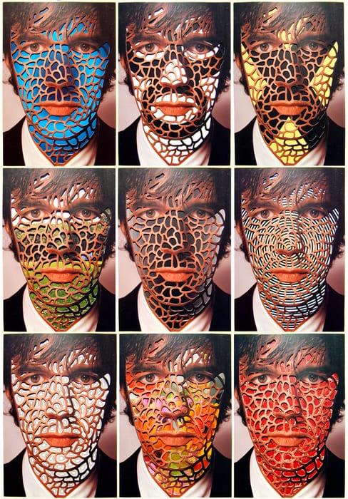
TIL-13 1KpgOhsA7ev7la2vUyFkthifo1_500 TIL26_1


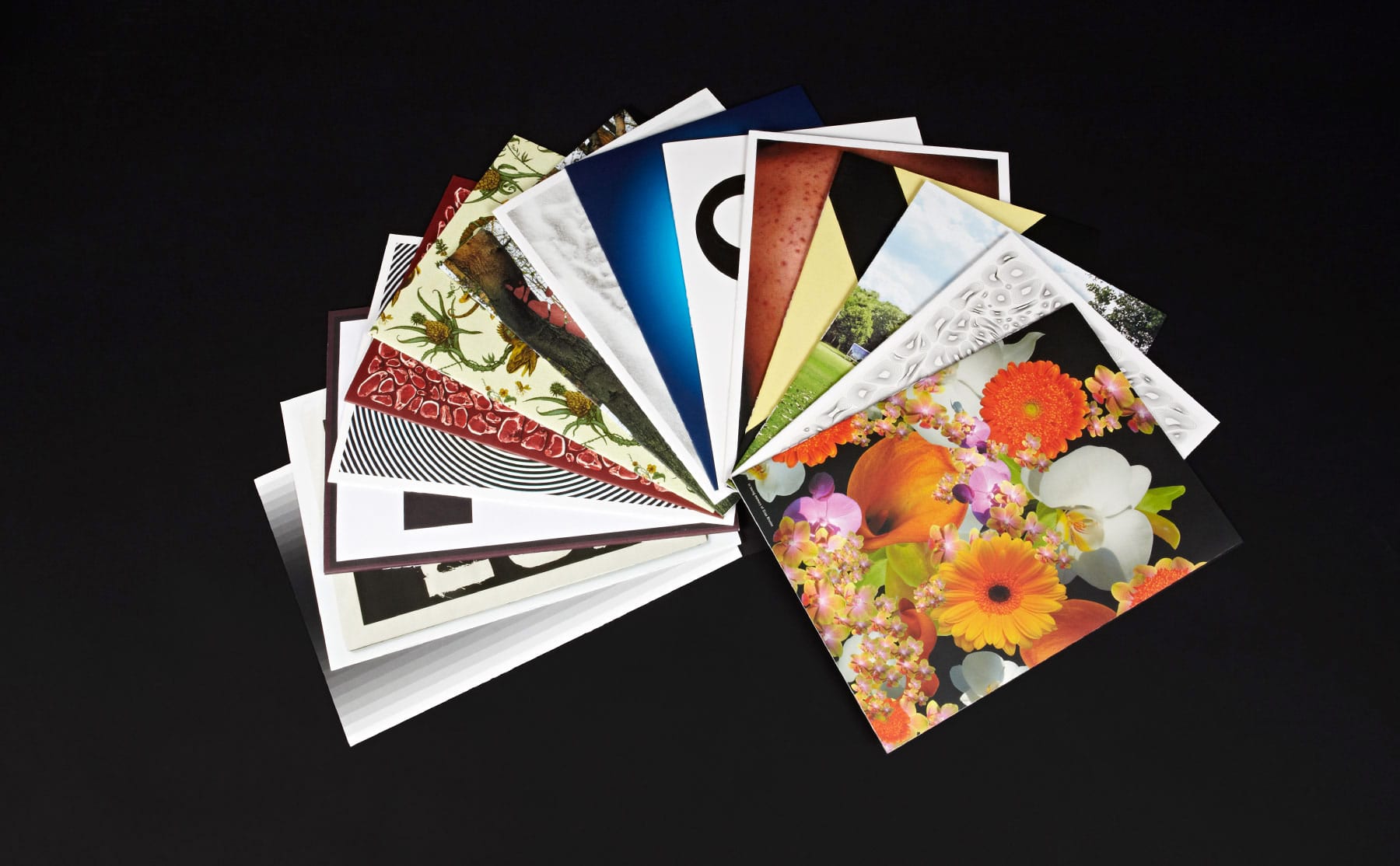
Stefan Sagmeister has created a book of many little books of what he has done in his life. the cover is of his face with bits cut off so that when the books are placed behind the cover they create different textures on his face. This is a fun and engaging way to create a book. Also by having this cover/case as a box you, the user know to take all the books out and put them away without being told how to do so, using initiative. I think this is a very clever and fun way to present a book unlike many convential and unoriginal methods. I will consider doing something fun and engaging like stefan with my piece.


Source:

Concept Pack…

To show my idea to the museum director (client) I need to come up with a visually engaging concept pack that interprets and promotes my idea as a proposal…

It needs to:

  • Be engaging
  • Have well structured information
  • Immerse client
  • Try and be innovative
  • Use imagery/typography to demonstrate idea
  • Have visual hierarchy
  • Show audience participation
  • Able to guide client through content
  • Be object of curiosity

Technologies…

In my experience I would use motion sensors and video projection to enhance the experience… As people enter the exhibition they will see decorative wallpaper (of the period) projected onto the walls and as they walk into the centre of the room the motion sensors will detect their movement and the wallpaper will rip. Following this the name of the exhibition, ‘Change’ will light up, as people move into the next part of the exhibition. By using motion sensory technology people will be taken by surprise and it is much easier than physically ripping wallpaper. Also the timing of when the word ‘Change’ lights up works effectively following on from the ripping of the wallpaper, showing what it is representing.


Motion Sensors

There are many types of motion sensors and many of these are available commercially and in varied sizes.

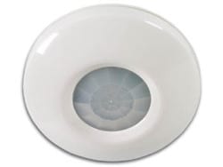
My experience will use passive infrared motion sensors. These are often used in burglar and shop alarms, detecting and measuring infrared energy. These work well because all humans release infrared energy. The amount depends on our body temperature, but all humans and many animals will be ‘sensed’ by this technology. Passive infrared motion sensors use photo detectors which uses the light in the wave lengths caused by our body heat, to an electric current, run through a small computer. This computer would usually be used to sound a burglar alarm, but in my exhibition it would be used to trigger the ripping of the wallpaper, via video projection and following this, the lighting up of the word ‘Change’. The things needed to use this technology can be very small and fairly hard to detect and so the people in my exhibition wouldn’t even know they were there. Photo detectors work when there are big or quick changes to the infrared energy. Normal human movement triggers this, including walking into an exhibition, but small movement, will not cause the technology to work, like the movement of an insect or the change in room temperature.

This is an example of what an infrared motion sensor may look like:

97-556


Video Projection

Video projectors create images, still or moving by projecting light, using lenses, on to a surface. This is usually onto a screen or plain wall. Projectors work by light, from a bulb, shining through a prism, which separates the light into colours, which are then sent through small screens. These screens are told how much light to let out to each pixel projected and then the light is shone through a lens and onto the surface which we see the resulting image off of. Unlike motion sensors, video projectors are often big enough to be obvious to the human eye as it walks into a room, but the projectors would be placed high up on the ceiling, as not to get in the way with the experience.

This is an example of what a modern video projector may look like:

JVC-projector


Sources:

Gathered visual inspiration from Google

These are random images I have found from google.com to help inspire me in designing my experience. They have not necessarily directly influenced my piece, but have helped expand my way of thinking of how I can used experience design:


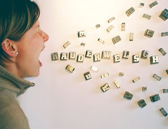
I like how speech has been visualised here  and the layout of this piece. Simple but effective.

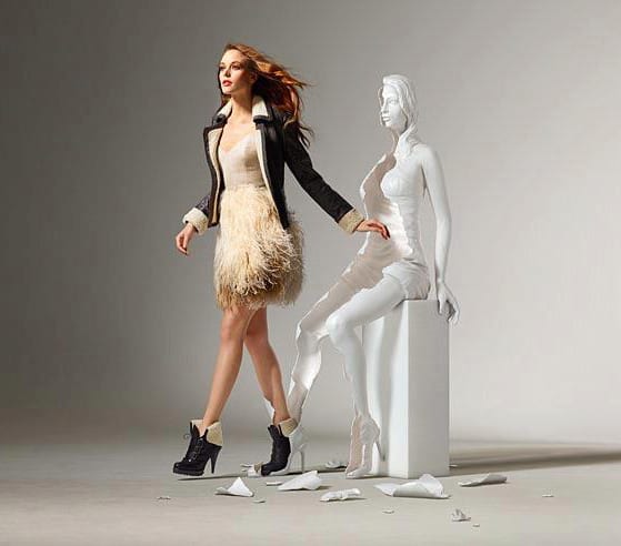
174533-stock-photo-woman-design-profession-humor-equality-feminine


A still/static piece that looks as if it is moving. I like that movement can be shown/implied by the layout and structure of a piece. Perhaps I might think about using this with my piece.

art-wall_2030010i


This isn’t experience design but I thought it fitted with my topic and how women at that time felt trapped, as if wrapped up and couldn’t get free. This is just a piece of art that has helped in my thinking of how I could create my experience.

b4917099-307c-4cc2-923c-0bcd9857a7c9-1


Again, this is not an experience or exhibition piece, but it is an interesting piece of installation art, showing a woman breaking free. Just another way I could tackle my experience and show the emotions and feelings of women at that time, feeling held back and that now is a time to ‘break free’.

break_free


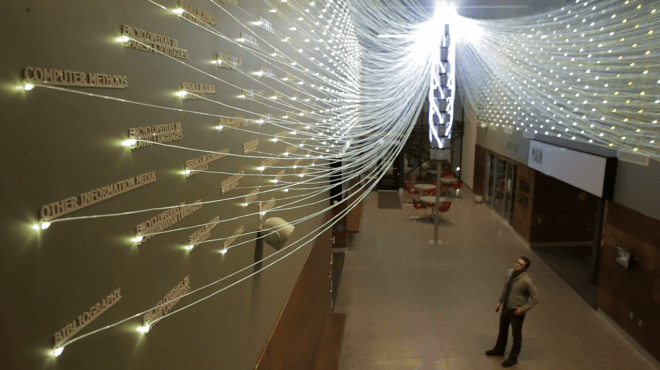
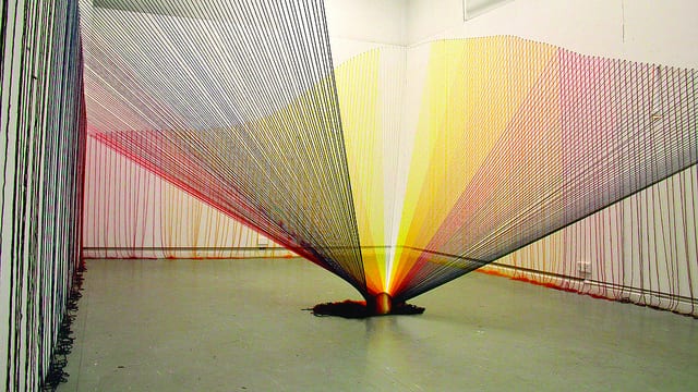
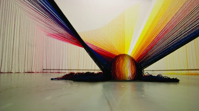
I like how all the lights are used here and then gathered together. Without even knowing what this piece is about I can tell that all the individual things link up together and are part of something bigger. To create a good piece you should be able to show the viewer what is going on without having to explain too much.

Filament-Mind-660x370


This art installation made me think of wallpaper being ripped/pulled down and related to an idea I thought of… that women were seen as beautiful and delicate, physically and mentally and I could show this using wallpaper and ripping it to show rebellion against that.

Liliana-Porter-Wrinkle-Installation1


These images have all contributed to my ideas process in coming up with my experience design.

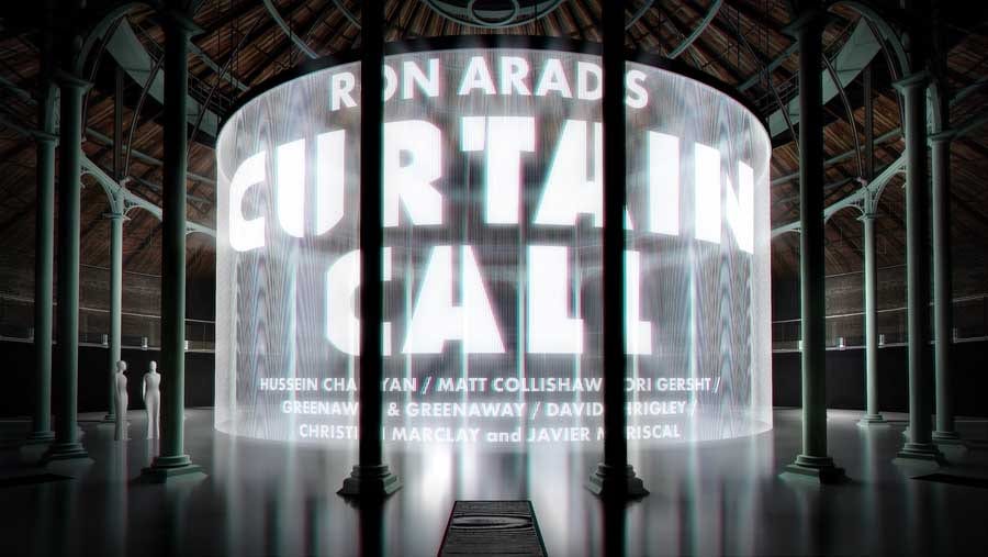
Curtain Call

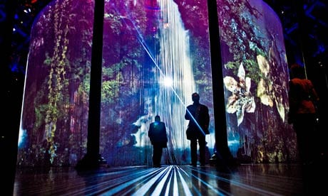
This piece is a 360° interactive installation – at The Roundhouse.

Using 5,600 silicon rods, videos are projected and can be viewed from inside or outside the circle. There is no specific entrance or exit, it is up to you how you go in and out, it’s left to you to create your own experience using the piece itself. It’s more personal this way and so no two experiences are the same.

Image converted using ifftoany18_curtain_call_tl090811 Mat-Collinshaws-Sordid-Ea-007

Ron Arad uses his space well to create an engaging piece. he uses the whole space and leaves it up to the viewer where to stand (or sit) and how long to stay there. this contemporary piece is very effective, fun and memorable. Video projection is used to its full advantage here.

This helps me understand how video projection doesn’t just have to be placed on a wall, but can be placed in different places, on different materials in different ways. There are many possibilities with this technology.


Source:

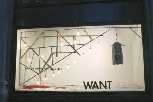
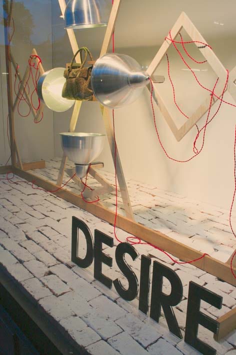
CRAVE, WANT, NEED, DESIRE, OBESS…

selfridges want desire

This window display by selfridges is visually very engaging and focuses on just one item in each window. they do this through use of space, colour and materials to draw your eye to the main piece. Each window has the same aim, but each is unique. They’re design has proved effective to capture attention.

I want my piece to capture peoples attention through use of space, colour and materials, like Selfridges have successfully done.


Source:

Experience Light

Shireen Rawlins

‘I aim to create structures/environments that are immersive and encourage interaction/intervention. These works often challenge traditional modes of viewing or preconceptions of ‘suitable etiquette’ within the gallery space. I am particularly interested in the viewer’s encounter and interaction with the space, and in the art experience as something that is therapeutic and transformative, extending beyond the individual to the social.’

8250249227_ce508b8246_z

8250247575_a1062e96cb_z

http://youtu.be/pPpNS1NdSvg

This is an eye-catching piece of art, but it becomes an interestingly engaging experience once you drop people into the mix. Watching the video of people walking around the piece it becomes more than just art. This is experience design. Yes it is simple and I’m sure more could be done to develop the idea to involve more senses, but it works well and really involved people. It uses aesthetics and curiosity to get people to go over to the piece and touch it as they move around. As they move they can go whatever way they want at whatever speed they like, and thus they are creating their own experience from this static piece of art. It’s interesting how people don’t even have to be told what to do or how to react with something, but if it’s there and it attracts their eyes they will be drawn to it and immerse themselves in an experience that they have created, using the object/art.

As Shireen states, the piece challenges traditional methods of viewing and ‘suitable etiqutte’ within the space. This piece encourages people to get up close and personal and they can share in the experience with others or alone. to fully experience the piece,  you have to physically walk round it and move your body to get under bits too. This all contributes to the experience. It doesn’t seem to produce a meaningful experience, but something different, which people can have fun with.

Source:

Atmospheric Art Installations

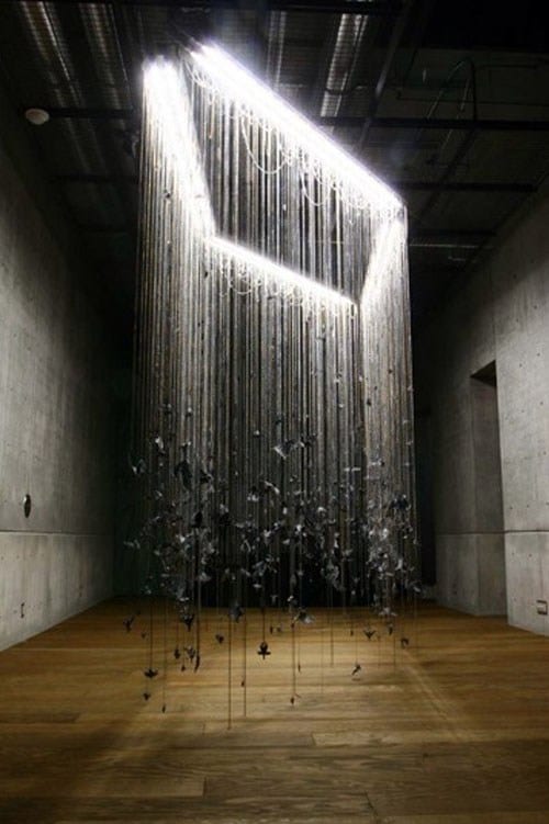
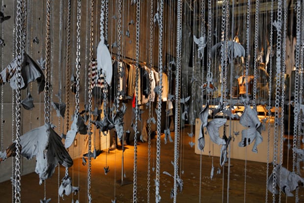
ISO Hirofu / Komainu

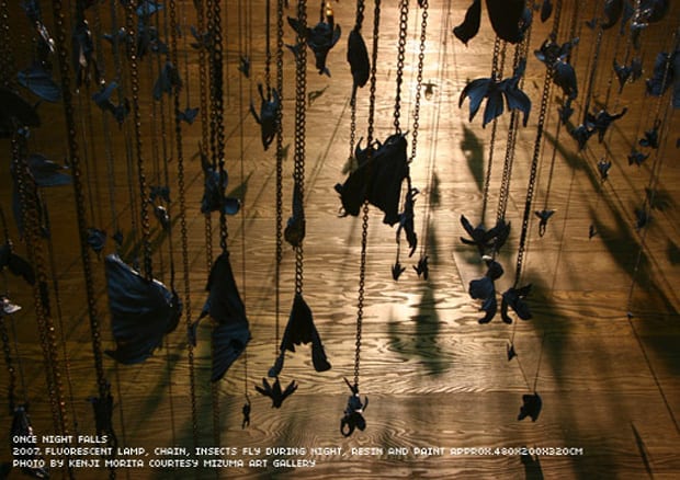
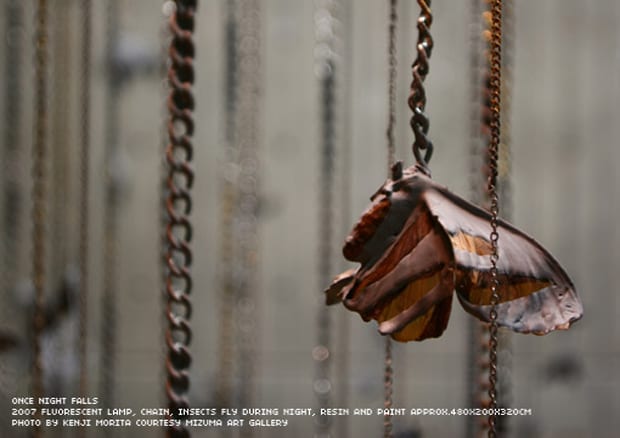
ISO uses, ordinary things we might happen to overlook in everyday life to create his installation pieces. This piece is of things that happen  and creatures that come out at night. His use of light shows this well, creating the effect of night, with a light above to make the insects hanging on chains visable.

iso-hirofu-komainu-once-night-falls iso-hirofu-komainu-insect-artwork iso-hirofu-komainu-diesel-artwork iso-hirofu-komainu-detail

This art is very minimalist, but interesting. It has made me think about the use of light in an installation and how light can effect how you view something and effects the piece by where you place it and how bright it is. You can appreciate this piece as one large installation or go up close and look at each individual intrinsically made insect. The shadows made from the way the light shines onto each object creates interesting silhouettes of each insect on the floor below.

Source:

Adhesive tape Art Installations

Monika Grzymala

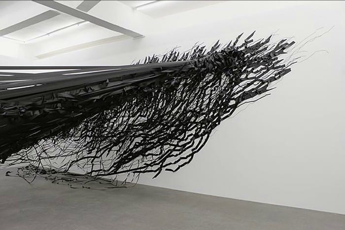
Using black tape, Monika creates these abstract installations. Beginning with ‘line and mark’ on the page she has progressed the idea further on a larger scale, to walls, creating 3d pieces. She sees her art as more of a performance piece, than an art installation because of the planning, phsyical effort and time she puts into it. Her pieces are her response to the place she is, whether its chaotic London, or busy New York.

Tape-Art-Installation-By-Monika-Grzymala-8 Tape-Art-Installation-By-Monika-Grzymala-620x348 Tape-Art-Installation-By-Monika-Grzymala-7 Tape-Art-Installation-By-Monika-Grzymala-5

I find these installations powerful just from first glance. They are static and yet show motion and movement. Just the immensity of the amount of tape in front of you as you see the piece is engaging. It’s like a controlled mess you can’t help but be immersed by. Being 3d, the piece is much more engaging than if it was just drawn on a piece of paper, which is why I think Monika uses this method of creating art. It has also opened my eyes to the fact that an everyday object, such as tape can create such an interesting and engaging piece on it’s on, if you use it skilfully.


Source:

‘Sooner or later it all comes down’

Via Grafik, Names Festival, 2008, Trafačka, Prague

via-grafik-black-box-installation-1 via-grafik-black-box-installation-2


‘It’s got such a great sense of motion to it, like it really could come crashing down at any moment.’

– Bobby Solomon


the installation looks like it could just fall on you and thus gives you a sense of uneasiness walking beneath it. It’s a simple idea and execution, but it works well. I like how such a simple design can create feelings and an experience because of the way it’s formed and how it is placed in the space. Also it’s clever how the fact that you feel like it could fall on you, because of the sense of motion created by the blocks.


Sources:


Why don’t more museums strike an emotional chord?

I read an article by Sharon Heal on her experience at ‘Experience Barnsley’ museum, sharing how she felt an emotional connection to the things in the museum…

 I was moved. I laughed out loud, I swallowed hard on a lump in my throat, I welled up and I felt a sense of belonging that I can’t ever recall feeling in a museum or gallery.

She made the point that usually in a museum or gallery you stand around and whisper, as if there’s an unspoken etiquette that we have to follow. But at this museum she felt an ease, to experience the museum in a laid back manor, where you can interact with whats around you.

One thing that Sharon says makes the museum a success is that it’s real people telling real stories. Something we can relate to and engage with. When creating my design I want to make it feel real and approachable, where people can connect, not just with their senses, but with their emotions.


Source:

So what is Experience Design?

Experience design is quite a new concept, although people have been designing to create an experience for years.

6 dimensions experience design is made up of:

  • Time/Duration  (To go round/participate/engage/some designs you might have to watch something happen)
  • Interactivity  (Can be very interactive or not at all/can be physically or psychologically)
  • Intensity  (How intensive the design is or the experience created)
  • Breadth/Consistency  (It might cover a lot of space or not much. It might also all be similar or different in content)
  • Sensorial and Cognitive Triggers  (Things that cause you to use your senses and acquire knowledge and understanding)
  • Significance/Meaning  (Good experience design should have a purpose and stay with people after they leave, a lasting memory/deeper understanding)
– To create a good experience design I will need to understand and utilise these ‘dimensions’ and do so in a way that enhances my idea.


Source:

What is Exhibition Design?

‘the focus is on collaboration; the balancing of space, object and information; the subtle integration; and the role of the audience’

This is the direction exhibition design is developing in and all these things are important for successful exhibition design.

It can involve more than one design discipline and to varying degrees, including:

  • architecture
  • interior design
  • environmental design
  • print graphics

It can also involve electronic and digital media, though the use of:

  • lighting
  • audio
  • mechanical interactions &more

Environments have the power to import and interpret information, involved an audience and influence their understanding.

‘Multilayered communication’ can also be used, helped by creating experiences in real time, utilising space, movement and memory.

To deliver a good narrative these techniques should be used.

It is impossible to communicate well and effectively if you don’t know who you are talking to. All these things should be taken into consideration and impact how information is received, processed and understood:

  • personal history
  • cultural background
  • gender
  • age
  • ability
  • learning styles

(To do this well I must identify my audience straight away)

Good experience design also incorporates passive storytelling, interaction and engagement.

– All these things are important to create a good piece of experience design and I will consider them all in my own piece.

Source:

  • ‘What is Exhibition Design’ by Jan Lorenc, Lee Skolnick and Craig Berger. (Roto Vision, Switzerland, 2007)

Votes for Women research

I re-read a study book about votes for women, wanting to find out more about why women wanted the vote, reasons for and against and the suffragette’s protests. I found out quite a lot about the movement.

 Reasons for the vote

Women wanted the vote, not just for political reasons, but because they believed it would end economic, social and moral unfair treatment they faced. They believed without the right to vote they were at a disadvantage, but with it their lives would be benefited, including improvement to marriage laws, sexual morals, it would also improve the lives of working class women and they believed that it would eliminate prostitution.

pic

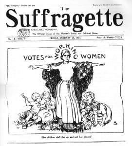
Cover of ‘The Suffragette’ Newspaper in 1913, supporting votes for women and showing it would be positive for working class women.


Reasons against the vote

A few ‘anti-suffrage’ quotes in the book, I found irritated me, over 100years later…

‘Men are governed by reason, Women by emotion’

‘Votes for Women? We shall be asked next to give votes to our horses and dogs.’

‘Women are guided by their wombs, rather than brains’

…Yes we live in a modern culture, but women are still women and shouldn’t have been treated as second class citizens. These quotes, even today are still very bitter and frustrating.

An argument against women being able to vote is that if they can’t fight and defend their country then they shouldn’t be able to vote either. Their role was seen to be a wife and mother. To give them the vote could ‘destroy’ family life and therefore destroy society, as the family was seen as a central part of society. The antis believed that women would challenge men’s authority and were unable to have an individual opinion. Women were perceived as too delicate to be involved with the dirtiness of politics and to be involved with it was believed to cause loss of the moral and social order of society.

The WSPU and militancy

After seeing slow progress and believing that politicians took little notice of the votes for women campaigns, the WSPU, (led by Emmeline Pankhurst) decided to go for a more militant approach, believing to gain the right to vote, force would be necessary.

Their forceful and militant actions included:

  • Smashing windows – originally done out of desperation, but became official policy
  • Setting fire to property/Arson attacks – not to cause harm to people but to protest against them, including David Lloyd George
  • Destruction of a postbox – by Emily Davidson
  • Destroying expensive works of art – including  Mary Richardson slashing ‘Venus’ by Velazquez, with an axe, to say people care more about paintings than people
  • Cut telegraph wires
  • Wrecked plants in Royal Botanical Garden at Kew
  • Chained themselves to railings in protest in the House of Commons and outside Downing Street
  • Hunger strikes
  • Imprisonment
  • Put themselves in danger of physical harassment

Some might say the Suffragette’s actions were more like minor terrorism than traditional political protest.


I think the Suffragettes were very extreme in their actions and some argue it hindered the cause, nether the less it was a difficult time and women were not treated fairly, but as second class citizens and these women stood up against this unfairness for what they believed was right and just.


Source:

  • Access to history: ‘Votes For Women’ by Paula Bartley (published by  Hodder Education, 2007)


The Personal is Political:

Gender in Private & Public Life in the 19th Century

I read an interesting article on the V&A website on politics and gender equality during the 19th Century (the period leading up to when my chosen object was made and defaced).

I was shocked to find the article state that in 1880, 23 years earlier, only men could freely go to bars, music halls and take part in most outdoor sports! Although during the 19th century laws had been passed in favour of women’s rights and removing gender injustices, this was a slow development in gender equality, which was (widely accepted as) a part of British Life.

Votes for Women was not a new demand in the 20th century, but one that had been expressed for over 50years! It was just that it now became a focus in the gender equality battle.


Source:


Women’s Suffrage… background research

‘Votes for women was a major breakthrough which affected the lives of all women in Britain.’

-Votes for Women (book)

We can look at the suffrage movement and see it as something of the past that has nothing to do with us, but because of the movement women can now vote and become MPs and do many things they wouldn’t have been able to do over 100years ago..

In the 19th century women’s rights were a lot different to mens. The law was more in favour of men’s rights and women were treated as second class citizens compared to them. This included matters such as: working hours, reasons for divorce, child custody and wages. Despite laws passing improving the inequalities women faced, they were still unequal to men in 1903.

Women didn’t just get paid much less than men, but weren’t allowed to have careers as doctors or lawyers.

– All this shows how being able to vote was much more than the vote, but about women wanting to be treated as equals to men.


The Suffragettes

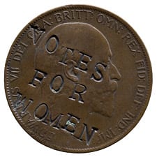
The coin I have chosen was defaced by members of the Women’s Social and Political Union (WSPU), The Suffragettes, who formed the same year my chosen object was defaced. Their well known motto was: “Deeds, not words”, meaning, that unlike the National Union of Women’s Suffrage Societies (NUWSS), The Suffragists, they believed if violent protest and breaking the law was what it took to gain the vote, that’s what they would do. Formed by the Pankhurst family, the WSPU used propaganda and protest to fight for women’s rights, frustrated by the slow progress they had seen.

Source:

  • ‘Votes For Women’ by Diane Atkinson (published by Cambridge University Press, Cambridge, 1988)


Artefact Background Research

Why did women want the vote?

Emmeline Pankhurst, leader of the suffragettes:

‘First of all it is a symbol, secondly a safeguard, and thirdly an instrument.’

votes for women

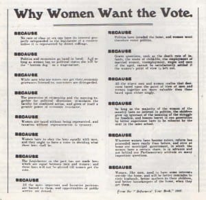
Handbill given away by NUWSS and WSPU on ‘Why Women Want the Vote’


Why were men and women against women getting the vote?

They believed that politics would have a negative effect on women and that they would become less polite, respectful and ladylike. They thought that by being able to vote, women would lose interest in marriage and children, creating an issue for humanity. Women were seen as much more emotional, unstable and ignorant than men, so to be able to vote would be a big mistake.

Not just men, but many women agreed with these reasons opposing Women’s right to vote. Today these views come across as very absurd, but they were widely believed to be strong arguments against Women’s suffrage.


Source:

  • ‘Votes For Women’ by Diane Atkinson (published by Cambridge University Press, Cambridge, 1988)

My Object

For the project we need to find a museum object of our choosing from any museums as long as it a)has a function and b)has a human connection attached to it…


pompeii_panther_tablek150880_l

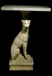
About a month ago I went to the British Museum and there are all sorts of fascinating objects in there from different places in the world and different periods in time. It’s such an expansive museum, that I didn’t managed to see a lot of it, but I did browse online at the collections and artefacts they have on display. Some of the interesting things I found included a coin defaced by the suffragettes, a ring with the lords prayer written on it from the Stuart period, a Roman garden bench from Pompeii and a Roman display table, also from Pompeii. All these objects were man made, had a function, represented something of the culture and time they were from and had the potential to create an experience out of…


defaced_penny_mdefaced_penny_obverse_l

The object that fascinated me the most was the coin defaced by the suffragettes. The coin was minted in Britain in 1903 and has a very interesting history behind it. The suffragettes defaced many pennies in protest, to create a political statement as a campaigning strategy. This act of civil disobedience would have been treasonous at the time, but the suffragettes felt that to change the law they needed to break it. It was actually a very clever, low budget method of protest and propaganda at the time, as coins were a widely circulated, everyday object and used by all classes and types of people, including powerful men and politicians. Also being only worth 1p, the pennies were not worth enough to be recalled by the banks. It would have also created different emotions amongst people, including empathy for the cause, comfort for those women in support of women’s suffrage and shock and rage from others who opposed women’s rights to vote and purely saw it as a criminal act.  It is also interesting how the defaced side of the coin is the head, with King Edward VII’s face, but the tail, showing Britannia, who first appeared on British coins in the Roman times, a strong powerful woman has not been touched. The coin featured as part of the British Museum’s ‘The world in 100 Objects’, under the theme ‘Mass Production, Mass Persuasion’, clearly seen as an important part of our history, not just as a country, but as humanity.

There are quite a few aspects and concepts with this object that I can use to connect people to the object and create an experience. These are my initial ideas:

  • The coin is an ordinary, everyday object made extraordinary: it’s interesting how a small object can say and represent so much. It’s a powerful thing.
  • Coins were widely circulated at this time and still are today. The internet today, like the coin is used by all types of people, of different wealths and backgrounds and is the easiest way to widely circulate things.
  • Despite breaking the law, some argue that in some situations this is ok to do, for an important cause, like the Suffragette movement. Was it a moral or amoral thing to do?
  • The coin does not just represent the Suffragette movement and their struggles, but it represents all the revolutions, protests and wars at the time… all fighting for what they believed was right and the hardships faced by many during the 19th & 20th Centuries.
  • It reminds us that there are still many places where people are fighting for their civil human rights now. It’s not just representing the past, but also the present.
  • It connects us to OUR past. As a British woman it is a reminder of the struggle many women faced for ‘me’, so that 100years later I could vote (something we may take for granted).

Sources:

Stuart Nolan: Magic and Curiosity

Guest lecture from a magician…

This lecture was surprisingly very interesting and helpful to the project. Stuart spoke a lot about magic and how it can link with experience design, whether it’s a big or small ways. For example he prefers to create magic with people, rather than having a ‘main man’ perform them to you. He also shared with us that people like to be led, and not just be told to do something, but when you are encouraged to follow someone and they involve you, you trust them more and more more likely to participate. Yes he was talking about magic, but it links with experience design. People should be involved in creating their experience and not just be shown or told, but led through it. Also just like with magic, Stuart shared with us that when you add people to a process you should allow space for things to happen that you might not expect.

He shared with us different projects that involved design and magic working together to create an experience. These included things like:

  • a light travelling onto someone’s hand and travelling with them across a room.
  • a dripping tap, that when a strobe light shone on it at the right time and place it look like it was still, or falling slowly, or even going back up into the tap.
  • a box that when you put your hand into it, it can look like a wing, or a hoof, or even a claw.

All these examples show how technology can be used to create all sorts of experiences, whether the audience is needed to participate to create the piece, or are just involved by watching something happen..

Something I hadn’t thought much about, was that ‘How you dress an experience, can change it’. As Stuart rightly said, it’s not just the experience that’s important, but how you arrange and show it to your viewers/audience. For example, Stuart has a suitcase which he takes to different places and for 50p people can see the ‘weird’ and unexplainable thing inside it. He purposely has the ‘thing’ hidden from view, but through how he has positioned this suitcase, people can see the last person’s experience and the expression it creates on their face. This rises curiosity in people, all because of how Stuart ‘dressed’ the experience. He shared with us that curiosity is a powerful thing and like with the ‘weird’ object, the curiosity rose a need in people to see what the thing was that made someone react captivatingly. Curiosity also comes from exclusivity by keeping people out. If they are kept out they are even more intrigued and interested in what it is that’s happening. Anticipation design is similar in the fact that you show people a part of something but not the full picture. Stuart was involved in creating the website for the game ‘GTA2’ and they used this type of design, by only letting one in ten people into the website at a time. Cleverly this method of design just made people more determined to get onto the site by teasing them through the use of curiosity and exclusivity. They wanted to see what they were missing out on. all these approaches are things I hadn’t even thought about and have helped me in my way of thinking as I progress further into this project.

Stuart went on to discuss with us: ‘why do people go to museums?’ Well that seems obvious doesn’t it? I love to go to museums, to learn and feel cultured, others because perhaps it’s something to do or simply because it is free. Surprisingly none of these answers were the top reason why people to go a museum. So Stuart told us that the top reason why people go to a museum is to take someone else/to be with others there and share the experience. Knowing why people go to museums means we can think about how they move around them and how, as Stuart pointed out, do you keep a group together, without people breaking off? From researching into this, Stuart was able to share with us how most people move through a museum or gallery:

  1. First most people will have some sort of orientation/plan, in which they might get rid of their coats and bags, go to the toilet and maybe get some food. This is an important thing for the museum to get right.
  2. Then when people begin to go round, they will at first focus on most things and read the information about the things they are observing.
  3. As time goes on and after about 40minutes they will get a bit bored and browse, rather than looking at everything.
  4. After a bit more time has passed people tend to only pick the things that attract them to look at, often on their way out of the museum.

All this is very interesting, but what has it got to do with my project? With only 20% of most people’s museum visits being structured and methodical, museum displays need to engage people and give them a reason to view objects and artefacts. This just increases my realisation that for people to even be interested in, let alone experience, my exhibition display, I need to make sure the design and display captures people’s curiosity and grabs their attention. To sum up, how you design and display an exhibition is very important and often is the reason why people will view or pass-by your exhibit.

The last thing Stuart spoke to us about was ‘Attention Design’, and he used the example of Walt Disney’s ‘Disneyland’ to explain this. When working on the film Lassie, Disney realised how a dog is drawn to an object. When years later he built the famous ‘DisneyLand’, he used this technique to draw people in. By just placing a big, beautiful castle in the middle of the theme park, or a giant rocket at ‘Epcot’, people would be drawn in without even being told to do so. Even though this is large scale, the same technique can be used in a museum exhibition to draw people in. Using the help of magicians as ‘imaginers’, Disney land also has many ‘hidden mickies’, that can be found any where in different forms and sizes. Some people will collect photographs of these and it can become a game for people to find them. Museum exhibitions could also include little fun things like this for people to find, get involved with and even collect.

Stuart Noland’s talk was very engaging, just like the many examples of design he shared with us. He also brought many things to mind I hadn’t even thought about using or doing for this project, that have enhanced my thinking.

More understanding and thoughts from lecture on experience design

Three important things to get right when communicating with people is the audience, content and message. All of these need to be right. The audience need to connect with the message and the message with the content, if not the experience won’t work.

Once I have chosen my object I need to identify and work out who my audience is and then understand who they are.

To produce a creative and cultural experience it is important that you connect with people’s emotions and focus on the ‘human element’… How can I make a personal and memorable experience, engaging someone to the object, but not focusing on the object itself.

Inclusivity: Connect everyone, don’t leave people out, find a way to include everyone.

An example that helped me understand experience design and inclusivity in that is: You listen to music, perhaps on your own at home. Music is like the ‘object’ and so when you go to see that band or musician live it is not just about the music but the experience, atmosphere and an emotional connection comes into it as well. You’re not just connecting with the band or musician, but you are inclusively sharing in the experience with the other people around you.

Initial Understanding of Experience Design project

This project is not just about designing a 2d piece, but designing an experience which people can connect with in different ways, whether this is physically and/or psychologically. Experience design can use all of our senses: touch, sight, hearing, taste, smell, and the sense of spatial awareness. From my understanding it is not just by including all or any of these things that you can make an experience, but by choosing the right ones that will bring people a deeper level of understanding and connection to the design/object. So once I have chosen an object, I should try to enhance the senses that will engage people and make them feel some sort of connection with my chosen object. This needs to be done using suitable technologies.

How to do a successful rebrand – with examples

http://www.hingemarketing.com/library/article/elements_of_a_successful_brand_1_positioning#

Elements of a Successful Brand 1: Positioning

  • All successful brands have something fundamental, an idea or principle: this is its positioning
  • Successful positioning needs to make a brand stand out from its competitors so it will attract people’s attention and give the company an advantage.
  • To stand out a brand must do these things: be different, be focused, be relevant.
  • Be different: Need people to notice you by standing out from competition. Today people have so many choices and by being different you provide the contrast needed to help people choice your brand.
  • Be focused: Many businesses expand their services rather than narrowing their expertise in hope of attracting new customers. Need to find your niche so qualified customers will find you and pay more for your services.
  • Be relevant: You can be different from everyone else and specialised, but you need people to be interested in you to succeed. Make sure there is sufficient interest in what you do.
  • Keys to powerful position: Find your niche, where you stand out from competitors and what you do what your competitors don’t do, or what you do better. Make a positioning statement and then ask yourself why a customer would care. Think of how you can contrast from others.
  • The strongest positioning is built on reduction. We subconsciously place brands into categories. The brands that do the best are known for simple ideas. Many top brands can be summarised in a few words: FedEx – became synonymous with “overnight”. Volvo – built reputation on “safety”. Apple – have become known for their great “innovation”.
  • Need to simplify brand, uncover their fundamental purpose. “What is the most basic benefit you provide?” If you have the courage to minimise your services to their essence, an effective new market position can be created.


http://www.hingemarketing.com/library/article/elements_of_a_successful_brand_2_the_tagline#

Elements of a Successful Brand 2: The Tagline

  • A lot of pressure is put on a brands tagline. They need to be engaging. A good tagline can speak to an audience with authority and elegance.
  • An effective tagline should: clarify what you do & how you are positioned, express an important brand attribute, support your positioning and help people recognise and remember you. 
  • Clarify: A tagline is an opportunity to show you’re different, express your personality or convey an important brand quality. (Examples: “Business furniture that works”: 925 Business Furniture, “Creating Pivotal Brands”: Hinge.)
  • Express an Important brand attribute: Every good brand stands for something: a point of interest or competitive advantage. Tagline is great place to show this attribute. (Examples: “Think Different”: Apple)
  • Support your positioning: Taglines are most helpful when they support the brand’s positioning. (Examples: “We try harder”: Avis, “The Ultimate driving machine”: BMW)
  • Keys to a great tagline: Short, show simple idea/benefit, be specific, be believable, avoid generic/cliched statements that could apply to others and memorable.
  • Avoid: vague, bland, untruthful ideas. (Bad examples: “We make sure:: Fujitsu Siemens… we make sure of what? Incomplete/bizarre/confusing, “Helping Clients succeed”: Booz Allen Hamilton… Bland, “A passion for the business of accounting”: Grant Thornton… About them, what about the client?


http://www.hingemarketing.com/library/article/elements_of_a_successful_brand_6_the_logo#

Elements of a Successful Brand 6: The Logo

  • A logo can be the anchor of a brand’s visual identity and an important part of being a successful brand.
  • A logo has three main functions: Identification, Differentiation, Aiding Recall.
  • Identification: A logo represents and identifies a brand. The mark visually aids the brands identity.
  • Differentiation: A logo creates visual separation from other brands. Being different from the rest gives a brand distinctiveness. A logo can also convey aspects of a brand’s personality or attitude.
  • Aiding Recall: A distinctive logo is a memorable logo. Being noticed and remembered is important.A logo should provide a shortcut helping us to identify a brand quickly.
  • Logos can be broken into two parts: the mark and the name. A mark supports the name and offers visual dimension to the identity. Some marks are so well known that the name isn’t needed to identify the brand (Nike and Apple). Many brand don’t even have a mark and just have logotype (Sony, IBM, Oracle). Logotypes need to be legible, whether online or at a distance.
  • Key questions to ask when creating a logo: Does it reflect the brand’s personality? Is it different from other logos in it’s industry? Is anyone going to notice it and remember you because of it?
  • Successful symbolic logo: United Presbyterian Church of America logo redesign. Designer managed to put many meanings into mark, including a cross, a descending dove, fire and the Bible. This logo integrates many symbols into a single, unified mark.


http://www.hingemarketing.com/library/article/elements_of_a_successful_brand_7_colour#

Elements of a Successful Brand 7: Colour

  • When colour is chosen and used efficiently, it can differentiate, motivate, and elevate a business. Some colours are so closely related to their brands that they have become as iconic as the logo itself! But it takes years of exposure to be able to associate a brand with its colour. Even so, colour can still be used to create an impact.
  • Colour Differentiates you: Make sure your colours stand out from your competition.
  • Colour Identifies you: Colour can become closely associated with your business. According to a University of Loyola, Maryland study, colour can enhance brand recognition by up to 80%.
  • Colour is Visceral: We react to colour instantly. It can cut through clutter and commands visual attention.
  • Psychology of Colours: Colours can have an effect on our moods and attitudes. Every colour has emotional implications, so many businesses use colour to influence people’s buying behaviour. Even so you would want to use a colour for your brand that is different to your competitors.
  • Blue: is the most liked colour and also the most commonly used colour in business. 


http://www.hingemarketing.com/library/article/elements_of_a_successful_brand_8_messaging#

Elements of a Successful Brand 8: Messaging

  • Messaging = the words a brand uses to describe itself.
  • Every brand needs a voice. Messaging provides the words to help people understand the brands value (why useful) and values (what it believes in). It also articulates a brand’s promise and stimulates desire for their services.
  • Messaging can be in the form of a tagline, slogan, headline, ect. Persuasive brand messages are always brief and covey critical aspects of a brand. Effective brand messages usually simplify something that is complex. A message needs to be simplified down to the point to get into people’s minds.
  • The Core Brand Message: Every great brand has a core brand message: a compact statement that declares why the brand matters and what it stands for. It communicates the values and key differentiators that define a brand. It should shape the brand’s marketing messages, which should describe aspects of the brand that are relevant to the need of the customers.
  • Creating a Message: Messages help brands to differentiate from others and often convey specific services or benefits (“Visa. It’s everywhere you want to be.”) Or be a call to action (“Got Milk?”). A brand message must be authentic to the brand and customers’ actual experiences.
  • Message checklist: Does your core brand message offer anything different from your competitors? Is your messaging short, simple and clear? Do your messages reflect reality? (Or are they aspirational?) Brand messages must be authentic to be believed. Do your messages resonate with your target audience? Do they say anything interesting?
  • Messages can appear in many places, including advertising, brochures, websites, business cards and email signatures.


http://www.designcouncil.org.uk/resources-and-events/Business-and-public-sector/Guides/The-power-of-branding/The-key-ingredients/

The power of branding: a practical guide

The key ingredients to a good brand

Consider:

  • The big idea – What lies at the heart of the company?
  • Vision – Where are you going?
  • Values – What do you believe in?
  • Personality – How od you want to come across?

The Big Idea 

  • This should encapsulate what makes you different, what you offer, why you’re doing it and how you’re going to present it.
  • Ask yourself: How can you stand out? What do you offer? What makes you different? What is your ‘personality’? What do consumers want or need? Is there a gap in the market?
Vision
  • Vision means thinking about the future, where you want to be and looking at ways to challenge the market or transform a sector.
  • Vision may be grand and large-scale or simple, like offering an existing product in a completely new way, or even changing the emphasis of a business form one core area to another.
Values
  • Relates to important aspects of how people see an organisation.
  • It’s what you stand for.
  • Most companies share these values: quality, openness, innovation, individual responsibility, fairness, respect for individual, empowerment, passion, flexibility, teamwork and pride.
Personality 
  • The tone, language and design are ways you can present your personality.
  • Personality trait examples: ‘efficient and business like’, ‘friendly and chatty’, or ‘humorous and irreverent’.
  • Ways you can start to control the elements of your company’s personality: Graphic design (visual identity), Tone and voice (language), Dialogue (one way or two way communication), Customer service (staff communication to customers)
The power of branding: a practical guide
How to communicate, manage and develop your brand identity
  • Differentiation: Important to define and present differentiation in your sector.
  • Engaging with customers: If you stand out for positive reasons and your tone of voice and communications are credible, customers will be interested in you. Appeal to people’s sense of individualism and focus on value of human interaction and communication, rather than competitive price plans or latest technology (example: Orange brand).
  • Evolution or revolution: When reassessing a brand you can go small and incremental, refreshing the brand or go for a major overhaul of the company or brand’s image. If a brand is already in a strong position with a solid customer base and you just need to keep up with growing or developing market then evolution isn the best option.
The power of branding: a practical guide
The relationship between design and branding.
  • A brand is not simple a logo or identity.
  • Logo = just one manifestation of brand. But is often top-level of communication, seen most frequently by most people.
  • Design translated the ideas into communication.
  • Design: Need to work through strategy and implementation to ensure results are consistent, adaptable and keep with original brand attributes.


http://www.integraphix.com/rebranding_article

  • Rebranding: process to develop new market direction or distinguish a brand from previous negative opinion.
  • Most logos or marketing campaigns are good for 5 to 10 years and then a brand needs to change to keep up with a more modern image and newer brand ideas. To keep up with competition and meet customers changing preferences, brands must evolve.
  • An evolving brand identity keeps a brand relevant and fresh in a marketing place that is always changing.
  • Most major brands have gone through transformations, which are essential to compete.
  • Coca-Cola’s image has been evolving since the 1950s to keep up with their target market, but have always kept to the same principles.
  • Rebranding is essential if your target market isn’t responding the way they should.


http://www.pixel77.com/3-essential-steps-successful-rebranding/

Essential steps toward successful rebranding

  • Example of a bad rebrand: PepsiCo & The Arnell Group regarding the packaging of Tropicana in 2009. Wanted it to look more up to date/modern and to show the juice itself, replacing the straw in an orange with a glass of orange juice. The identity was diluted and people were so used to/familiar with the old packaging that it was how they identified the product in shops. Tropicana’s sales went down 20% in the first 2 months, costing PepsiCo overall $33million.

  • Cigna Rebrand: Leader Creative rebranded Cigna because their logo didn’t represent the wide range of services that they offered. They used focus groups which confirmed concerns and people referred to the logo as “bureaucratic” and “unresponsive”. Cigna were worried that change would result in losing brand equity built around their previous identity and tried to keep the black box but it didn’t work.Surely a health care company should express care, security and stability and create an emotional response from the clients. This is the reason they included a tree in the logo, with a new slogan “A business of caring” and the redesign was a success.
  • The reasons behind rebranding are just as important as the new brand identity.


http://www.logodesignlove.com/10-successful-logo-redesigns

Successful logo redesigns

  • Logo redesigns often implement subtle changes to refresh the look whilst considering customer recognition.
  • Toys R Us: The star has been placed inside the R to make a tighter and simpler wordmark, less patriotic, more bulbous and more fun.

  • MSNBC: Not grammatically correct, but lowercase is less imposing, more legible, and friendlier than all-caps. Was clunky and unflattering. Peacock feathers have stayed, no need to change. The mark is now approachable and rhythmical, rather than cold and monotonous. Achieved from changing typeface.

  • Science Channel: Period table look is well used, relating to brand. The orange reproduces well on RGB screens and also has sense of being fresh and new. But there are many different points that parts of the logo are aligned to, seems clunky.

  • Dolby: Double-ds merged together, works well with new type and removes visual separation and additional noise. Dolby word removed from rectangle, with lighter weight typeface for better legibility.

  • Delta: New logo simple and to the point. New colours work better – blue more dominant and more modern typeface.


http://kingmedianow.wordpress.com/2011/05/31/starbucks-serves-up-a-valuable-lesson-in-rebranding/

Starbucks Rebranding

  • Starbucks are a universally known company with locations in over 50 countries. In 2011, on their 40th anniversary Starbucks revealed their new logo as part of a rebrand campaign. They new logo included the same illustration as before, but now in all green and without the brand name on the cup. Other companies such as Apple and Nike have also done the same, because they are so recognisable only an image is needed for their logo, without the brand name.


  • To be a successful brand you must go beyond the physical characteristics of colour, design, packaging, ect. and determine the new direction you would like to follow that your clients can identify with. Starbucks have started to go into the non-coffee business activities and products in recent years, such as music and ice cream, and are continuing to expand in this direction.
  • By removing the words from the logo, Starbucks can represent their hopes to align with the non-coffee activities and make sit easier for marketing in non-English speaking countries.
  • Starbucks rebrand has been seen as successful and shows how important branding and rebranding campaigns are today and how important it is to rebrand to ensure success for your company.


http://www.fastcompany.com/1777409/how-starbucks-transformed-coffee-commodity-4-splurge

  • A brand is an entity that engenders an emotional connection with a consumer … Consumers emotionally connect with brands when the brands repeatedly provide something that the consumer wants, desires, or needs.
  • I think the best brands are those that create something for consumers that they don’t even know they need yet.
  • It’s really interesting to watch brands get older, and gain more competitors in the marketplace, and struggle to stay relevant. Look at Levi’s or Gap or any of the great American brands that have gone through these struggles. Look at Starbucks! In order for brands to recapture their spirit, they almost always go back to their core. They seem to forget for a while, then remember, “Oh yeah, we’re a coffee company!” Then they get rid of the movies and the spinning racks filled with CDs and start focusing on coffee again.
  • What’s it like to start working with a brand when it’s in the middle of a disaster? You only have one place to go, and that’s up.

http://www.designcouncil.org.uk/resources-and-events/Business-and-public-sector/Guides/The-power-of-branding/Brand-management-techniques/

&

http://www.retireat21.com/entrepreneurship/17-evolutions-of-logos

Revolution & Evolution

BP (evolution then revolution):

  • The original corporate identity designed in the early 1920s was used for over 80 years, but has been constantly refreshed over over those years, keeping the logo looking contemporary.
  • The corporate identity was completely redesigned in 2000, creating the tessellated ‘sunflower’/helios identity. The design changed because the company’s approach to environmental concerns had changed and it now represented their commitment to producing energy in many ways. The tagline also changed to ‘Beyond Petroleum’ and other aspirational, environmentally themed messages were used e.g. ‘bigger picture’ and ‘better products’.


Apple (revolution then evolution)

  • Original logo Isaac Newton sitting under a tree. Chief exec Steve Jobs thought that this overly detailed logo had something to do with slow sales, so completely changed identity – a revolution of the corporate visual design – and commission the rainbow striped logo, which ran for 22 years.
  • This revolution in branding was needed to kick-start demand for the company’s products.
  • Apple was firmly established by 1998 and the rainbow identity evolved into the more contemporary logo we know today.
  • The original logo was designed by Steve Jobs himself and Ronald Wayne and the rainbow logo was designed by Rob Janoff. The apple has a bite out of it so it isn’t recognised as another fruit.


Shelter (evolution):

  • Housing charity Shelter have kept their previous focus with their association with the homeless, but focus more on poor housing conditions. As the charity’s identity changed their logo did to, adjusting the letter ‘h’ to look like a roof.


http://www.businessinsider.com/10-most-successful-rebranding-campaigns-2011-2?op=1

UPS (big and boring to personal and innovative)

  • UPS have always been in competition with FedEx, who introduced late night deliveries and package tracking. UPS needed to remind their customers of how they can meet people’s needs.
  • They replaced the slogan “Moving at the speed of business” with “What can brown do for you?” and created adverts to show their customers that UPS can help you whoever you are. This approach produced good results, ranking up their profit margin in 2001.
  • UPS are still showing customers what they can do and their latest slogan is ‘We (heart) Logistics’.
  • UPS have used forward-looking slogans that tell customers they are continuously adapting and proving new ways to meet their demands.

http://www.1stwebdesigner.com/inspiration/successful-logo-redesigns-improvements/

CBS

  • A major American television network which started as a radio network, sometimes referred to as the “Eye Network” in reference to the logo.
  • Old Logo: From 1940 to 1951 CBS just used an oval spotlight on the block letters C-B-S and then a new logo was made in 1951. The eye has been kept and used as much as possible.
  • New Logo: Known as the ‘Eyemark, the new logo’s has a different typeface, giving it a modern and futuristic feel. The eye is still a dominant part of the logo.
Discovery Channel
  • Old Logo: First logo was a tv screen picturing a map of the world. ‘The’ was dropped from the name in the mid-90s and the globe became a permanent part of the logo, with an added ‘strap’.
  • New Logo: The new logo has been used since 2008. It contains new graphics and new tagline: ‘The world is just awesome’. The typeface Aurora Bold was replaced with Gotham and the globe has merged with the ‘D’ in Discovery. The new logo is more simplified and less crowded.

Lecture notes:

Skoda rebrand

  • Skoda were seen as an unreliable and uncool, joke brand. For these reasons they needed a rebrand.
  • Volkswagen took 30% of Skoda in 1991, by using their skilled workforce and industry know how, Volkswagen introduced training, educating and better design standards.
  • Skoda needed their own niche, separate from Volkswagen. They are now one of the fastest growing car companies.
  • The rebrand led to more than a third growth in sales between 2007 and 2011 (39.5%).
  • Their adverts mentioned their failures, showing they knew their faults and identified this. This was brave, but paid off. Other adverts showed that they were putting effort into their products and showing a change in behaviour (Cake advert & water and music advert: simply clever). These adverts were not necessarily aiming for Skoda’s target market, if the skoda logo was replaced by another car company’s the adverts would still have worked. These adverts were used to help redefine the brand.
  • “We needed to move away from being a cheap brand to being a value-for-money brand. At the same time, we badly needed to find our own positioning within the group, rather than just trading on being part of the VW Group. Otherwise, we might just as well have re-branded ourselves as VW, with very little reason for existence.”   Skoda marketing manager

Federal Express rebrand

  • Federal Express were established in 1973, but because of the long name changed it to ‘FedEx’ in 1994, making it more visible from afar when on their lorries for example.
  • In 1994 Federal Express hired Landor to rebrand them. Focus groups were used and it was decided the name would be shortened for better communication of speed.
  • The FedEx name meant a whole new language for the company and included copyright of the new name. This name was shorter and therefor more sufficient.
  • A clever trick FedEx used in their rebrand for creating the image of an arrow in the space between the E and x, but if consumers don’t see it it doesn’t matter.


Tom Lovell – The Partners
What is a brand?
  • Logo, Colour, Imagery, Typeface, ect all important, but theres more to it… Feeling, Association, Promise, Emotional Connection.
  • Physiological and Intellectual.
  • Before rebranding experience the brand and find out what people want from it (design around this).
Brand Strategy
  • Links design work to message.
  • Gives brand purpose.
1. Be Emotional
  • Be true to the essence of the brand.
  • Be passionate about it.
  • Believe it will create change.
  • Starting point.
  • Be simple and honest.
  • Get it down into post-it note – pure
  • Olympics 2012 logo: Unsuccessful? Why? Most emotional event in world and not distilled into identity. No joy, excitement or anticipation shown.
  • Face Britian: ‘Signature for a nation’ For Children so fun and friendly logo. Not serious. Logo fits with self portrait.
2. Stand For Something
  • What is the brand there for?
  • Avail – Carer agency. ‘We Do Care’ – We care about people and caring is our business. Every idea will come out of this. “Give hug” on website – friendly faces for nervous customers.
3. Consider Where It Lives
  • How are you approaching people?
  • Sticking a logo on a website does not show if a brand works or not.
  • Ebay rebrand – Have experience, fun, more than a logo mark. Mark not needed, the site and the experience are. (Bland new logo in my opinion)
AirAsia rebrand:
  • ‘Now everyone can fly’ – need reason to exist – cheap but for all – Lost way and needed to be brought back to this.
  • Where does it live? Airports and Adverts.
  • Colour red used a lot: seen as the red brand / red airline. But associate red with sale, cheap, stop sign, shut. Red needed to be contained within logo.
  • Came up with designs for destinations: examples of different cultures.
  • Using Black, White and Red proved effective. Colours stand out and when people are tired and stressed in an airport, these simple colours will help them know where to go.
  • Merchandise: badges – collectables from where you (can) go/souvenirs/experience and cool, clean t-shirts (handing when travelling and sweaty).
  • New planes with designs to do with destinations. Re-launch: dragon on side of plane (flying dragon). Made impact: others can see from other planes or when plane is in air. Advertising as well as design.
Important points
  • Be emotional about your brand / ideas
  • Have a simple yet effective idea
  • Apply idea in best way and be impactful
  • Use narrative and express insight into problems


Brand Research


http://www.forbes.com/sites/loisgeller/2012/05/23/a-brand-is-a-specialized/

  • Brand = promise
  • Brand = specific combination of logo, words, type font, design, colors, personality, price, service, etc. & Attributes.
  • Buying a certain brand says something about the person who buys it.
  • If you’re going to develop your brand, the last thing you want to do is follow the beaten path. You want to head down your own road. Your brand has to plant itself in the hearts and minds (especially hearts) of prospects and customers.
  • Does your brand make you feel great about your own company?


http://www.movingbrands.com/?page_id=

  • Most brands remain fixated on yesterday’s problem – consistent reproduction across media. But today a brand must be alive to change, just like the people it wants to connect with and the business it is part of.


http://idsgn.org/posts/design-discussions-debbie-millman-on-brand-thinking/

  • Most important aspects of creating a brand are as follows:
  1. Single-minded confidence in the brands mission.
  2. Deep understanding of human behavior.
  3. The ability of the brand to make a difference in someone’s life.
  • If we don’t create a compelling visual language, then people won’t be able to connect with whatever you are trying to sell them.
The power of branding: a practical guide
What we mean by ‘brand’ and ‘branding’
  • A brand simply is a set of associations that a person or a group of people makes with a company, product, service, individual or organisation.
  • A brand results from a set of associations and perceptions in people’s minds. Branding is an attempt to harness, generate, influence and control these associations to help a business perform better.
The power of branding: a practical guide
Why you need a brand
  • Branding helps you stand out from competitors, adds value to offers and engages you with your customers.
  • Branding is a way of clearly highlighting what makes your offer different to, and more desirable than, anyone else’s.
  • Effective branding gives a product/organisation something with a unique character and promise.
  • A brand can be extended through a whole range of offers… Tesco were an economy supermarket, who now sell a range of products and services, from furniture to insurance. But the application of the brand attributes, remain consistent, e.g: ease of access and low price. This has allowed the business to move into new market sectors without changing their core brand identity. This adds value to the business, but their association with the existing brand adds value to services to. (If they like the brand in one product area they might try and like the company’s offers in other areas.)


Blockbuster brand research

 http://www.guardian.co.uk/film/filmblog/2010/feb/25/blockbusters-independent-retailers-dvd

  • Independent rental outlets say they are suffering because Blockbuster has secured paid-for exclusives with virtually all of the major film studios, allowing it to stock the lion’s share of new releases two weeks ahead of other outlets.
  • they have strong bargaining power with the studios and a long historic relationship.


http://www.guardian.co.uk/money/2012/feb/10/lovefolm-netflix-video-streaming?INTCMP=SRCH

  • A view “Blockbuster also offers a similar online service which is just as reliable, up-to-date (sometimes more so) and competitive as the one offered by Lovefilm.”


http://www.blockbuster.co.uk/help/aboutus.aspx

  • ‘Blockbuster’s goal is to be the destination of choice for movies, games and home entertainment both in-store and online. The company is continually looking for ways to offer its customers more value, choice and convenience.’
  • ‘Blockbuster UK is no longer just a video rental store. Rental is the core strength of the business, but there are also retail propositions for movies, games, drinks and confectionery.’
  • ‘For many people a ‘Great Night In’ is sitting down with friends and family to enjoy a movie and indulge themselves with a choice of their favourite chocolates, snacks or ice cream treats. Blockbuster UK provides all the elements of a ‘Great Night In’ under one roof. ‘
  • ‘Blockbuster UK continues to evolve and innovate..’


http://www.choosedvdrental.co.uk/dvd-rental-review/blockbuster.asp

  • Review – good points, unique to Blockbuster


http://www.franchisesales.co.uk/search/articles/why-blockbuster-is-on-the-brink-of-bankruptcy

  • Blockbuster’s single biggest competitor has been the growth of the rental-by-post market.
  • Up until the spread of internet usage by the general public, Blockbuster had a tight hold on the DVD rental market. With the highest number of stores, the largest selection of movies and a ubiquitous brand, the company dominated the industry. – they need to get into this market if they want to survive or offer something with dvd rentals & stores others can’t.


http://www.mirror.co.uk/money/personal-finance/blockbuster-fights-back-against-lovefilm-725493

  • Blockbuster is hitting back at DVD rivals after securing exclusive rights to new films three weeks ahead of general release. – with Icon Disney and Lionsgate EXCLUSIVITY
  • blockbuster have plenty more films to offer than Netflix
  • “No one else can match us in offering all the hottest new releases including our new Exclusives – movies which are not available to rent anywhere else than Blockbuster for weeks.”


http://sjhoward.co.uk/archive/2012/01/12/lovefilm-and-blockbuster-which-online-dvd-rental-service-is-best

  • Netlix doesn’t offer nearly as many films and Love Film and Blockbuster. Love Film can’t rent Universal films.and include dvd extras as separate titles.


http://www.labbrand.com/brand-source/reader’s-digest-radioshack-blockbuster-among-brands-predicted-disappear

  • “Blockbuster… has a brand names that references old technologies and seems to reflect their outdated identities. Like the VHS video itself, Blockbuster’s model of renting movies through physical locations has completely lost its relevance.”


http://articles.businessinsider.com/2009-07-16/tech/29972444_1_blockbuster-digital-media-movielink

  • “I’ve never met, talk to or read an interview with any executive from Blockbuster that makes any clear case as to why anyone should think of Blockbuster as a digital media company… I can’t find any white paper on it and no where on their website do they even outline what digital media means to their business.” = problem
Blockbuster store and dvd box: