Victorian/Edwardian Wallpaper design

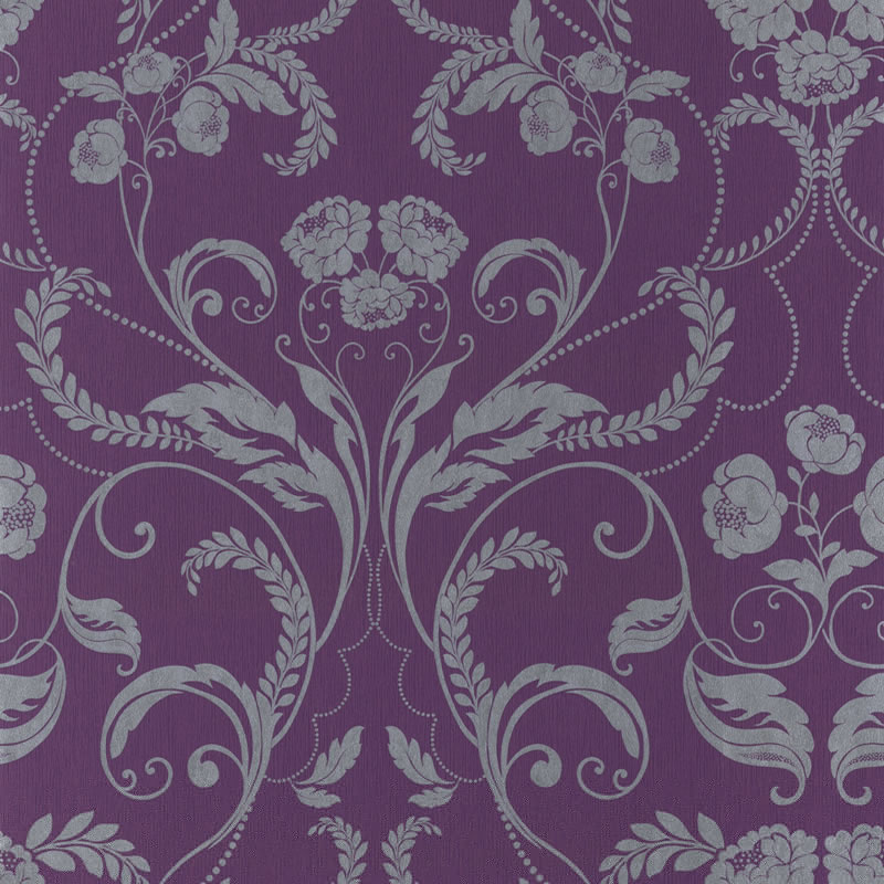
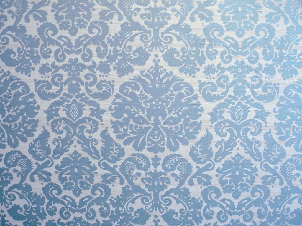
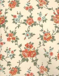
For my experience and concept document I have wallpaper projected to represent how women were perceived at the time. Beautiful and too delicate to be involved with ‘the dirtiness of politics’, but the wallpaper rips via the projection and motion sensors as people enter the centre of the room. I’ve looked at Victorian and Edwardian style wallpaper designs as visual research to help me decided what I want my wallpaper design to look like.

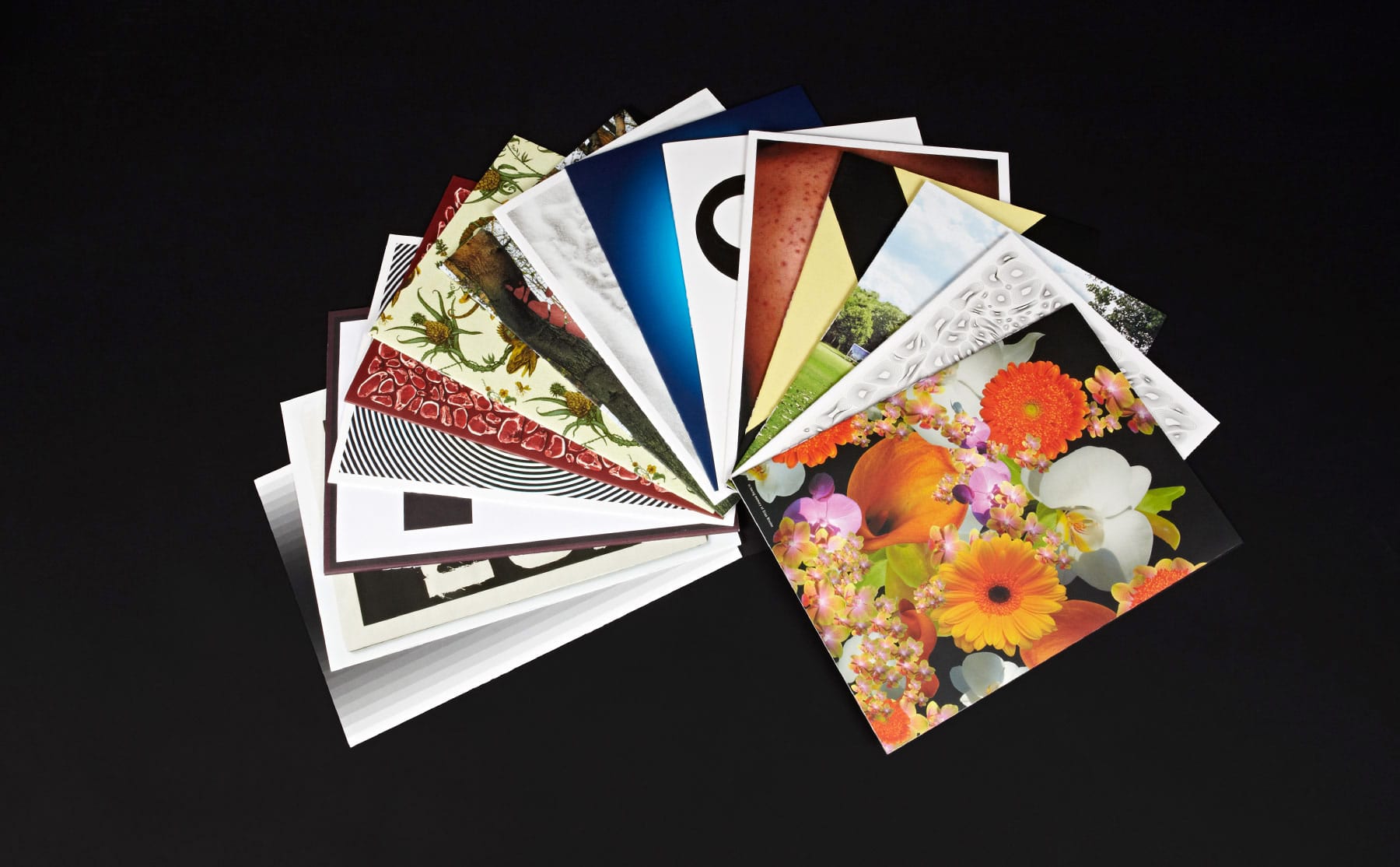
17583-amazing-modern-warmth-victorian-wallpaper istockphoto_5538664-seamless-floral-wallpaper

twiggy-edwardian-wallpaper-104501-purple-by-muriva-10060-ppattern-vintage_002725402

pic


Source:

By Hand: Handmade elements in graphic design

Handmade design:

Despite advances being made in digital technology, we still love analogue/hand produced designs.They feel and look more ‘human’, we want nostalgia and realness. This way of producing design work seems more original as there are many ways to do it and you’re not relying on a computer but doing things for yourself.

I would like to produce something by hand to create an original piece, even if the design is digital, perhaps for the form to be hand produced.

These two original designs are contemporary analogue design created using collage:


Scaan


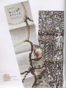
An Exhibition Flier for Yokohama Museum of Art by Surmometer inc.

This piece is quite crude in layout but it works well. It’s unique and the markings left are part of the piece, contributing to its originality. The layout works well too. I really like how printmaking and colour have also been used. It’s quite decorative and the hierarchy also works well, separating the title and exhibition information format he body copy. This has made me think about using handmade graphics to produce my piece perhaps.


Scan

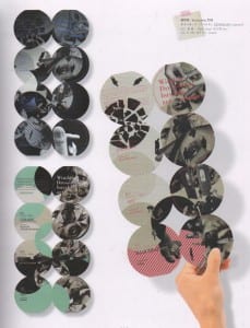
An Invitation for DESPERADO [Aparrel] by LOOK inc

I really like how circles have been used to create this piece, they work really well and so do the circles designed and collaged on. By only using a few colours the piece is quite simple, but very bold and effective. I also like how the text follows the circles and takes you through the piece and guides you where to go. Heirachy with text, again works well here, separating titles and information from body copy clearly. Some titles are harder to rea don different backgrounds though, I will try to avoid this in my piece. But I want to experiment with using circles, especially as my object, a coin is also a circle.


Source:

  • ‘By Hand: Handmade elements in graphic design’. (Pie Books, Tokyo Japan, 2009)

Concertina/Origami book Ideas

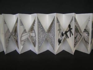
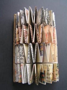
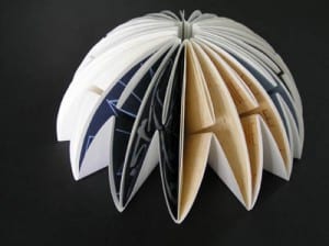
I liked the idea of creating a book by concertina/origami methods and so looked at some different pieces to give me inspiration and ideas of what I could do and how I could represent my experience using these methods:


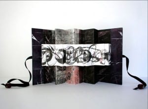
DSCN1251[1] DSCN1256[1]


I like how this piece folds out and is a fun, engaging piece.


codedSilenceinFashion

Anna Mavromatis creates decorative, original pieces, and rethinks how books, origami and concertinas can be created and used, using printmaking techniques.


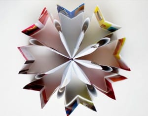
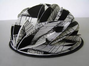
OLYMPUS DIGITAL CAMERA 4593_2009653937Battle_Within_400x299pix OLYMPUS DIGITAL CAMERAOLYMPUS DIGITAL CAMERA


I really like these pieces made by Helen Malone. They have inspired me to experiment with different types of origami book making. Each one is unique and shows off the art/design inside it well. they are very engaging, interesting and visually exciting and enticing pieces.


Sources:

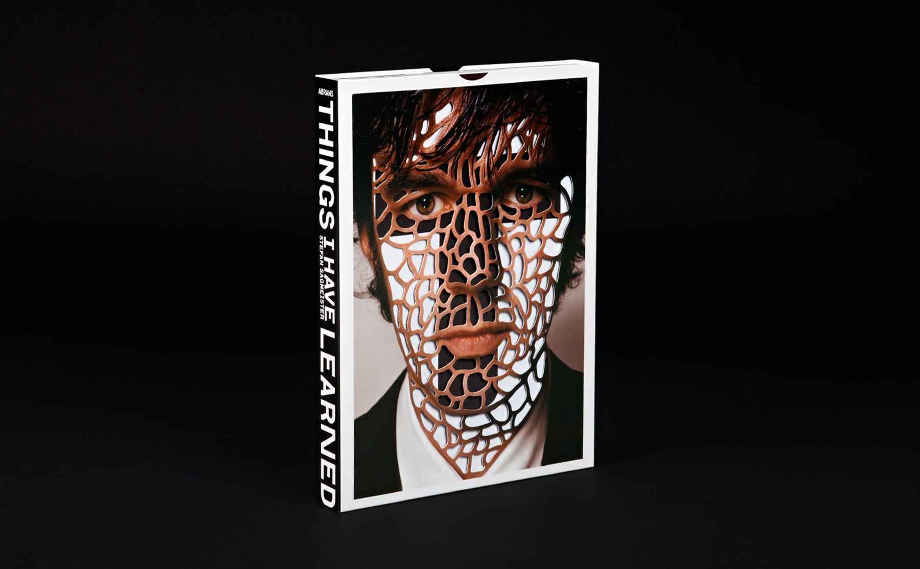
Things I have learned in my life so far

Stefan Sagmeister

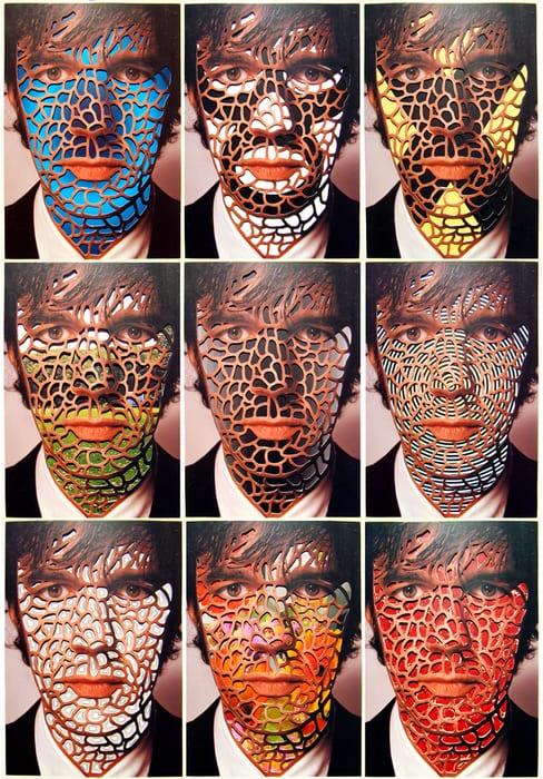
TIL-13 1KpgOhsA7ev7la2vUyFkthifo1_500 TIL26_1


Stefan Sagmeister has created a book of many little books of what he has done in his life. the cover is of his face with bits cut off so that when the books are placed behind the cover they create different textures on his face. This is a fun and engaging way to create a book. Also by having this cover/case as a box you, the user know to take all the books out and put them away without being told how to do so, using initiative. I think this is a very clever and fun way to present a book unlike many convential and unoriginal methods. I will consider doing something fun and engaging like stefan with my piece.


Source:

Concept Pack…

To show my idea to the museum director (client) I need to come up with a visually engaging concept pack that interprets and promotes my idea as a proposal…

It needs to:

  • Be engaging
  • Have well structured information
  • Immerse client
  • Try and be innovative
  • Use imagery/typography to demonstrate idea
  • Have visual hierarchy
  • Show audience participation
  • Able to guide client through content
  • Be object of curiosity

Technologies…

In my experience I would use motion sensors and video projection to enhance the experience… As people enter the exhibition they will see decorative wallpaper (of the period) projected onto the walls and as they walk into the centre of the room the motion sensors will detect their movement and the wallpaper will rip. Following this the name of the exhibition, ‘Change’ will light up, as people move into the next part of the exhibition. By using motion sensory technology people will be taken by surprise and it is much easier than physically ripping wallpaper. Also the timing of when the word ‘Change’ lights up works effectively following on from the ripping of the wallpaper, showing what it is representing.


Motion Sensors

There are many types of motion sensors and many of these are available commercially and in varied sizes.

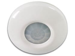
My experience will use passive infrared motion sensors. These are often used in burglar and shop alarms, detecting and measuring infrared energy. These work well because all humans release infrared energy. The amount depends on our body temperature, but all humans and many animals will be ‘sensed’ by this technology. Passive infrared motion sensors use photo detectors which uses the light in the wave lengths caused by our body heat, to an electric current, run through a small computer. This computer would usually be used to sound a burglar alarm, but in my exhibition it would be used to trigger the ripping of the wallpaper, via video projection and following this, the lighting up of the word ‘Change’. The things needed to use this technology can be very small and fairly hard to detect and so the people in my exhibition wouldn’t even know they were there. Photo detectors work when there are big or quick changes to the infrared energy. Normal human movement triggers this, including walking into an exhibition, but small movement, will not cause the technology to work, like the movement of an insect or the change in room temperature.

This is an example of what an infrared motion sensor may look like:

97-556


Video Projection

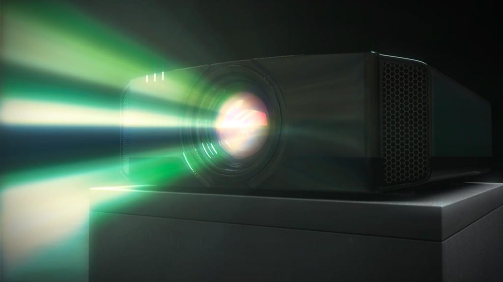
Video projectors create images, still or moving by projecting light, using lenses, on to a surface. This is usually onto a screen or plain wall. Projectors work by light, from a bulb, shining through a prism, which separates the light into colours, which are then sent through small screens. These screens are told how much light to let out to each pixel projected and then the light is shone through a lens and onto the surface which we see the resulting image off of. Unlike motion sensors, video projectors are often big enough to be obvious to the human eye as it walks into a room, but the projectors would be placed high up on the ceiling, as not to get in the way with the experience.

This is an example of what a modern video projector may look like:

JVC-projector


Sources:

Gathered visual inspiration from Google

These are random images I have found from google.com to help inspire me in designing my experience. They have not necessarily directly influenced my piece, but have helped expand my way of thinking of how I can used experience design:


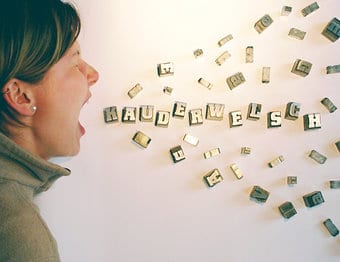
I like how speech has been visualised here  and the layout of this piece. Simple but effective.

174533-stock-photo-woman-design-profession-humor-equality-feminine


A still/static piece that looks as if it is moving. I like that movement can be shown/implied by the layout and structure of a piece. Perhaps I might think about using this with my piece.

art-wall_2030010i


This isn’t experience design but I thought it fitted with my topic and how women at that time felt trapped, as if wrapped up and couldn’t get free. This is just a piece of art that has helped in my thinking of how I could create my experience.

b4917099-307c-4cc2-923c-0bcd9857a7c9-1


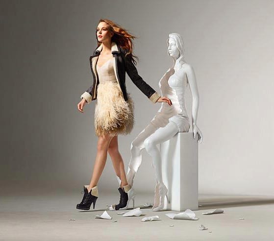
Again, this is not an experience or exhibition piece, but it is an interesting piece of installation art, showing a woman breaking free. Just another way I could tackle my experience and show the emotions and feelings of women at that time, feeling held back and that now is a time to ‘break free’.

break_free


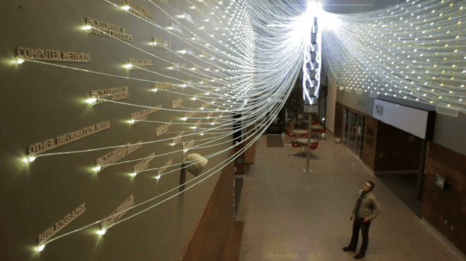
I like how all the lights are used here and then gathered together. Without even knowing what this piece is about I can tell that all the individual things link up together and are part of something bigger. To create a good piece you should be able to show the viewer what is going on without having to explain too much.

Filament-Mind-660x370


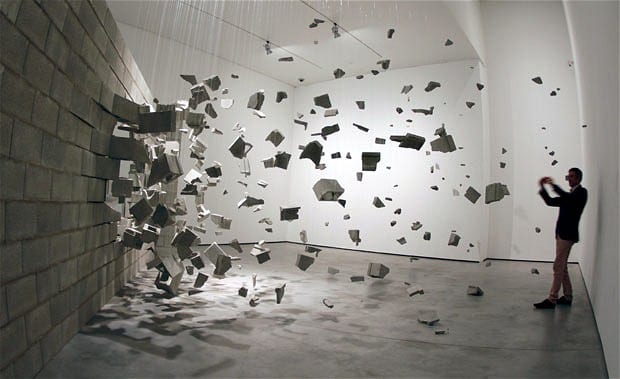
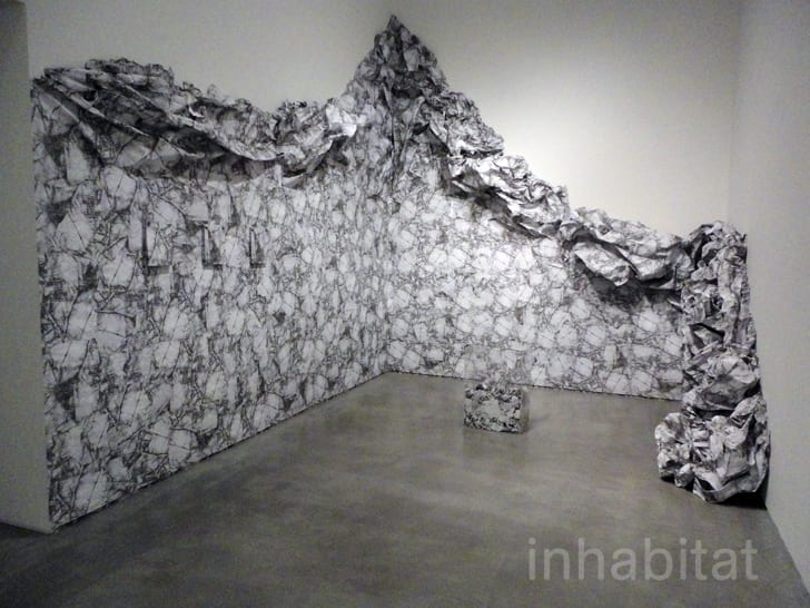
This art installation made me think of wallpaper being ripped/pulled down and related to an idea I thought of… that women were seen as beautiful and delicate, physically and mentally and I could show this using wallpaper and ripping it to show rebellion against that.

Liliana-Porter-Wrinkle-Installation1


These images have all contributed to my ideas process in coming up with my experience design.

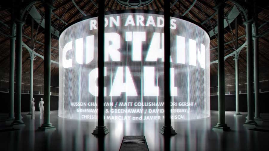
Curtain Call

This piece is a 360° interactive installation – at The Roundhouse.

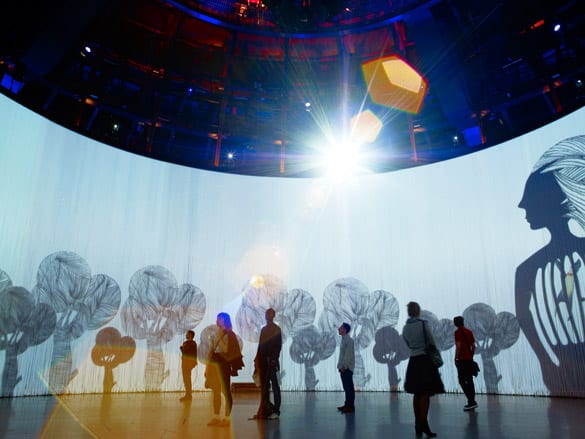
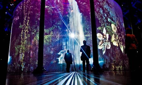
Using 5,600 silicon rods, videos are projected and can be viewed from inside or outside the circle. There is no specific entrance or exit, it is up to you how you go in and out, it’s left to you to create your own experience using the piece itself. It’s more personal this way and so no two experiences are the same.

Image converted using ifftoany18_curtain_call_tl090811 Mat-Collinshaws-Sordid-Ea-007

Ron Arad uses his space well to create an engaging piece. he uses the whole space and leaves it up to the viewer where to stand (or sit) and how long to stay there. this contemporary piece is very effective, fun and memorable. Video projection is used to its full advantage here.

This helps me understand how video projection doesn’t just have to be placed on a wall, but can be placed in different places, on different materials in different ways. There are many possibilities with this technology.


Source:

CRAVE, WANT, NEED, DESIRE, OBESS…

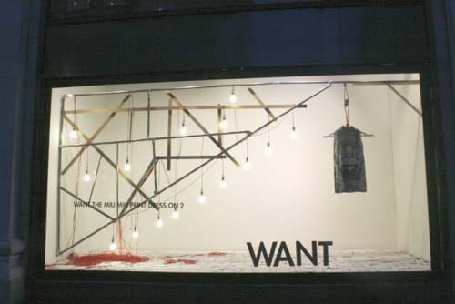
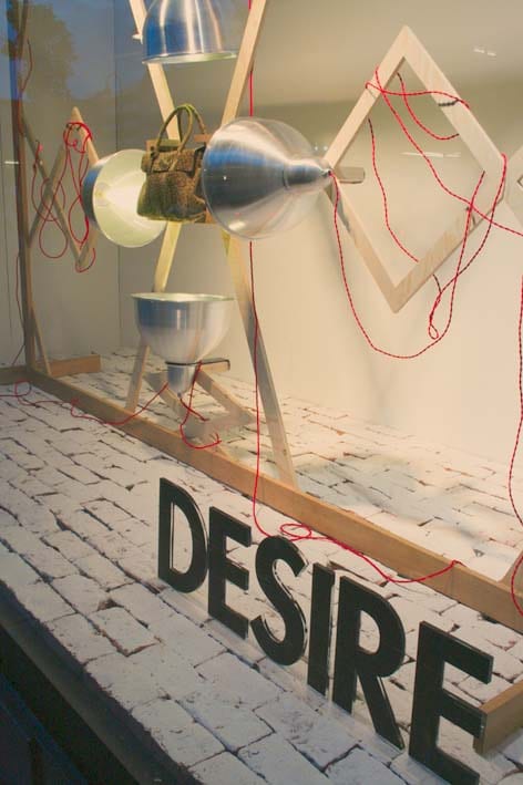
selfridges want desire

This window display by selfridges is visually very engaging and focuses on just one item in each window. they do this through use of space, colour and materials to draw your eye to the main piece. Each window has the same aim, but each is unique. They’re design has proved effective to capture attention.

I want my piece to capture peoples attention through use of space, colour and materials, like Selfridges have successfully done.


Source:

Experience Light

Shireen Rawlins

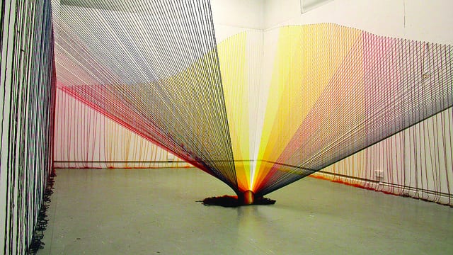
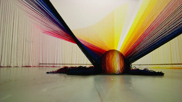
‘I aim to create structures/environments that are immersive and encourage interaction/intervention. These works often challenge traditional modes of viewing or preconceptions of ‘suitable etiquette’ within the gallery space. I am particularly interested in the viewer’s encounter and interaction with the space, and in the art experience as something that is therapeutic and transformative, extending beyond the individual to the social.’

8250249227_ce508b8246_z

8250247575_a1062e96cb_z

http://youtu.be/pPpNS1NdSvg

This is an eye-catching piece of art, but it becomes an interestingly engaging experience once you drop people into the mix. Watching the video of people walking around the piece it becomes more than just art. This is experience design. Yes it is simple and I’m sure more could be done to develop the idea to involve more senses, but it works well and really involved people. It uses aesthetics and curiosity to get people to go over to the piece and touch it as they move around. As they move they can go whatever way they want at whatever speed they like, and thus they are creating their own experience from this static piece of art. It’s interesting how people don’t even have to be told what to do or how to react with something, but if it’s there and it attracts their eyes they will be drawn to it and immerse themselves in an experience that they have created, using the object/art.

As Shireen states, the piece challenges traditional methods of viewing and ‘suitable etiqutte’ within the space. This piece encourages people to get up close and personal and they can share in the experience with others or alone. to fully experience the piece,  you have to physically walk round it and move your body to get under bits too. This all contributes to the experience. It doesn’t seem to produce a meaningful experience, but something different, which people can have fun with.

Source:

Atmospheric Art Installations

ISO Hirofu / Komainu

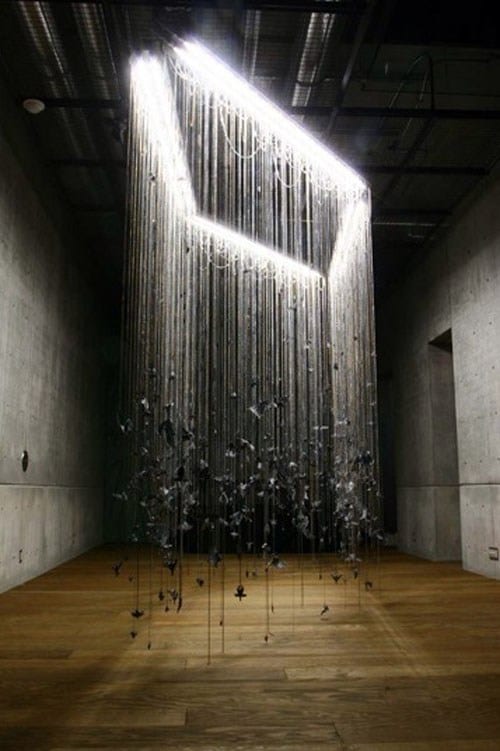
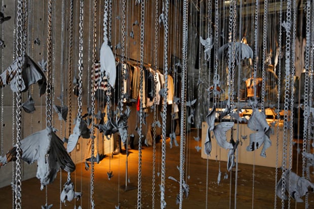
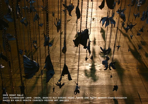
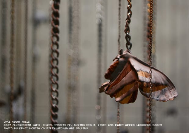
ISO uses, ordinary things we might happen to overlook in everyday life to create his installation pieces. This piece is of things that happen  and creatures that come out at night. His use of light shows this well, creating the effect of night, with a light above to make the insects hanging on chains visable.

iso-hirofu-komainu-once-night-falls iso-hirofu-komainu-insect-artwork iso-hirofu-komainu-diesel-artwork iso-hirofu-komainu-detail

This art is very minimalist, but interesting. It has made me think about the use of light in an installation and how light can effect how you view something and effects the piece by where you place it and how bright it is. You can appreciate this piece as one large installation or go up close and look at each individual intrinsically made insect. The shadows made from the way the light shines onto each object creates interesting silhouettes of each insect on the floor below.

Source:

Adhesive tape Art Installations

Monika Grzymala

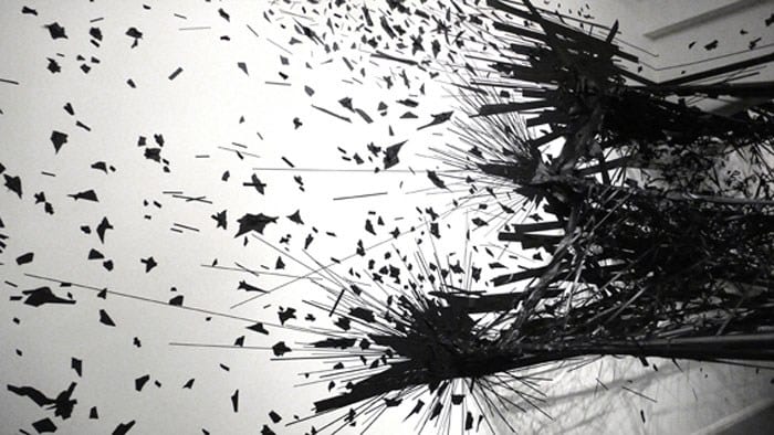
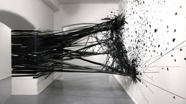
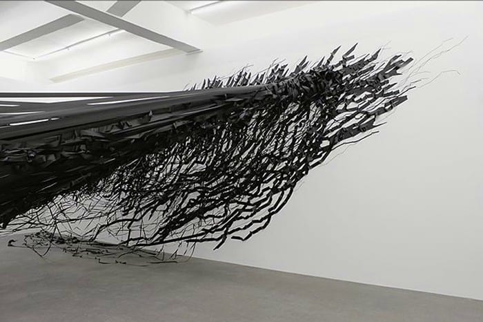
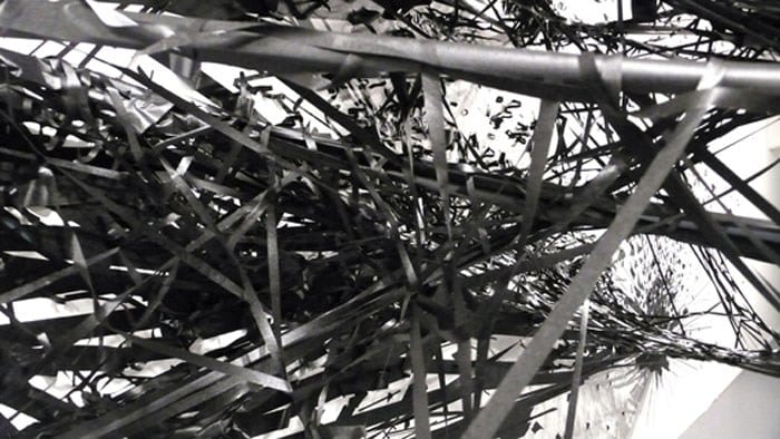
Using black tape, Monika creates these abstract installations. Beginning with ‘line and mark’ on the page she has progressed the idea further on a larger scale, to walls, creating 3d pieces. She sees her art as more of a performance piece, than an art installation because of the planning, phsyical effort and time she puts into it. Her pieces are her response to the place she is, whether its chaotic London, or busy New York.

Tape-Art-Installation-By-Monika-Grzymala-8 Tape-Art-Installation-By-Monika-Grzymala-620x348 Tape-Art-Installation-By-Monika-Grzymala-7 Tape-Art-Installation-By-Monika-Grzymala-5

I find these installations powerful just from first glance. They are static and yet show motion and movement. Just the immensity of the amount of tape in front of you as you see the piece is engaging. It’s like a controlled mess you can’t help but be immersed by. Being 3d, the piece is much more engaging than if it was just drawn on a piece of paper, which is why I think Monika uses this method of creating art. It has also opened my eyes to the fact that an everyday object, such as tape can create such an interesting and engaging piece on it’s on, if you use it skilfully.


Source:

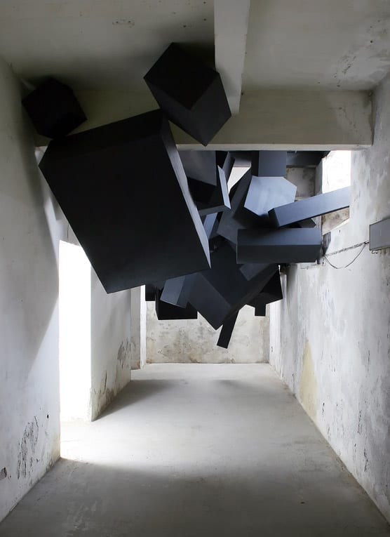
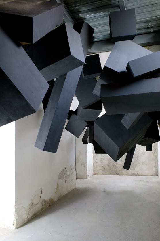
‘Sooner or later it all comes down’

Via Grafik, Names Festival, 2008, Trafačka, Prague

via-grafik-black-box-installation-1 via-grafik-black-box-installation-2


‘It’s got such a great sense of motion to it, like it really could come crashing down at any moment.’

– Bobby Solomon


the installation looks like it could just fall on you and thus gives you a sense of uneasiness walking beneath it. It’s a simple idea and execution, but it works well. I like how such a simple design can create feelings and an experience because of the way it’s formed and how it is placed in the space. Also it’s clever how the fact that you feel like it could fall on you, because of the sense of motion created by the blocks.


Sources:


Why don’t more museums strike an emotional chord?

I read an article by Sharon Heal on her experience at ‘Experience Barnsley’ museum, sharing how she felt an emotional connection to the things in the museum…

 I was moved. I laughed out loud, I swallowed hard on a lump in my throat, I welled up and I felt a sense of belonging that I can’t ever recall feeling in a museum or gallery.

She made the point that usually in a museum or gallery you stand around and whisper, as if there’s an unspoken etiquette that we have to follow. But at this museum she felt an ease, to experience the museum in a laid back manor, where you can interact with whats around you.

One thing that Sharon says makes the museum a success is that it’s real people telling real stories. Something we can relate to and engage with. When creating my design I want to make it feel real and approachable, where people can connect, not just with their senses, but with their emotions.


Source:

So what is Experience Design?

Experience design is quite a new concept, although people have been designing to create an experience for years.

6 dimensions experience design is made up of:

  • Time/Duration  (To go round/participate/engage/some designs you might have to watch something happen)
  • Interactivity  (Can be very interactive or not at all/can be physically or psychologically)
  • Intensity  (How intensive the design is or the experience created)
  • Breadth/Consistency  (It might cover a lot of space or not much. It might also all be similar or different in content)
  • Sensorial and Cognitive Triggers  (Things that cause you to use your senses and acquire knowledge and understanding)
  • Significance/Meaning  (Good experience design should have a purpose and stay with people after they leave, a lasting memory/deeper understanding)

– To create a good experience design I will need to understand and utilise these ‘dimensions’ and do so in a way that enhances my idea.


Source:

What is Exhibition Design?

‘the focus is on collaboration; the balancing of space, object and information; the subtle integration; and the role of the audience’

This is the direction exhibition design is developing in and all these things are important for successful exhibition design.

It can involve more than one design discipline and to varying degrees, including:

  • architecture
  • interior design
  • environmental design
  • print graphics

It can also involve electronic and digital media, though the use of:

  • lighting
  • audio
  • mechanical interactions &more

Environments have the power to import and interpret information, involved an audience and influence their understanding.

‘Multilayered communication’ can also be used, helped by creating experiences in real time, utilising space, movement and memory.

To deliver a good narrative these techniques should be used.

It is impossible to communicate well and effectively if you don’t know who you are talking to. All these things should be taken into consideration and impact how information is received, processed and understood:

  • personal history
  • cultural background
  • gender
  • age
  • ability
  • learning styles

(To do this well I must identify my audience straight away)

Good experience design also incorporates passive storytelling, interaction and engagement.

– All these things are important to create a good piece of experience design and I will consider them all in my own piece.

Source:

  • ‘What is Exhibition Design’ by Jan Lorenc, Lee Skolnick and Craig Berger. (Roto Vision, Switzerland, 2007)

Votes for Women research

I re-read a study book about votes for women, wanting to find out more about why women wanted the vote, reasons for and against and the suffragette’s protests. I found out quite a lot about the movement.

 Reasons for the vote

Women wanted the vote, not just for political reasons, but because they believed it would end economic, social and moral unfair treatment they faced. They believed without the right to vote they were at a disadvantage, but with it their lives would be benefited, including improvement to marriage laws, sexual morals, it would also improve the lives of working class women and they believed that it would eliminate prostitution.

pic

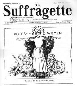
Cover of ‘The Suffragette’ Newspaper in 1913, supporting votes for women and showing it would be positive for working class women.


Reasons against the vote

A few ‘anti-suffrage’ quotes in the book, I found irritated me, over 100years later…

‘Men are governed by reason, Women by emotion’

‘Votes for Women? We shall be asked next to give votes to our horses and dogs.’

‘Women are guided by their wombs, rather than brains’

…Yes we live in a modern culture, but women are still women and shouldn’t have been treated as second class citizens. These quotes, even today are still very bitter and frustrating.

An argument against women being able to vote is that if they can’t fight and defend their country then they shouldn’t be able to vote either. Their role was seen to be a wife and mother. To give them the vote could ‘destroy’ family life and therefore destroy society, as the family was seen as a central part of society. The antis believed that women would challenge men’s authority and were unable to have an individual opinion. Women were perceived as too delicate to be involved with the dirtiness of politics and to be involved with it was believed to cause loss of the moral and social order of society.

The WSPU and militancy

After seeing slow progress and believing that politicians took little notice of the votes for women campaigns, the WSPU, (led by Emmeline Pankhurst) decided to go for a more militant approach, believing to gain the right to vote, force would be necessary.

Their forceful and militant actions included:

  • Smashing windows – originally done out of desperation, but became official policy
  • Setting fire to property/Arson attacks – not to cause harm to people but to protest against them, including David Lloyd George
  • Destruction of a postbox – by Emily Davidson
  • Destroying expensive works of art – including  Mary Richardson slashing ‘Venus’ by Velazquez, with an axe, to say people care more about paintings than people
  • Cut telegraph wires
  • Wrecked plants in Royal Botanical Garden at Kew
  • Chained themselves to railings in protest in the House of Commons and outside Downing Street
  • Hunger strikes
  • Imprisonment
  • Put themselves in danger of physical harassment

Some might say the Suffragette’s actions were more like minor terrorism than traditional political protest.


I think the Suffragettes were very extreme in their actions and some argue it hindered the cause, nether the less it was a difficult time and women were not treated fairly, but as second class citizens and these women stood up against this unfairness for what they believed was right and just.


Source:

  • Access to history: ‘Votes For Women’ by Paula Bartley (published by  Hodder Education, 2007)


The Personal is Political:

Gender in Private & Public Life in the 19th Century

I read an interesting article on the V&A website on politics and gender equality during the 19th Century (the period leading up to when my chosen object was made and defaced).

I was shocked to find the article state that in 1880, 23 years earlier, only men could freely go to bars, music halls and take part in most outdoor sports! Although during the 19th century laws had been passed in favour of women’s rights and removing gender injustices, this was a slow development in gender equality, which was (widely accepted as) a part of British Life.

Votes for Women was not a new demand in the 20th century, but one that had been expressed for over 50years! It was just that it now became a focus in the gender equality battle.


Source:


Women’s Suffrage… background research

‘Votes for women was a major breakthrough which affected the lives of all women in Britain.’

-Votes for Women (book)

We can look at the suffrage movement and see it as something of the past that has nothing to do with us, but because of the movement women can now vote and become MPs and do many things they wouldn’t have been able to do over 100years ago..

In the 19th century women’s rights were a lot different to mens. The law was more in favour of men’s rights and women were treated as second class citizens compared to them. This included matters such as: working hours, reasons for divorce, child custody and wages. Despite laws passing improving the inequalities women faced, they were still unequal to men in 1903.

Women didn’t just get paid much less than men, but weren’t allowed to have careers as doctors or lawyers.

– All this shows how being able to vote was much more than the vote, but about women wanting to be treated as equals to men.


The Suffragettes

The coin I have chosen was defaced by members of the Women’s Social and Political Union (WSPU), The Suffragettes, who formed the same year my chosen object was defaced. Their well known motto was: “Deeds, not words”, meaning, that unlike the National Union of Women’s Suffrage Societies (NUWSS), The Suffragists, they believed if violent protest and breaking the law was what it took to gain the vote, that’s what they would do. Formed by the Pankhurst family, the WSPU used propaganda and protest to fight for women’s rights, frustrated by the slow progress they had seen.

Source:

  • ‘Votes For Women’ by Diane Atkinson (published by Cambridge University Press, Cambridge, 1988)


Artefact Background Research

Why did women want the vote?

Emmeline Pankhurst, leader of the suffragettes:

‘First of all it is a symbol, secondly a safeguard, and thirdly an instrument.’

votes for women

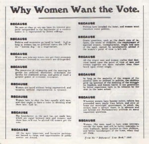
Handbill given away by NUWSS and WSPU on ‘Why Women Want the Vote’


Why were men and women against women getting the vote?

They believed that politics would have a negative effect on women and that they would become less polite, respectful and ladylike. They thought that by being able to vote, women would lose interest in marriage and children, creating an issue for humanity. Women were seen as much more emotional, unstable and ignorant than men, so to be able to vote would be a big mistake.

Not just men, but many women agreed with these reasons opposing Women’s right to vote. Today these views come across as very absurd, but they were widely believed to be strong arguments against Women’s suffrage.


Source:

  • ‘Votes For Women’ by Diane Atkinson (published by Cambridge University Press, Cambridge, 1988)

My Object

For the project we need to find a museum object of our choosing from any museums as long as it a)has a function and b)has a human connection attached to it…


pompeii_panther_tablek150880_l

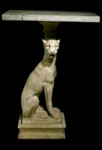
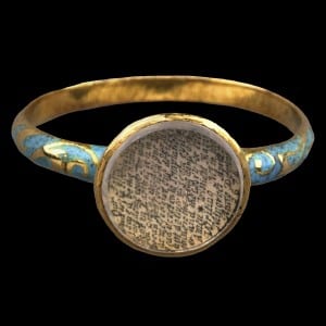
About a month ago I went to the British Museum and there are all sorts of fascinating objects in there from different places in the world and different periods in time. It’s such an expansive museum, that I didn’t managed to see a lot of it, but I did browse online at the collections and artefacts they have on display. Some of the interesting things I found included a coin defaced by the suffragettes, a ring with the lords prayer written on it from the Stuart period, a Roman garden bench from Pompeii and a Roman display table, also from Pompeii. All these objects were man made, had a function, represented something of the culture and time they were from and had the potential to create an experience out of…


defaced_penny_mdefaced_penny_obverse_l

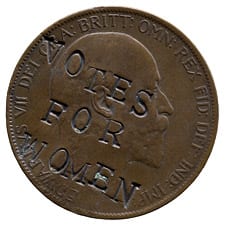
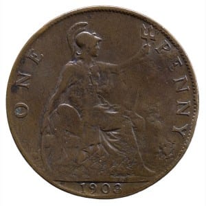
The object that fascinated me the most was the coin defaced by the suffragettes. The coin was minted in Britain in 1903 and has a very interesting history behind it. The suffragettes defaced many pennies in protest, to create a political statement as a campaigning strategy. This act of civil disobedience would have been treasonous at the time, but the suffragettes felt that to change the law they needed to break it. It was actually a very clever, low budget method of protest and propaganda at the time, as coins were a widely circulated, everyday object and used by all classes and types of people, including powerful men and politicians. Also being only worth 1p, the pennies were not worth enough to be recalled by the banks. It would have also created different emotions amongst people, including empathy for the cause, comfort for those women in support of women’s suffrage and shock and rage from others who opposed women’s rights to vote and purely saw it as a criminal act.  It is also interesting how the defaced side of the coin is the head, with King Edward VII’s face, but the tail, showing Britannia, who first appeared on British coins in the Roman times, a strong powerful woman has not been touched. The coin featured as part of the British Museum’s ‘The world in 100 Objects’, under the theme ‘Mass Production, Mass Persuasion’, clearly seen as an important part of our history, not just as a country, but as humanity.

There are quite a few aspects and concepts with this object that I can use to connect people to the object and create an experience. These are my initial ideas:

  • The coin is an ordinary, everyday object made extraordinary: it’s interesting how a small object can say and represent so much. It’s a powerful thing.
  • Coins were widely circulated at this time and still are today. The internet today, like the coin is used by all types of people, of different wealths and backgrounds and is the easiest way to widely circulate things.
  • Despite breaking the law, some argue that in some situations this is ok to do, for an important cause, like the Suffragette movement. Was it a moral or amoral thing to do?
  • The coin does not just represent the Suffragette movement and their struggles, but it represents all the revolutions, protests and wars at the time… all fighting for what they believed was right and the hardships faced by many during the 19th & 20th Centuries.
  • It reminds us that there are still many places where people are fighting for their civil human rights now. It’s not just representing the past, but also the present.
  • It connects us to OUR past. As a British woman it is a reminder of the struggle many women faced for ‘me’, so that 100years later I could vote (something we may take for granted).

Sources:

Stuart Nolan: Magic and Curiosity

Guest lecture from a magician…

This lecture was surprisingly very interesting and helpful to the project. Stuart spoke a lot about magic and how it can link with experience design, whether it’s a big or small ways. For example he prefers to create magic with people, rather than having a ‘main man’ perform them to you. He also shared with us that people like to be led, and not just be told to do something, but when you are encouraged to follow someone and they involve you, you trust them more and more more likely to participate. Yes he was talking about magic, but it links with experience design. People should be involved in creating their experience and not just be shown or told, but led through it. Also just like with magic, Stuart shared with us that when you add people to a process you should allow space for things to happen that you might not expect.

He shared with us different projects that involved design and magic working together to create an experience. These included things like:

  • a light travelling onto someone’s hand and travelling with them across a room.
  • a dripping tap, that when a strobe light shone on it at the right time and place it look like it was still, or falling slowly, or even going back up into the tap.
  • a box that when you put your hand into it, it can look like a wing, or a hoof, or even a claw.

All these examples show how technology can be used to create all sorts of experiences, whether the audience is needed to participate to create the piece, or are just involved by watching something happen..

Something I hadn’t thought much about, was that ‘How you dress an experience, can change it’. As Stuart rightly said, it’s not just the experience that’s important, but how you arrange and show it to your viewers/audience. For example, Stuart has a suitcase which he takes to different places and for 50p people can see the ‘weird’ and unexplainable thing inside it. He purposely has the ‘thing’ hidden from view, but through how he has positioned this suitcase, people can see the last person’s experience and the expression it creates on their face. This rises curiosity in people, all because of how Stuart ‘dressed’ the experience. He shared with us that curiosity is a powerful thing and like with the ‘weird’ object, the curiosity rose a need in people to see what the thing was that made someone react captivatingly. Curiosity also comes from exclusivity by keeping people out. If they are kept out they are even more intrigued and interested in what it is that’s happening. Anticipation design is similar in the fact that you show people a part of something but not the full picture. Stuart was involved in creating the website for the game ‘GTA2’ and they used this type of design, by only letting one in ten people into the website at a time. Cleverly this method of design just made people more determined to get onto the site by teasing them through the use of curiosity and exclusivity. They wanted to see what they were missing out on. all these approaches are things I hadn’t even thought about and have helped me in my way of thinking as I progress further into this project.

Stuart went on to discuss with us: ‘why do people go to museums?’ Well that seems obvious doesn’t it? I love to go to museums, to learn and feel cultured, others because perhaps it’s something to do or simply because it is free. Surprisingly none of these answers were the top reason why people to go a museum. So Stuart told us that the top reason why people go to a museum is to take someone else/to be with others there and share the experience. Knowing why people go to museums means we can think about how they move around them and how, as Stuart pointed out, do you keep a group together, without people breaking off? From researching into this, Stuart was able to share with us how most people move through a museum or gallery:

  1. First most people will have some sort of orientation/plan, in which they might get rid of their coats and bags, go to the toilet and maybe get some food. This is an important thing for the museum to get right.
  2. Then when people begin to go round, they will at first focus on most things and read the information about the things they are observing.
  3. As time goes on and after about 40minutes they will get a bit bored and browse, rather than looking at everything.
  4. After a bit more time has passed people tend to only pick the things that attract them to look at, often on their way out of the museum.

All this is very interesting, but what has it got to do with my project? With only 20% of most people’s museum visits being structured and methodical, museum displays need to engage people and give them a reason to view objects and artefacts. This just increases my realisation that for people to even be interested in, let alone experience, my exhibition display, I need to make sure the design and display captures people’s curiosity and grabs their attention. To sum up, how you design and display an exhibition is very important and often is the reason why people will view or pass-by your exhibit.

The last thing Stuart spoke to us about was ‘Attention Design’, and he used the example of Walt Disney’s ‘Disneyland’ to explain this. When working on the film Lassie, Disney realised how a dog is drawn to an object. When years later he built the famous ‘DisneyLand’, he used this technique to draw people in. By just placing a big, beautiful castle in the middle of the theme park, or a giant rocket at ‘Epcot’, people would be drawn in without even being told to do so. Even though this is large scale, the same technique can be used in a museum exhibition to draw people in. Using the help of magicians as ‘imaginers’, Disney land also has many ‘hidden mickies’, that can be found any where in different forms and sizes. Some people will collect photographs of these and it can become a game for people to find them. Museum exhibitions could also include little fun things like this for people to find, get involved with and even collect.

Stuart Noland’s talk was very engaging, just like the many examples of design he shared with us. He also brought many things to mind I hadn’t even thought about using or doing for this project, that have enhanced my thinking.

More understanding and thoughts from lecture on experience design

Three important things to get right when communicating with people is the audience, content and message. All of these need to be right. The audience need to connect with the message and the message with the content, if not the experience won’t work.

Once I have chosen my object I need to identify and work out who my audience is and then understand who they are.

To produce a creative and cultural experience it is important that you connect with people’s emotions and focus on the ‘human element’… How can I make a personal and memorable experience, engaging someone to the object, but not focusing on the object itself.

Inclusivity: Connect everyone, don’t leave people out, find a way to include everyone.

An example that helped me understand experience design and inclusivity in that is: You listen to music, perhaps on your own at home. Music is like the ‘object’ and so when you go to see that band or musician live it is not just about the music but the experience, atmosphere and an emotional connection comes into it as well. You’re not just connecting with the band or musician, but you are inclusively sharing in the experience with the other people around you.

Initial Understanding of Experience Design project

This project is not just about designing a 2d piece, but designing an experience which people can connect with in different ways, whether this is physically and/or psychologically. Experience design can use all of our senses: touch, sight, hearing, taste, smell, and the sense of spatial awareness. From my understanding it is not just by including all or any of these things that you can make an experience, but by choosing the right ones that will bring people a deeper level of understanding and connection to the design/object. So once I have chosen an object, I should try to enhance the senses that will engage people and make them feel some sort of connection with my chosen object. This needs to be done using suitable technologies.