Gathered visual inspiration from Google

These are random images I have found from google.com to help inspire me in designing my experience. They have not necessarily directly influenced my piece, but have helped expand my way of thinking of how I can used experience design:


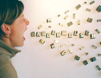
I like how speech has been visualised here  and the layout of this piece. Simple but effective.

174533-stock-photo-woman-design-profession-humor-equality-feminine


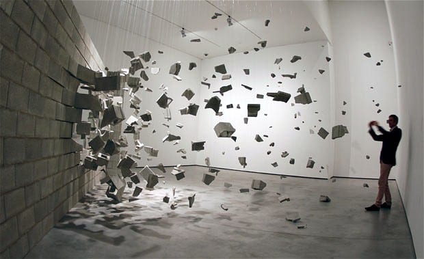
A still/static piece that looks as if it is moving. I like that movement can be shown/implied by the layout and structure of a piece. Perhaps I might think about using this with my piece.

art-wall_2030010i


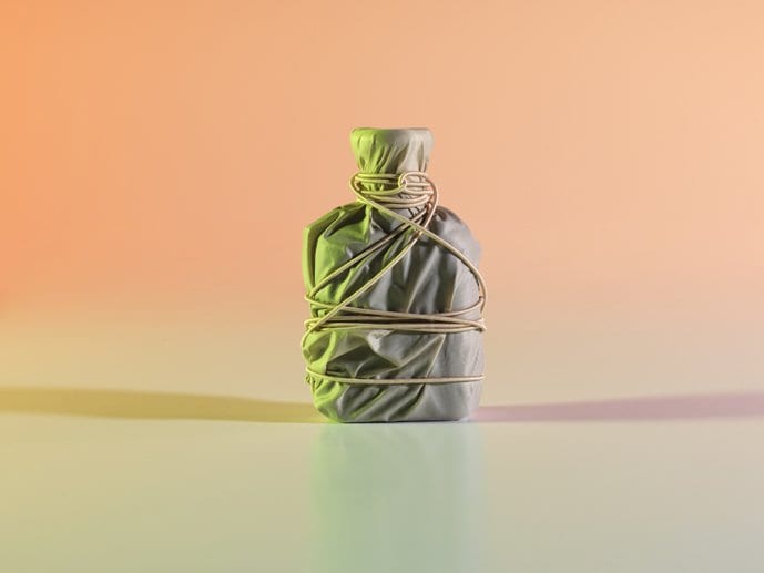
This isn’t experience design but I thought it fitted with my topic and how women at that time felt trapped, as if wrapped up and couldn’t get free. This is just a piece of art that has helped in my thinking of how I could create my experience.

b4917099-307c-4cc2-923c-0bcd9857a7c9-1


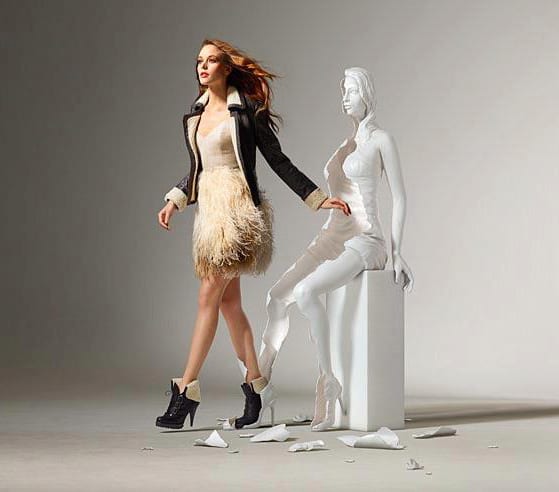
Again, this is not an experience or exhibition piece, but it is an interesting piece of installation art, showing a woman breaking free. Just another way I could tackle my experience and show the emotions and feelings of women at that time, feeling held back and that now is a time to ‘break free’.

break_free


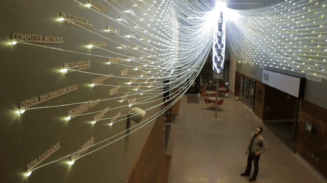
I like how all the lights are used here and then gathered together. Without even knowing what this piece is about I can tell that all the individual things link up together and are part of something bigger. To create a good piece you should be able to show the viewer what is going on without having to explain too much.

Filament-Mind-660x370


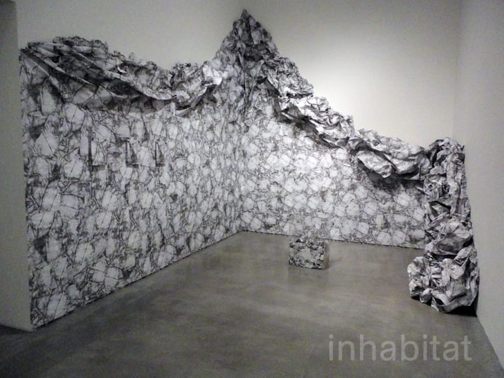
This art installation made me think of wallpaper being ripped/pulled down and related to an idea I thought of… that women were seen as beautiful and delicate, physically and mentally and I could show this using wallpaper and ripping it to show rebellion against that.

Liliana-Porter-Wrinkle-Installation1


These images have all contributed to my ideas process in coming up with my experience design.
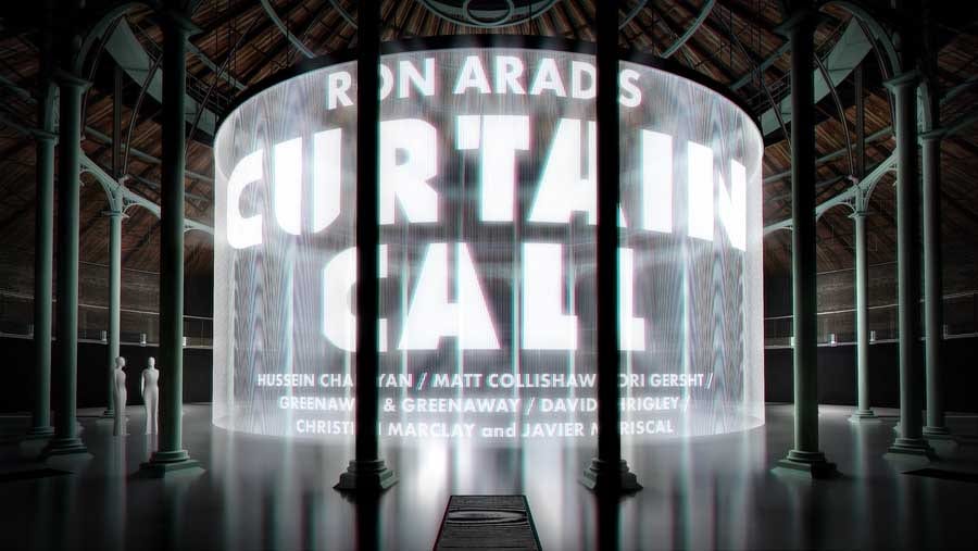
Curtain Call

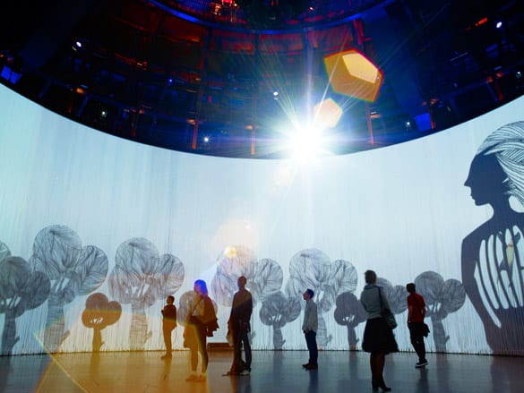
This piece is a 360° interactive installation – at The Roundhouse.

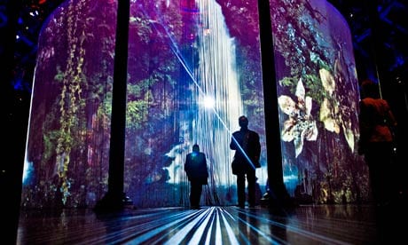
Using 5,600 silicon rods, videos are projected and can be viewed from inside or outside the circle. There is no specific entrance or exit, it is up to you how you go in and out, it’s left to you to create your own experience using the piece itself. It’s more personal this way and so no two experiences are the same.

Image converted using ifftoany18_curtain_call_tl090811 Mat-Collinshaws-Sordid-Ea-007

Ron Arad uses his space well to create an engaging piece. he uses the whole space and leaves it up to the viewer where to stand (or sit) and how long to stay there. this contemporary piece is very effective, fun and memorable. Video projection is used to its full advantage here.

This helps me understand how video projection doesn’t just have to be placed on a wall, but can be placed in different places, on different materials in different ways. There are many possibilities with this technology.


Source:

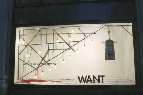
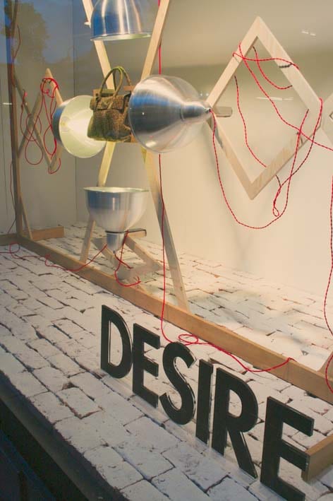
CRAVE, WANT, NEED, DESIRE, OBESS…

selfridges want desire

This window display by selfridges is visually very engaging and focuses on just one item in each window. they do this through use of space, colour and materials to draw your eye to the main piece. Each window has the same aim, but each is unique. They’re design has proved effective to capture attention.

I want my piece to capture peoples attention through use of space, colour and materials, like Selfridges have successfully done.


Source:

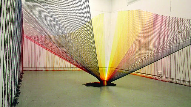
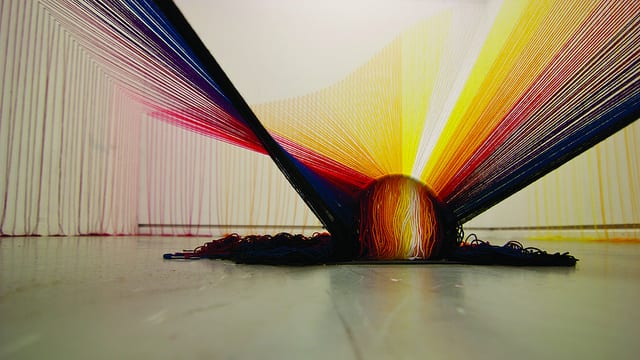
Experience Light

Shireen Rawlins

‘I aim to create structures/environments that are immersive and encourage interaction/intervention. These works often challenge traditional modes of viewing or preconceptions of ‘suitable etiquette’ within the gallery space. I am particularly interested in the viewer’s encounter and interaction with the space, and in the art experience as something that is therapeutic and transformative, extending beyond the individual to the social.’

8250249227_ce508b8246_z

8250247575_a1062e96cb_z

http://youtu.be/pPpNS1NdSvg

This is an eye-catching piece of art, but it becomes an interestingly engaging experience once you drop people into the mix. Watching the video of people walking around the piece it becomes more than just art. This is experience design. Yes it is simple and I’m sure more could be done to develop the idea to involve more senses, but it works well and really involved people. It uses aesthetics and curiosity to get people to go over to the piece and touch it as they move around. As they move they can go whatever way they want at whatever speed they like, and thus they are creating their own experience from this static piece of art. It’s interesting how people don’t even have to be told what to do or how to react with something, but if it’s there and it attracts their eyes they will be drawn to it and immerse themselves in an experience that they have created, using the object/art.
As Shireen states, the piece challenges traditional methods of viewing and ‘suitable etiqutte’ within the space. This piece encourages people to get up close and personal and they can share in the experience with others or alone. to fully experience the piece,  you have to physically walk round it and move your body to get under bits too. This all contributes to the experience. It doesn’t seem to produce a meaningful experience, but something different, which people can have fun with.

Source:

Atmospheric Art Installations

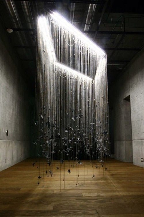
ISO Hirofu / Komainu

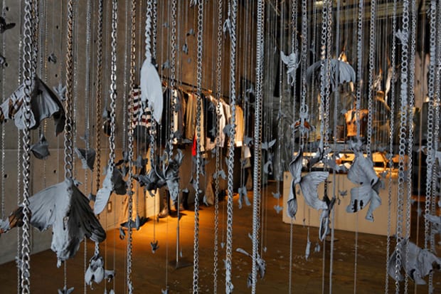
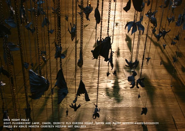
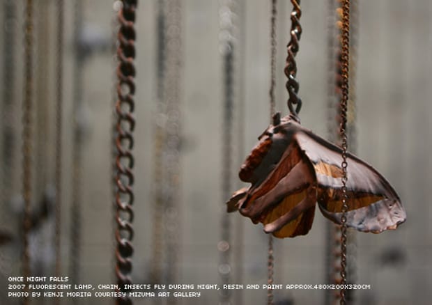
ISO uses, ordinary things we might happen to overlook in everyday life to create his installation pieces. This piece is of things that happen  and creatures that come out at night. His use of light shows this well, creating the effect of night, with a light above to make the insects hanging on chains visable.

iso-hirofu-komainu-once-night-falls iso-hirofu-komainu-insect-artwork iso-hirofu-komainu-diesel-artwork iso-hirofu-komainu-detail

This art is very minimalist, but interesting. It has made me think about the use of light in an installation and how light can effect how you view something and effects the piece by where you place it and how bright it is. You can appreciate this piece as one large installation or go up close and look at each individual intrinsically made insect. The shadows made from the way the light shines onto each object creates interesting silhouettes of each insect on the floor below.

Source:

Adhesive tape Art Installations

Monika Grzymala

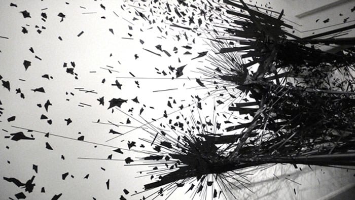
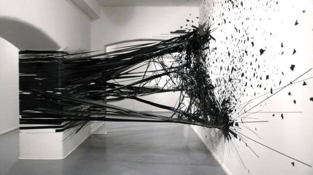
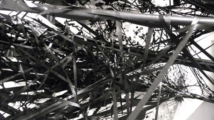
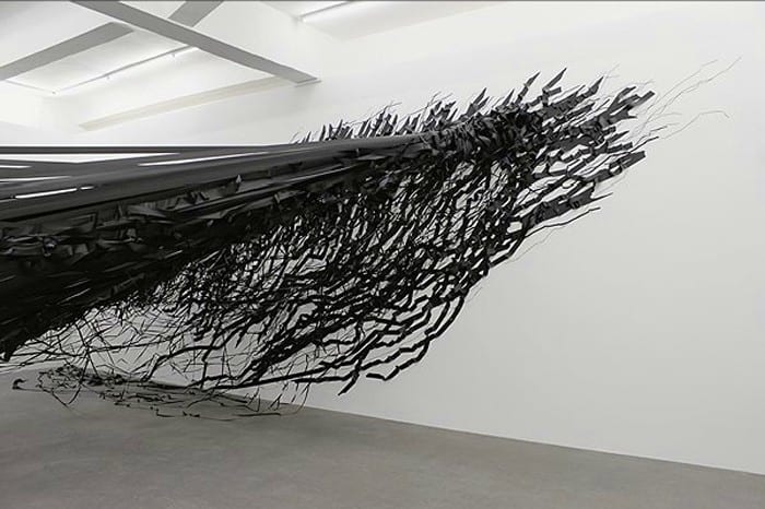
Using black tape, Monika creates these abstract installations. Beginning with ‘line and mark’ on the page she has progressed the idea further on a larger scale, to walls, creating 3d pieces. She sees her art as more of a performance piece, than an art installation because of the planning, phsyical effort and time she puts into it. Her pieces are her response to the place she is, whether its chaotic London, or busy New York.

Tape-Art-Installation-By-Monika-Grzymala-8 Tape-Art-Installation-By-Monika-Grzymala-620x348 Tape-Art-Installation-By-Monika-Grzymala-7 Tape-Art-Installation-By-Monika-Grzymala-5

I find these installations powerful just from first glance. They are static and yet show motion and movement. Just the immensity of the amount of tape in front of you as you see the piece is engaging. It’s like a controlled mess you can’t help but be immersed by. Being 3d, the piece is much more engaging than if it was just drawn on a piece of paper, which is why I think Monika uses this method of creating art. It has also opened my eyes to the fact that an everyday object, such as tape can create such an interesting and engaging piece on it’s on, if you use it skilfully.


Source:

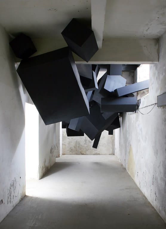
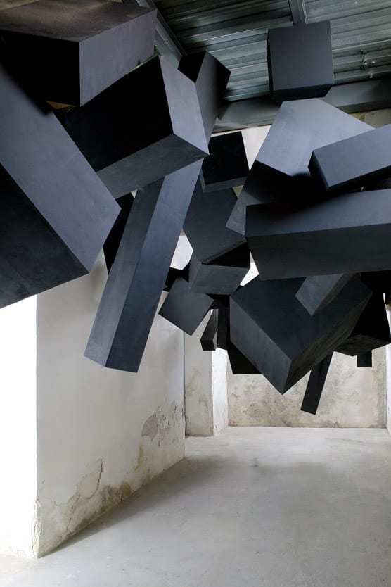
‘Sooner or later it all comes down’

Via Grafik, Names Festival, 2008, Trafačka, Prague

via-grafik-black-box-installation-1 via-grafik-black-box-installation-2


‘It’s got such a great sense of motion to it, like it really could come crashing down at any moment.’

– Bobby Solomon


the installation looks like it could just fall on you and thus gives you a sense of uneasiness walking beneath it. It’s a simple idea and execution, but it works well. I like how such a simple design can create feelings and an experience because of the way it’s formed and how it is placed in the space. Also it’s clever how the fact that you feel like it could fall on you, because of the sense of motion created by the blocks.


Sources: