http://www.hingemarketing.com/library/article/elements_of_a_successful_brand_1_positioning#
Elements of a Successful Brand 1: Positioning
- All successful brands have something fundamental, an idea or principle: this is its positioning
- Successful positioning needs to make a brand stand out from its competitors so it will attract people’s attention and give the company an advantage.
- To stand out a brand must do these things: be different, be focused, be relevant.
- Be different: Need people to notice you by standing out from competition. Today people have so many choices and by being different you provide the contrast needed to help people choice your brand.
- Be focused: Many businesses expand their services rather than narrowing their expertise in hope of attracting new customers. Need to find your niche so qualified customers will find you and pay more for your services.
- Be relevant: You can be different from everyone else and specialised, but you need people to be interested in you to succeed. Make sure there is sufficient interest in what you do.
- Keys to powerful position: Find your niche, where you stand out from competitors and what you do what your competitors don’t do, or what you do better. Make a positioning statement and then ask yourself why a customer would care. Think of how you can contrast from others.
- The strongest positioning is built on reduction. We subconsciously place brands into categories. The brands that do the best are known for simple ideas. Many top brands can be summarised in a few words: FedEx – became synonymous with “overnight”. Volvo – built reputation on “safety”. Apple – have become known for their great “innovation”.
- Need to simplify brand, uncover their fundamental purpose. “What is the most basic benefit you provide?” If you have the courage to minimise your services to their essence, an effective new market position can be created.
http://www.hingemarketing.com/library/article/elements_of_a_successful_brand_2_the_tagline#
Elements of a Successful Brand 2: The Tagline
- A lot of pressure is put on a brands tagline. They need to be engaging. A good tagline can speak to an audience with authority and elegance.
- An effective tagline should: clarify what you do & how you are positioned, express an important brand attribute, support your positioning and help people recognise and remember you.
- Clarify: A tagline is an opportunity to show you’re different, express your personality or convey an important brand quality. (Examples: “Business furniture that works”: 925 Business Furniture, “Creating Pivotal Brands”: Hinge.)
- Express an Important brand attribute: Every good brand stands for something: a point of interest or competitive advantage. Tagline is great place to show this attribute. (Examples: “Think Different”: Apple)
- Support your positioning: Taglines are most helpful when they support the brand’s positioning. (Examples: “We try harder”: Avis, “The Ultimate driving machine”: BMW)
- Keys to a great tagline: Short, show simple idea/benefit, be specific, be believable, avoid generic/cliched statements that could apply to others and memorable.
- Avoid: vague, bland, untruthful ideas. (Bad examples: “We make sure:: Fujitsu Siemens… we make sure of what? Incomplete/bizarre/confusing, “Helping Clients succeed”: Booz Allen Hamilton… Bland, “A passion for the business of accounting”: Grant Thornton… About them, what about the client?
http://www.hingemarketing.com/library/article/elements_of_a_successful_brand_6_the_logo#
Elements of a Successful Brand 6: The Logo
- A logo can be the anchor of a brand’s visual identity and an important part of being a successful brand.
- A logo has three main functions: Identification, Differentiation, Aiding Recall.
- Identification: A logo represents and identifies a brand. The mark visually aids the brands identity.
- Differentiation: A logo creates visual separation from other brands. Being different from the rest gives a brand distinctiveness. A logo can also convey aspects of a brand’s personality or attitude.
- Aiding Recall: A distinctive logo is a memorable logo. Being noticed and remembered is important.A logo should provide a shortcut helping us to identify a brand quickly.
- Logos can be broken into two parts: the mark and the name. A mark supports the name and offers visual dimension to the identity. Some marks are so well known that the name isn’t needed to identify the brand (Nike and Apple). Many brand don’t even have a mark and just have logotype (Sony, IBM, Oracle). Logotypes need to be legible, whether online or at a distance.
- Key questions to ask when creating a logo: Does it reflect the brand’s personality? Is it different from other logos in it’s industry? Is anyone going to notice it and remember you because of it?
- Successful symbolic logo: United Presbyterian Church of America logo redesign. Designer managed to put many meanings into mark, including a cross, a descending dove, fire and the Bible. This logo integrates many symbols into a single, unified mark.
http://www.hingemarketing.com/library/article/elements_of_a_successful_brand_7_colour#
Elements of a Successful Brand 7: Colour
- When colour is chosen and used efficiently, it can differentiate, motivate, and elevate a business. Some colours are so closely related to their brands that they have become as iconic as the logo itself! But it takes years of exposure to be able to associate a brand with its colour. Even so, colour can still be used to create an impact.
- Colour Differentiates you: Make sure your colours stand out from your competition.
- Colour Identifies you: Colour can become closely associated with your business. According to a University of Loyola, Maryland study, colour can enhance brand recognition by up to 80%.
- Colour is Visceral: We react to colour instantly. It can cut through clutter and commands visual attention.
- Psychology of Colours: Colours can have an effect on our moods and attitudes. Every colour has emotional implications, so many businesses use colour to influence people’s buying behaviour. Even so you would want to use a colour for your brand that is different to your competitors.
- Blue: is the most liked colour and also the most commonly used colour in business.
http://www.hingemarketing.com/library/article/elements_of_a_successful_brand_8_messaging#
Elements of a Successful Brand 8: Messaging
- Messaging = the words a brand uses to describe itself.
- Every brand needs a voice. Messaging provides the words to help people understand the brands value (why useful) and values (what it believes in). It also articulates a brand’s promise and stimulates desire for their services.
- Messaging can be in the form of a tagline, slogan, headline, ect. Persuasive brand messages are always brief and covey critical aspects of a brand. Effective brand messages usually simplify something that is complex. A message needs to be simplified down to the point to get into people’s minds.
- The Core Brand Message: Every great brand has a core brand message: a compact statement that declares why the brand matters and what it stands for. It communicates the values and key differentiators that define a brand. It should shape the brand’s marketing messages, which should describe aspects of the brand that are relevant to the need of the customers.
- Creating a Message: Messages help brands to differentiate from others and often convey specific services or benefits (“Visa. It’s everywhere you want to be.”) Or be a call to action (“Got Milk?”). A brand message must be authentic to the brand and customers’ actual experiences.
- Message checklist: Does your core brand message offer anything different from your competitors? Is your messaging short, simple and clear? Do your messages reflect reality? (Or are they aspirational?) Brand messages must be authentic to be believed. Do your messages resonate with your target audience? Do they say anything interesting?
- Messages can appear in many places, including advertising, brochures, websites, business cards and email signatures.
The power of branding: a practical guide
The key ingredients to a good brand
Consider:
- The big idea – What lies at the heart of the company?
- Vision – Where are you going?
- Values – What do you believe in?
- Personality – How od you want to come across?
The Big Idea
- This should encapsulate what makes you different, what you offer, why you’re doing it and how you’re going to present it.
- Ask yourself: How can you stand out? What do you offer? What makes you different? What is your ‘personality’? What do consumers want or need? Is there a gap in the market?
- Vision means thinking about the future, where you want to be and looking at ways to challenge the market or transform a sector.
- Vision may be grand and large-scale or simple, like offering an existing product in a completely new way, or even changing the emphasis of a business form one core area to another.
- Relates to important aspects of how people see an organisation.
- It’s what you stand for.
- Most companies share these values: quality, openness, innovation, individual responsibility, fairness, respect for individual, empowerment, passion, flexibility, teamwork and pride.
- The tone, language and design are ways you can present your personality.
- Personality trait examples: ‘efficient and business like’, ‘friendly and chatty’, or ‘humorous and irreverent’.
- Ways you can start to control the elements of your company’s personality: Graphic design (visual identity), Tone and voice (language), Dialogue (one way or two way communication), Customer service (staff communication to customers)
- Differentiation: Important to define and present differentiation in your sector.
- Engaging with customers: If you stand out for positive reasons and your tone of voice and communications are credible, customers will be interested in you. Appeal to people’s sense of individualism and focus on value of human interaction and communication, rather than competitive price plans or latest technology (example: Orange brand).
- Evolution or revolution: When reassessing a brand you can go small and incremental, refreshing the brand or go for a major overhaul of the company or brand’s image. If a brand is already in a strong position with a solid customer base and you just need to keep up with growing or developing market then evolution isn the best option.
- A brand is not simple a logo or identity.
- Logo = just one manifestation of brand. But is often top-level of communication, seen most frequently by most people.
- Design translated the ideas into communication.
- Design: Need to work through strategy and implementation to ensure results are consistent, adaptable and keep with original brand attributes.
http://www.integraphix.com/rebranding_article
- Rebranding: process to develop new market direction or distinguish a brand from previous negative opinion.
- Most logos or marketing campaigns are good for 5 to 10 years and then a brand needs to change to keep up with a more modern image and newer brand ideas. To keep up with competition and meet customers changing preferences, brands must evolve.
- An evolving brand identity keeps a brand relevant and fresh in a marketing place that is always changing.
- Most major brands have gone through transformations, which are essential to compete.
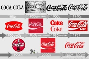
- Coca-Cola’s image has been evolving since the 1950s to keep up with their target market, but have always kept to the same principles.
- Rebranding is essential if your target market isn’t responding the way they should.
http://www.pixel77.com/3-essential-steps-successful-rebranding/
Essential steps toward successful rebranding
- Example of a bad rebrand: PepsiCo & The Arnell Group regarding the packaging of Tropicana in 2009. Wanted it to look more up to date/modern and to show the juice itself, replacing the straw in an orange with a glass of orange juice. The identity was diluted and people were so used to/familiar with the old packaging that it was how they identified the product in shops. Tropicana’s sales went down 20% in the first 2 months, costing PepsiCo overall $33million.
- Cigna Rebrand: Leader Creative rebranded Cigna because their logo didn’t represent the wide range of services that they offered. They used focus groups which confirmed concerns and people referred to the logo as “bureaucratic” and “unresponsive”. Cigna were worried that change would result in losing brand equity built around their previous identity and tried to keep the black box but it didn’t work.Surely a health care company should express care, security and stability and create an emotional response from the clients. This is the reason they included a tree in the logo, with a new slogan “A business of caring” and the redesign was a success.
- The reasons behind rebranding are just as important as the new brand identity.
http://www.logodesignlove.com/10-successful-logo-redesigns
Successful logo redesigns
- Logo redesigns often implement subtle changes to refresh the look whilst considering customer recognition.
- Toys R Us: The star has been placed inside the R to make a tighter and simpler wordmark, less patriotic, more bulbous and more fun.
- MSNBC: Not grammatically correct, but lowercase is less imposing, more legible, and friendlier than all-caps. Was clunky and unflattering. Peacock feathers have stayed, no need to change. The mark is now approachable and rhythmical, rather than cold and monotonous. Achieved from changing typeface.
- Science Channel: Period table look is well used, relating to brand. The orange reproduces well on RGB screens and also has sense of being fresh and new. But there are many different points that parts of the logo are aligned to, seems clunky.
- Dolby: Double-ds merged together, works well with new type and removes visual separation and additional noise. Dolby word removed from rectangle, with lighter weight typeface for better legibility.
- Delta: New logo simple and to the point. New colours work better – blue more dominant and more modern typeface.
http://kingmedianow.wordpress.com/2011/05/31/starbucks-serves-up-a-valuable-lesson-in-rebranding/
Starbucks Rebranding
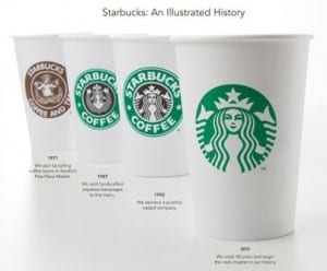
- Starbucks are a universally known company with locations in over 50 countries. In 2011, on their 40th anniversary Starbucks revealed their new logo as part of a rebrand campaign. They new logo included the same illustration as before, but now in all green and without the brand name on the cup. Other companies such as Apple and Nike have also done the same, because they are so recognisable only an image is needed for their logo, without the brand name.
- To be a successful brand you must go beyond the physical characteristics of colour, design, packaging, ect. and determine the new direction you would like to follow that your clients can identify with. Starbucks have started to go into the non-coffee business activities and products in recent years, such as music and ice cream, and are continuing to expand in this direction.
- By removing the words from the logo, Starbucks can represent their hopes to align with the non-coffee activities and make sit easier for marketing in non-English speaking countries.
- Starbucks rebrand has been seen as successful and shows how important branding and rebranding campaigns are today and how important it is to rebrand to ensure success for your company.
http://www.fastcompany.com/1777409/how-starbucks-transformed-coffee-commodity-4-splurge
- A brand is an entity that engenders an emotional connection with a consumer … Consumers emotionally connect with brands when the brands repeatedly provide something that the consumer wants, desires, or needs.
- I think the best brands are those that create something for consumers that they don’t even know they need yet.
- It’s really interesting to watch brands get older, and gain more competitors in the marketplace, and struggle to stay relevant. Look at Levi’s or Gap or any of the great American brands that have gone through these struggles. Look at Starbucks! In order for brands to recapture their spirit, they almost always go back to their core. They seem to forget for a while, then remember, “Oh yeah, we’re a coffee company!” Then they get rid of the movies and the spinning racks filled with CDs and start focusing on coffee again.
- What’s it like to start working with a brand when it’s in the middle of a disaster? You only have one place to go, and that’s up.
&
http://www.retireat21.com/entrepreneurship/17-evolutions-of-logos
Revolution & Evolution
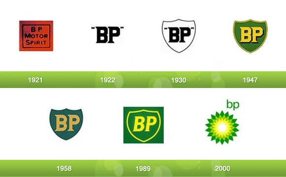
BP (evolution then revolution):
- The original corporate identity designed in the early 1920s was used for over 80 years, but has been constantly refreshed over over those years, keeping the logo looking contemporary.
- The corporate identity was completely redesigned in 2000, creating the tessellated ‘sunflower’/helios identity. The design changed because the company’s approach to environmental concerns had changed and it now represented their commitment to producing energy in many ways. The tagline also changed to ‘Beyond Petroleum’ and other aspirational, environmentally themed messages were used e.g. ‘bigger picture’ and ‘better products’.
Apple (revolution then evolution)
- Original logo Isaac Newton sitting under a tree. Chief exec Steve Jobs thought that this overly detailed logo had something to do with slow sales, so completely changed identity – a revolution of the corporate visual design – and commission the rainbow striped logo, which ran for 22 years.
- This revolution in branding was needed to kick-start demand for the company’s products.
- Apple was firmly established by 1998 and the rainbow identity evolved into the more contemporary logo we know today.
- The original logo was designed by Steve Jobs himself and Ronald Wayne and the rainbow logo was designed by Rob Janoff. The apple has a bite out of it so it isn’t recognised as another fruit.
Shelter (evolution):
- Housing charity Shelter have kept their previous focus with their association with the homeless, but focus more on poor housing conditions. As the charity’s identity changed their logo did to, adjusting the letter ‘h’ to look like a roof.
http://www.businessinsider.com/10-most-successful-rebranding-campaigns-2011-2?op=1
UPS (big and boring to personal and innovative)
- UPS have always been in competition with FedEx, who introduced late night deliveries and package tracking. UPS needed to remind their customers of how they can meet people’s needs.
- They replaced the slogan “Moving at the speed of business” with “What can brown do for you?” and created adverts to show their customers that UPS can help you whoever you are. This approach produced good results, ranking up their profit margin in 2001.
- UPS are still showing customers what they can do and their latest slogan is ‘We (heart) Logistics’.
- UPS have used forward-looking slogans that tell customers they are continuously adapting and proving new ways to meet their demands.
http://www.1stwebdesigner.com/inspiration/successful-logo-redesigns-improvements/
CBS
- A major American television network which started as a radio network, sometimes referred to as the “Eye Network” in reference to the logo.
- Old Logo: From 1940 to 1951 CBS just used an oval spotlight on the block letters C-B-S and then a new logo was made in 1951. The eye has been kept and used as much as possible.
- New Logo: Known as the ‘Eyemark, the new logo’s has a different typeface, giving it a modern and futuristic feel. The eye is still a dominant part of the logo.
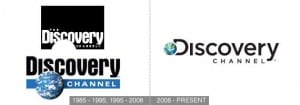
- Old Logo: First logo was a tv screen picturing a map of the world. ‘The’ was dropped from the name in the mid-90s and the globe became a permanent part of the logo, with an added ‘strap’.
- New Logo: The new logo has been used since 2008. It contains new graphics and new tagline: ‘The world is just awesome’. The typeface Aurora Bold was replaced with Gotham and the globe has merged with the ‘D’ in Discovery. The new logo is more simplified and less crowded.
Lecture notes:
Skoda rebrand
- Skoda were seen as an unreliable and uncool, joke brand. For these reasons they needed a rebrand.
- Volkswagen took 30% of Skoda in 1991, by using their skilled workforce and industry know how, Volkswagen introduced training, educating and better design standards.
- Skoda needed their own niche, separate from Volkswagen. They are now one of the fastest growing car companies.
- The rebrand led to more than a third growth in sales between 2007 and 2011 (39.5%).
- Their adverts mentioned their failures, showing they knew their faults and identified this. This was brave, but paid off. Other adverts showed that they were putting effort into their products and showing a change in behaviour (Cake advert & water and music advert: simply clever). These adverts were not necessarily aiming for Skoda’s target market, if the skoda logo was replaced by another car company’s the adverts would still have worked. These adverts were used to help redefine the brand.
- “We needed to move away from being a cheap brand to being a value-for-money brand. At the same time, we badly needed to find our own positioning within the group, rather than just trading on being part of the VW Group. Otherwise, we might just as well have re-branded ourselves as VW, with very little reason for existence.” Skoda marketing manager
Federal Express rebrand
- Federal Express were established in 1973, but because of the long name changed it to ‘FedEx’ in 1994, making it more visible from afar when on their lorries for example.
- In 1994 Federal Express hired Landor to rebrand them. Focus groups were used and it was decided the name would be shortened for better communication of speed.
- The FedEx name meant a whole new language for the company and included copyright of the new name. This name was shorter and therefor more sufficient.
- A clever trick FedEx used in their rebrand for creating the image of an arrow in the space between the E and x, but if consumers don’t see it it doesn’t matter.
- Logo, Colour, Imagery, Typeface, ect all important, but theres more to it… Feeling, Association, Promise, Emotional Connection.
- Physiological and Intellectual.
- Before rebranding experience the brand and find out what people want from it (design around this).
- Links design work to message.
- Gives brand purpose.
- Be true to the essence of the brand.
- Be passionate about it.
- Believe it will create change.
- Starting point.
- Be simple and honest.
- Get it down into post-it note – pure
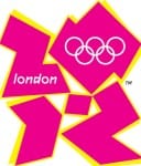
- Olympics 2012 logo: Unsuccessful? Why? Most emotional event in world and not distilled into identity. No joy, excitement or anticipation shown.
- Face Britian: ‘Signature for a nation’ For Children so fun and friendly logo. Not serious. Logo fits with self portrait.
- What is the brand there for?
- Avail – Carer agency. ‘We Do Care’ – We care about people and caring is our business. Every idea will come out of this. “Give hug” on website – friendly faces for nervous customers.
- How are you approaching people?
- Sticking a logo on a website does not show if a brand works or not.
- Ebay rebrand – Have experience, fun, more than a logo mark. Mark not needed, the site and the experience are. (Bland new logo in my opinion)


- ‘Now everyone can fly’ – need reason to exist – cheap but for all – Lost way and needed to be brought back to this.
- Where does it live? Airports and Adverts.
- Colour red used a lot: seen as the red brand / red airline. But associate red with sale, cheap, stop sign, shut. Red needed to be contained within logo.
- Came up with designs for destinations: examples of different cultures.
- Using Black, White and Red proved effective. Colours stand out and when people are tired and stressed in an airport, these simple colours will help them know where to go.
- Merchandise: badges – collectables from where you (can) go/souvenirs/experience and cool, clean t-shirts (handing when travelling and sweaty).
- New planes with designs to do with destinations. Re-launch: dragon on side of plane (flying dragon). Made impact: others can see from other planes or when plane is in air. Advertising as well as design.
- Be emotional about your brand / ideas
- Have a simple yet effective idea
- Apply idea in best way and be impactful
- Use narrative and express insight into problems
