Annual Report

With my idea of creating a ‘Publication of Me’, I thought about the idea and format of an Annual Report. Like how companies sell themselves, including financial reports and showing what they are etc, I could do the same, with me!

I didn’t know much about Annual Reports, so I researched a bit about them…


Definition:

1. An annual publication that public corporations must provide to shareholders to describe their operations and financial conditions. The front part of the report often contains an impressive combination of graphics, photos and an accompanying narrative, all of which chronicle the company’s activities over the past year. The back part of the report contains detailed financial and operational information.

2. In the case of mutual funds, an annual report is a required document that is made available to fund shareholders on a fiscal year basis. It discloses certain aspects of a fund’s operations and financial condition. In contrast to corporate annual reports, mutual fund annual reports are best described as “plain vanilla” in terms of their presentation.

1. It was not until legislation was enacted after the stock market crash in 1929 that the annual report became a regular component of corporate financial reporting. Typically, an annual report will contain the following sections:
Explanation:-Financial Highlights
-Letter to the Shareholders
-Narrative Text, Graphics and Photos
-Management’s Discussion and Analysis
-Financial Statements
-Notes to Financial Statements
-Auditor’s Report
-Summary Financial Data
-Corporate Information2. A mutual fund annual report, along with a fund’s prospectus and statement of additional information, is a source of multi-year fund data and performance, which is made available to fund shareholders as well as to prospective fund investors. Unfortunately, most of the information is quantitative rather than qualitative, which addresses the mandatory accounting disclosures required of mutual funds.

Why Annual Reports are important to you:

An annual report can give you a lot of important information about a company. When you’re a regular stockholder, the company sends you its annual report…

You need to carefully analyze an annual report to find out the following:

  • You want to know how well the company is doing. Are earnings higher, lower, or the same as the year before? How are sales doing? These numbers should be presented clearly in the financial section of the annual report.
  • You want to find out whether the company is making more money than it is spending. How does the balance sheet look? Are assets higher or lower than the year before? Is debt growing, shrinking, or about the same as the year before?
  • You want to get an idea of management’s strategic plan for the coming year. How will management build on the company’s success? This plan is usually covered in the beginning of the annual report — frequently in the letter from the chairman of the board.

Your task boils down to figuring out where the company has been, where it is now, and where it’s going. As an investor, you don’t need to read the annual report like a novel — from cover to cover. Instead, approach it like a newspaper and jump around to the relevant sections to get the answers you need to decide whether you should buy or hold on to the stock.

Why do we need an annual report?

Annual reports can:

  • communicate not just your activities, but your accomplishments during the past year;
  • convince existing supporters that their funds are being well spent and help you raise money by attracting new donors;
  • educate community leaders and influential decisionmakers about your work on important issues;
  • recognize special people including donors and volunteers; and
  • serve as a historical record of your progress.

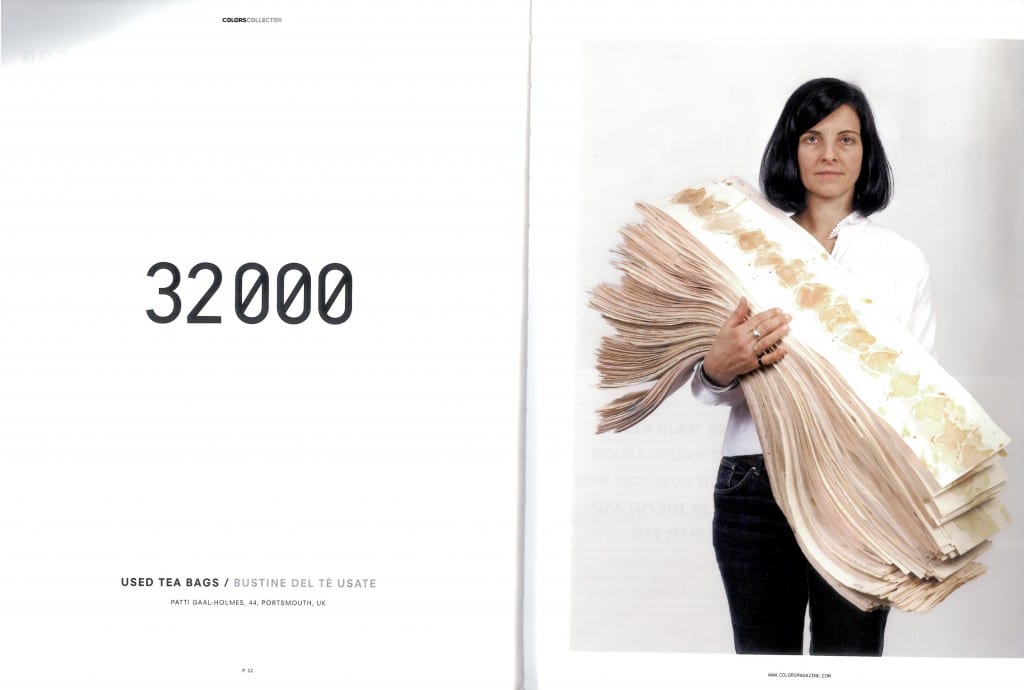
Colors Collector

Issue No. 79 / 147 234 – Winter 2010 / 2011

I began looking at how people collect objects, usually because they have some value to them and this idea led me to finding this magazine and using it for research into the subject. Here are some interesting quotes from the magazine that link to my project/ideas:


Introduction –

The word ‘collector’ is used for a person who regroups and catalogues objects linked to a theme. They can be everyday products – industrial or natural – or even works of art.

… a common object – an item – that by its particularity, rarity or what it represents becomes an extraordinary product that should be looked at with particular attention and/or be collected.


There’s an intense & perverse identification that occurs between people and their things. Design Critic. (Cristina Morozzi) –

There’s an intense and perverse identification that occurs between people and their things. The things we love and collect tell our stories truthfully. Words can be guarded and false; things, on the contrary, are honest. They cannot lie. They tell our stories, despite us…by displaying them [we] expose [ourselves].


With collections it pays to be a little bit mad. Design Critic. (Pierre Doze) –

The volume and variety of information and products that fill our daily lives is constantly growing. Whether virtual data or solid objects, we seem to accumulate them almost despite ourselves.


colors collector2colors collector colors collector3


Source: The magazine itself


Thirty Pieces of Silver

Cornelia Parker – 1988-9

Thirty Pieces of Silver 1988-9 by Cornelia Parker born 1956 Thirty Pieces of Silver 1988-9 by Cornelia Parker born 1956

This installation piece included over a thousand silver objects, including plates, spoons, candlesticks, trophies, cigarette cases, teapots and trombones. They were crushed and arranged into disc shaped groups, suspended a foot from the floor by fine wires. The title relates to the biblical story when Judas Iscariot betrayed Jesus for thirty pieces of silver.

Cornelia Parker wanted to change the objects meaning, visibility, worth and by flattening them she did this literally. She thought that the silver had more potential when crushed and their everyday meanings had gone. This piece is about materiality and anti-matter.

From: TATE

– This piece has made me think about objects in a different way. How deforming them can give them a different, but still notable meaning.

Michael Landy – ‘Breakdown’

Man ‘destroys’ life for art

Michael Landy is an installation artist who  got rid of everything he owned for his exhibition in 2001 called ‘Break Down’. He shredded or granulated things from socks to family photographs, leaving him with no possessions for the sake of ‘art’. The reason for the piece being an examination of society’s romance with consumerism.

The title isn’t just about the breakdown of the objects in Michael Landy’s life, or the breakdown of the materials that create them, but it also reflects the emotional breakdown Landy will face.

He made an inventory of everything he owned, from socks to cds, even his car, amounting to 7,006 objects and 10 people were needed to assist in the destruction. Landy didn’t just destroy everyday objects, he also got rid of his valuable art collection too.

From: BBC NEWS


Michael Landy’s inventory of his possessions also included every item of furniture, every book, every piece of food, every cat toy, taking three years to complete the final inventory, containing 7,227 items. They were classified into 10 categories: Artworks, Clothing, Equipment, Furniture, Kitchen, Leisure, Motor Vehicle, Perishables, Reading Material and Studio Material.

He used a large bespoke machine and with a team of people reduced every object to shredded or granulated material. It was on display for two weeks in former C&A store on Oxford Street, London, described as ‘Landy’s consumer nightmare’.

From: Art Angel


Once complete, Landy said: “When I finished I did feel an incredible sense of freedom,” he says, “the possibility that I could do anything. But that freedom is eroded by the everyday concerns of life. Life was much simpler when I was up on my platform.”

From: The Guardian


Michael-Landys-Break-Down-008

The Guardian


breakdown michael landy

From: http://spyridongiasafakis.blogspot.co.uk/p/research-paper.html


– Sounds like Michael Landy did an extreme spring clean of his life, perhaps a way to free himself from the consumerism that we are all drawn to. He wasn’t just getting rid of his possessions, but things that define who he is, a part of his identity, gone.

– This links to the theme of collecting and holding on to things we don’t need, but value.

– But did Landy go too far in destroying other artists works? Was this experience really freeing or restraining?

Credits / Contributions page

For our magazine I am sorting, editing and creating the credits/contributions page. To help me do this I have looked at this section from a selection of modern, well designed magazines to see what is included and how they design it…

The Magazines I looked at were:

Vogue, L’Officiel, Art in America, I-D, Colors and Bau Meister. All credited but varied in theme, audience and design.

Photo 05-03-2014 11 43 26

Photo 05-03-2014 11 42 32

Photo 05-03-2014 11 42 48

– Vogue –

This contributions page only uses half a page, but this is probably due to advertisements, which we aren’t including in our magazine. They have separated each section, centred the type and use of horizontal lines to create hierarchy.   This design is quite conventional and simple. A method to consider, but more spaced out.

Photo 05-03-2014 11 42 51

L’Officiel –

I like how the credits are in 3 columns here, simple, but laid out well using hierarchy with bold text. In this magazine there’s also a separate page which focuses on who the contributors are, like a profile. I like this idea but need to consider if it will enhance the magazine or is an unnecessary contribution.

Photo 05-03-2014 11 42 54

– Art in America –

Here the credits are placed on the same page as the contents. It’s laid out well, but we have agreed not to do this as we think it would work better to be placed on separate pages. The layout is well done and very similar to the ones previously looked at.

Photo 05-03-2014 11 42 58

– I-D  –

The contents page here is very simple in design, using bold type to create hierarchy, ranging left. It also includes pictures of contributors and gives you information on them, which I quite like. It also is different from the others I’ve looked at as each person is asked to contribute an answer to a question relating to this particular issue: ‘What do you collect’. Using this approach makes you more inclined to look though this page than flicking past it, which is what most of us do when we reads a magazine. I like this approach , butI think it only works if you have a question or topic in mind that fits with the magazine or issue.

Photo 05-03-2014 11 43 03

– Colors  –

in this magazine the credits are on the very last page at the back. I like this idea, as it’s easy to find, but I also like when magazines have it placed with the contents page, as this is where you would expect to find the credits page. Hierarchy here is done by line spacing and alternating between capital letters and lowercase. This is a simple idea. I like it but I wouldn’t want to produce a credits page quite as simple. But it shows how even subtle changes create a clear hierarchy.

Photo 05-03-2014 11 43 08

– Bau Meister –

This layout is very similar to Vogue’s design. Although in comparison, Bau Meister’s looks quite wordy and harder to read. But I like how each section is separated using spacing.

Looking at these credits/contribution page designs has helped me think about how I will put this pages together, in content and design. Most stick to a conventional approach with subtle changes specific to their magazine. This is not a page to over-design or be experimental with, but just place what needs to be on the page, as this is in essence a reference page. I will consider the approaches used above when designing the credits/contributions page.