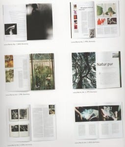
The Art Directors Handbook of Professional Magazine Design is a great book on how to do magazine design, with many great examples. It’s helped me think deeper about how I go about designing magazines, which I hope to apply to my design and art directing.
Sketching:
- It’s important to sketch ides and layouts, but it helps to read the text your designing for and have a precise concept too.
- Things to think about when using photography: which pictures should you put first, is there a logical order, will they be grouped and how, do the colours go together, is the sequence too repetitive, does it add something new???
Layout variations:
- The choice of opening picture sets the mood for the rest, and the typography has a decisive influence on this mood. (Important to remember!)
Grid systems:
- The number and width of columns influence the character of a magazine.
- The right layout of columns is immensely important for the structure of a magazine page.
- Lines should have roughly sixty characters = better readability.
- The content should also influence what layout you chose.
- Here are examples of how different magazines have used grid systems well in various ways (page 19):
Source: ‘The Art Directors Handbook of Professional Magazine Design: Classic Techniques and Inspirational Approaches’ – Horst Moser (Thames and Hudson, London)
