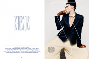
These images are taken from Issue 6 of Pilot Magazine.
Pilot magazine uses a lot of overlapping in its design. This is done very well and adds to the aesthetics of the design. It’s quite simple with use of colour and in its style, but this works very well and accompanied by black and white photographcs, the colours are bold and engaging. As the deisgn is simple, the bold, decorative typeface (used for titles in the spreads) doesn’t clutter or over shadow the rest, but work in harmony with it.
Source: Blogspot…


