Some examples of magazine spread design I like:
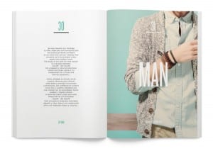
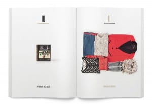
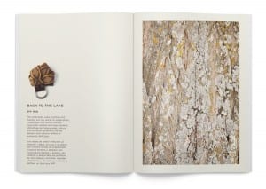
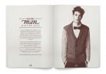
Design of seasonal lookbooks for Springfield by Luis B Hernandez.
I love the minimalistic, clean-cut style in these spreads. they are very readable and eye-grabbingly simple. Also, the page numbering is done very differently to conventional magazines, in quite a contemporary, yet aesthetically pleasing way. This style may be considered for the magazine.
Source: Luis B Hernandez
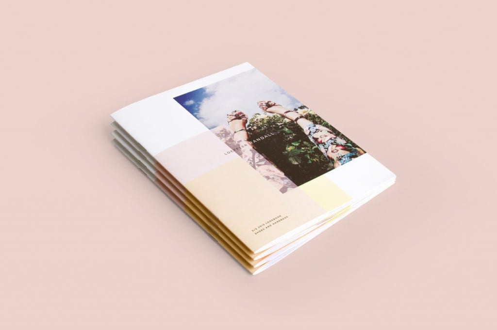
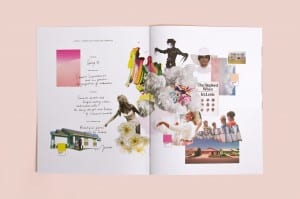
Loeffler Randall by Ro and Co
These spreads are not for a magazine, but part of a branding and packaging brief. The design again is quite contemporary and minimal. I like this style as it’s not too cluttered and attention grabbing, as it’s unlike the ‘in your face’ covers magazines often have. The contents uses collage and handwritten type, looking more authentic and friendly, and contrasts the clean cut cover.
Source: Ro and Co Studio
