For the group magazine project, all 6 of us must produce a front cover using the same Masthead design. So I have looked at some examples of
magazines that use the same masthead design, yet keep each cover exciting and different to the last…
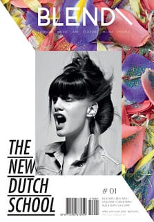
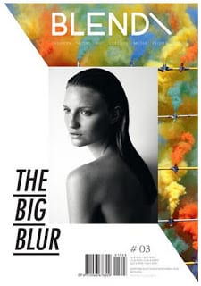
Blend magazine (Dutch, established 2004, alternative lifestyle media)
Blend magazine have an obvious cover style as their magazine has developed, helping readers to recognise them instantly. It’s quite a contemporary and modern themed cover, using bright colours with black and white photographs of women to attract their audience.
Source: http://cadenceandclementine.blogspot.co.uk/2012/01/blend.html
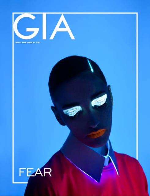
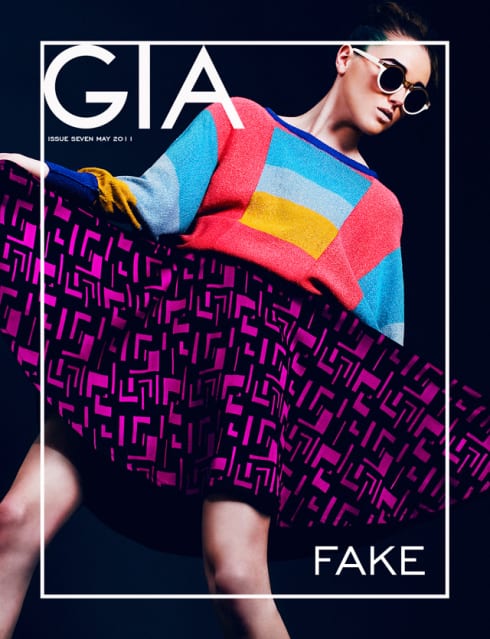
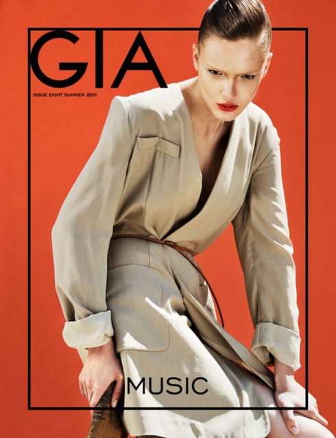
GIA magazine
Gia magazine has various themes/titles, yet keep to the same layout and style theme on the cover of each issue. Bold colours behind photographs of posed women is clearly a consistent cover theme.
Source: http://art8amby.wordpress.com/tag/gia-magazine/
