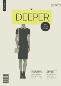
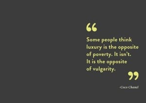
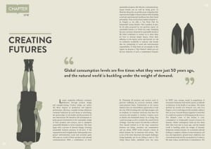
‘A mock publication design for a Luxury fashion magazine.’ by Aakansha Kukreja
this publication is very minimal yet bold and quite surreal too. I really like the composition and the art direction, with clear use of the grid throughout. There is a clear overall style and design ethos, which is coherant throughout, including use of space, type faces and images. The cover has great use of white space and is quite inviting. Although I like the minimal style and want to use it, I don’t want it to be this plain, using brighter colours and more interesting images too.
Source: Aakansha Kukreja


