Anthony Neil Dart is a designer who’s designed many magazines. I’ve looked at some of his designs that interest me and inspire ideas of our magazine design project.
Metode
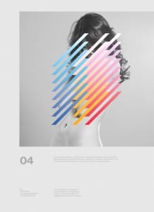
These designs are both for Metode magazine and use contrasting black and white photography with brightly coloured shapes to create intriguing cover designs, accompanied by a few lines of text. I like the composition of these designs and the contrast is engaging. I would like to try these attention grabbing techniques and contemporary ideas with my project.
Barcelona – Show us your type Exhibit 2010
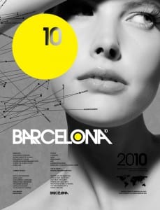
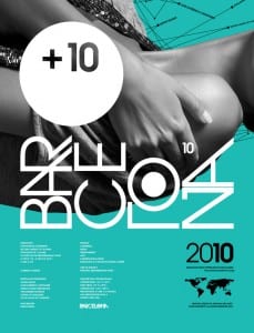
These two designs again use bold colours with black and white photography. The bright yellow and turquoise colours really stand out against the black and white and the type hierarchy is done very well. There is also a bit of a surreal look to these covers, which I think works quite well.
Source: Anthony Neil Dart on Behance


