Credits / Contributions page

For our magazine I am sorting, editing and creating the credits/contributions page. To help me do this I have looked at this section from a selection of modern, well designed magazines to see what is included and how they design it…

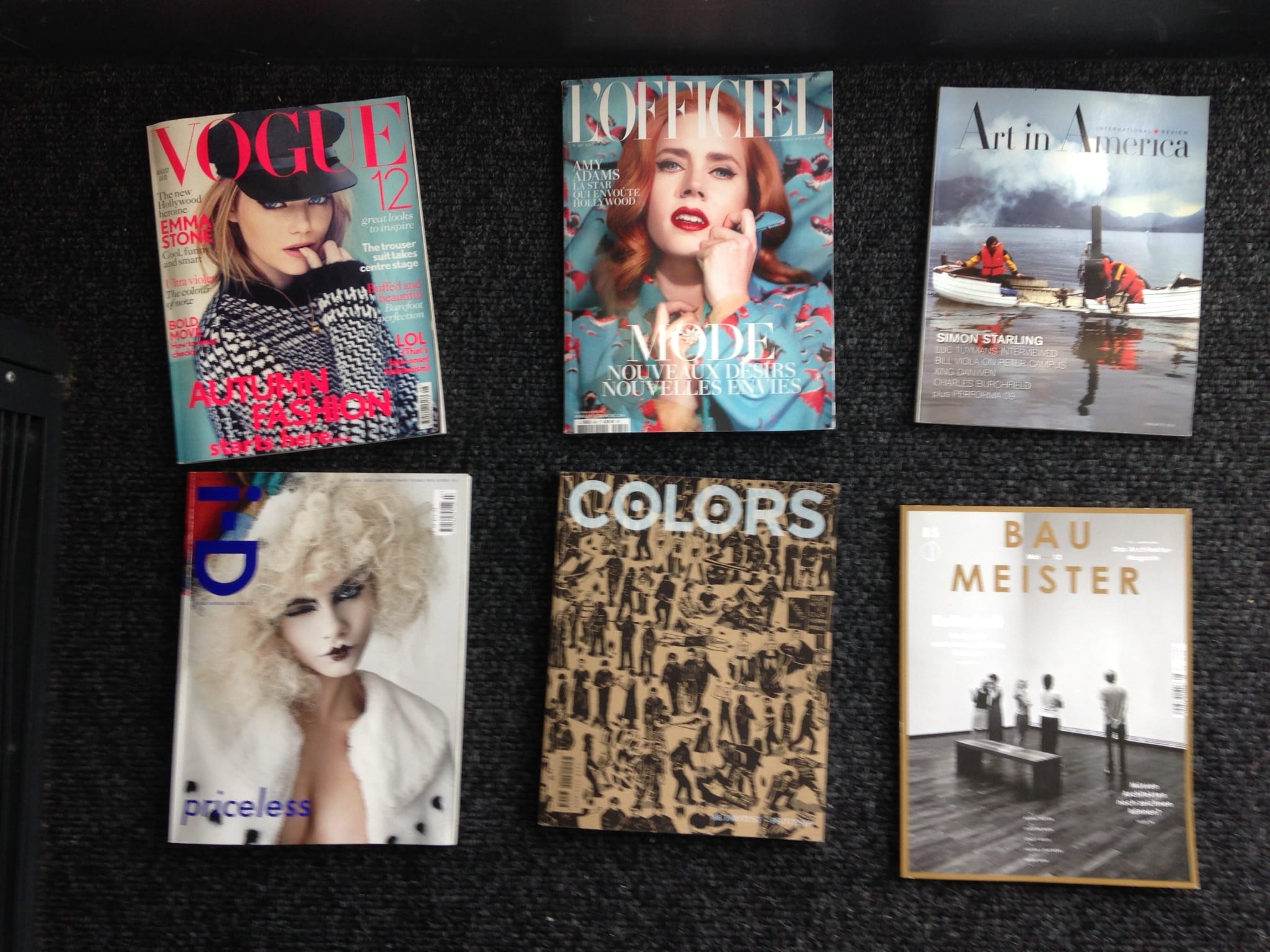
The Magazines I looked at were:

Vogue, L’Officiel, Art in America, I-D, Colors and Bau Meister. All credited but varied in theme, audience and design.

Photo 05-03-2014 11 43 26

Photo 05-03-2014 11 42 32

Photo 05-03-2014 11 42 48

– Vogue –

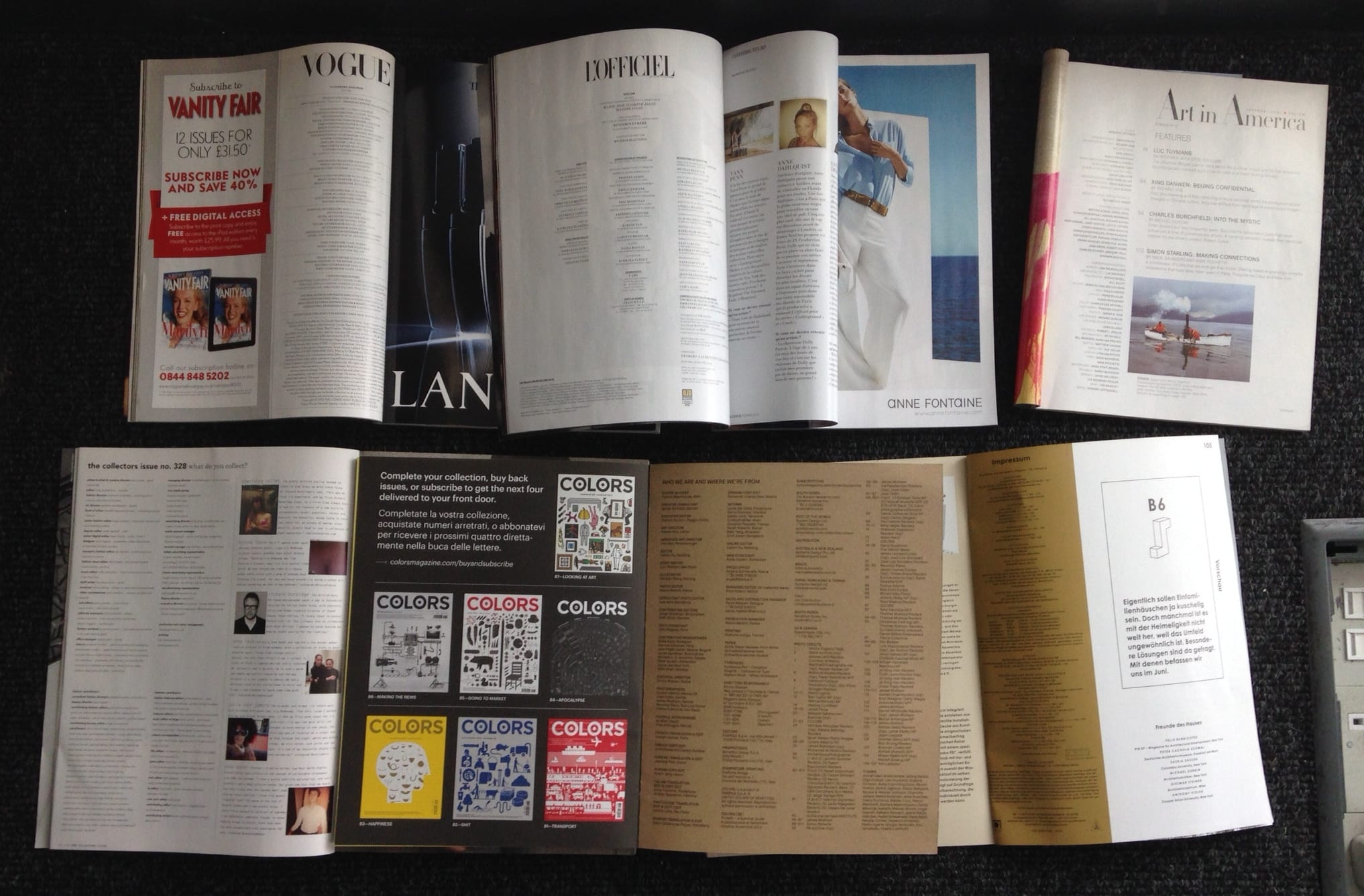
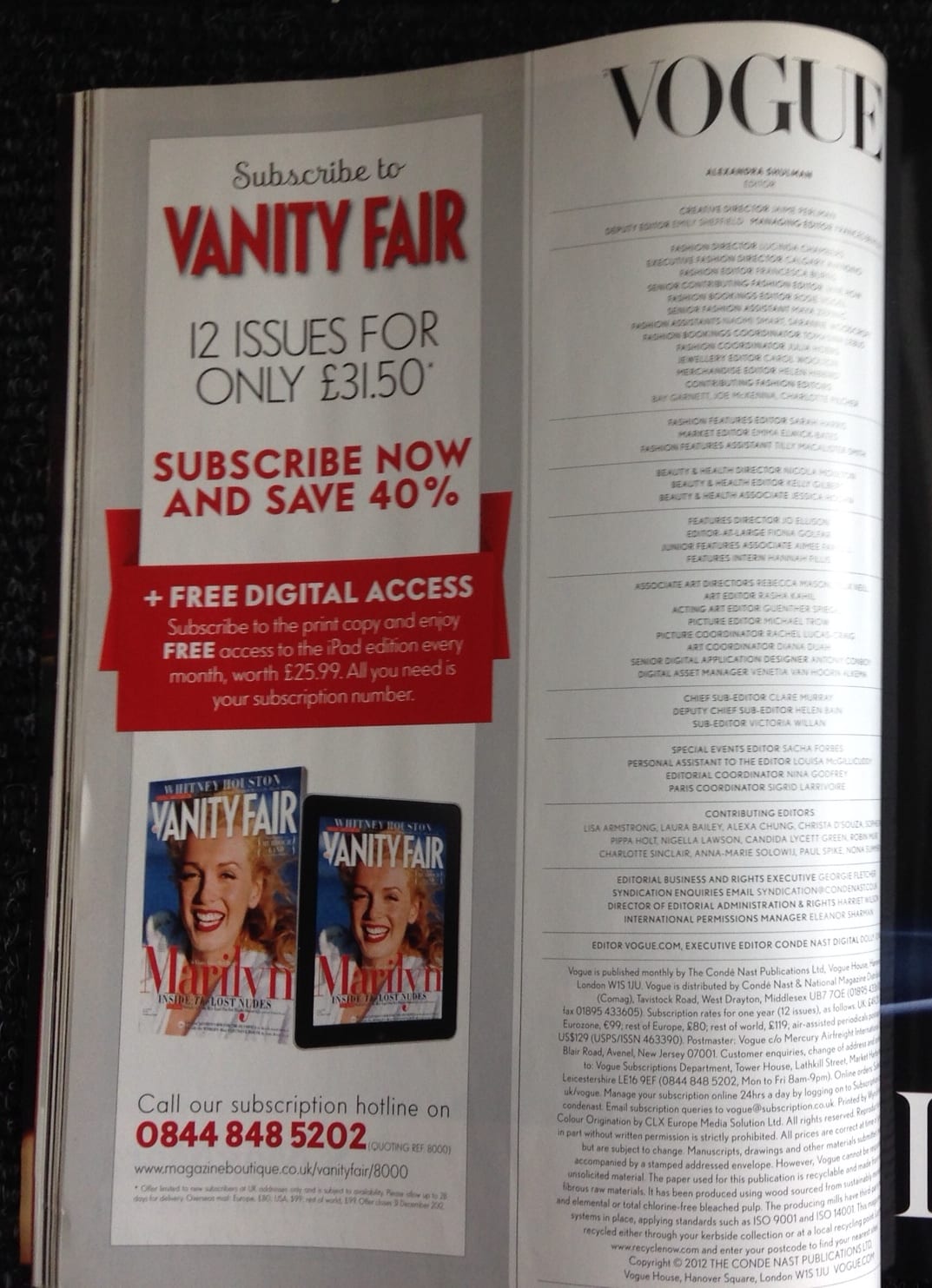
This contributions page only uses half a page, but this is probably due to advertisements, which we aren’t including in our magazine. They have separated each section, centred the type and use of horizontal lines to create hierarchy.   This design is quite conventional and simple. A method to consider, but more spaced out.

Photo 05-03-2014 11 42 51

L’Officiel –

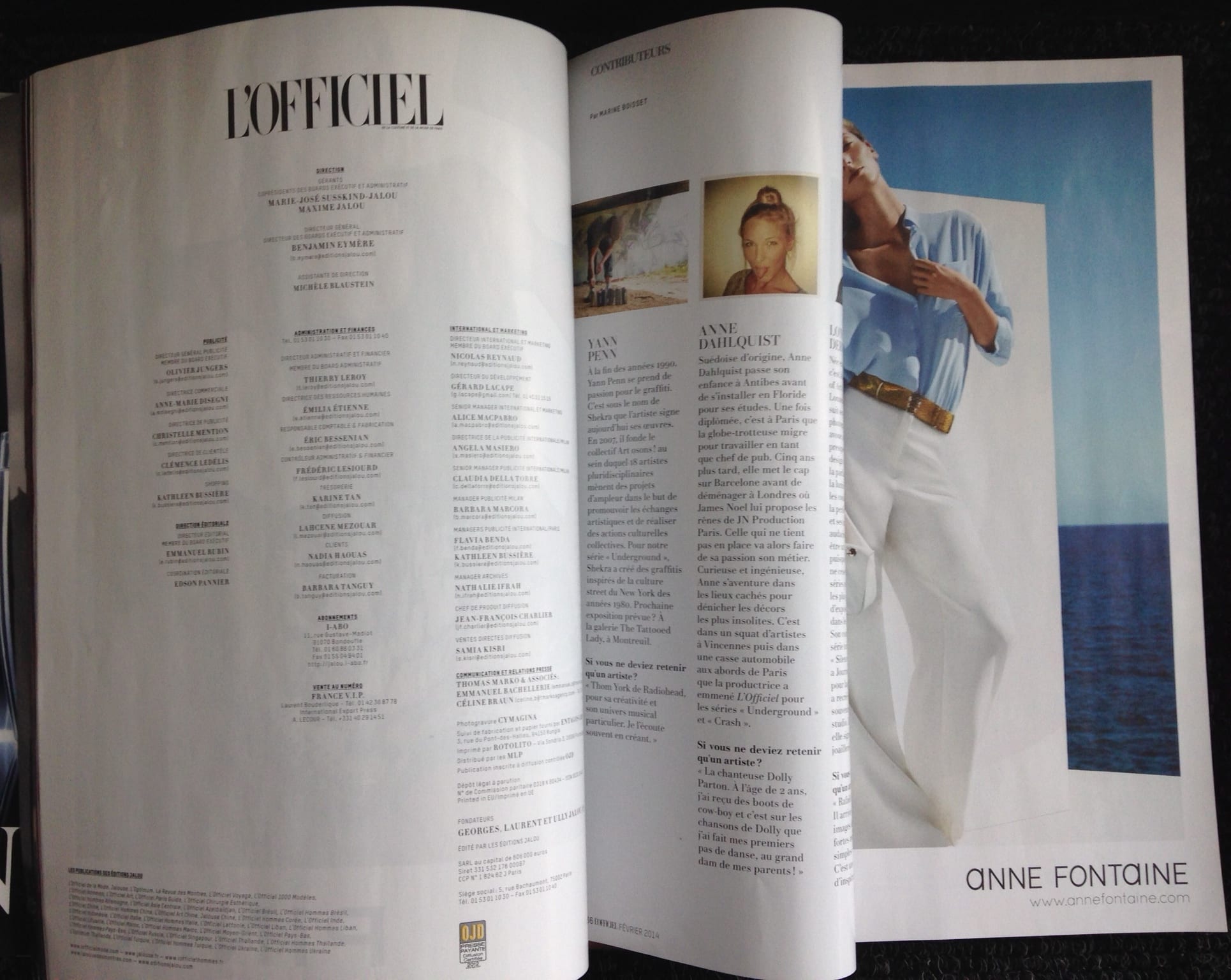
I like how the credits are in 3 columns here, simple, but laid out well using hierarchy with bold text. In this magazine there’s also a separate page which focuses on who the contributors are, like a profile. I like this idea but need to consider if it will enhance the magazine or is an unnecessary contribution.
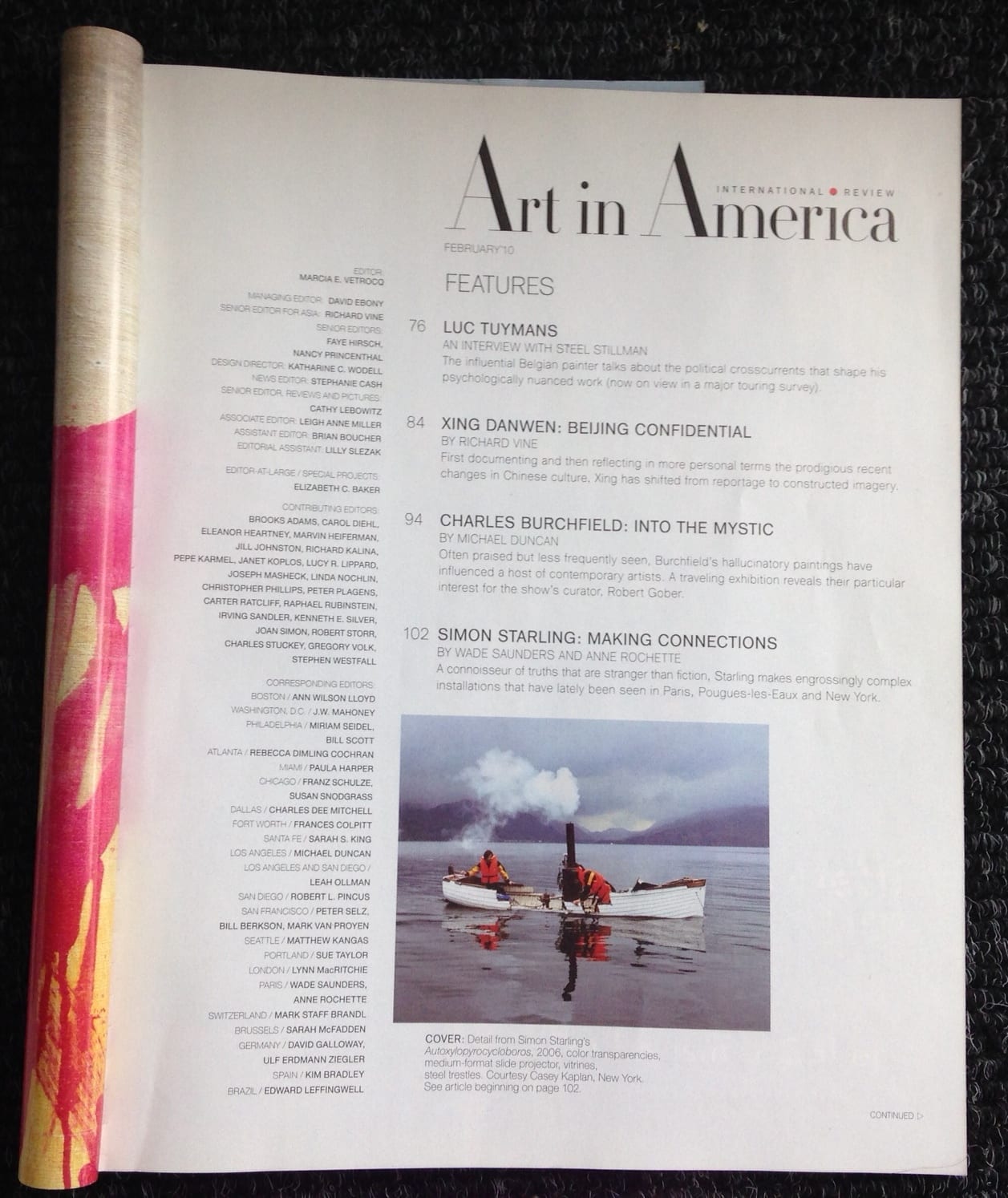
Photo 05-03-2014 11 42 54

– Art in America –

Here the credits are placed on the same page as the contents. It’s laid out well, but we have agreed not to do this as we think it would work better to be placed on separate pages. The layout is well done and very similar to the ones previously looked at.
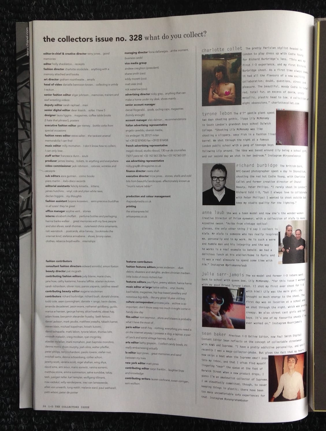
Photo 05-03-2014 11 42 58

– I-D  –

The contents page here is very simple in design, using bold type to create hierarchy, ranging left. It also includes pictures of contributors and gives you information on them, which I quite like. It also is different from the others I’ve looked at as each person is asked to contribute an answer to a question relating to this particular issue: ‘What do you collect’. Using this approach makes you more inclined to look though this page than flicking past it, which is what most of us do when we reads a magazine. I like this approach , butI think it only works if you have a question or topic in mind that fits with the magazine or issue.
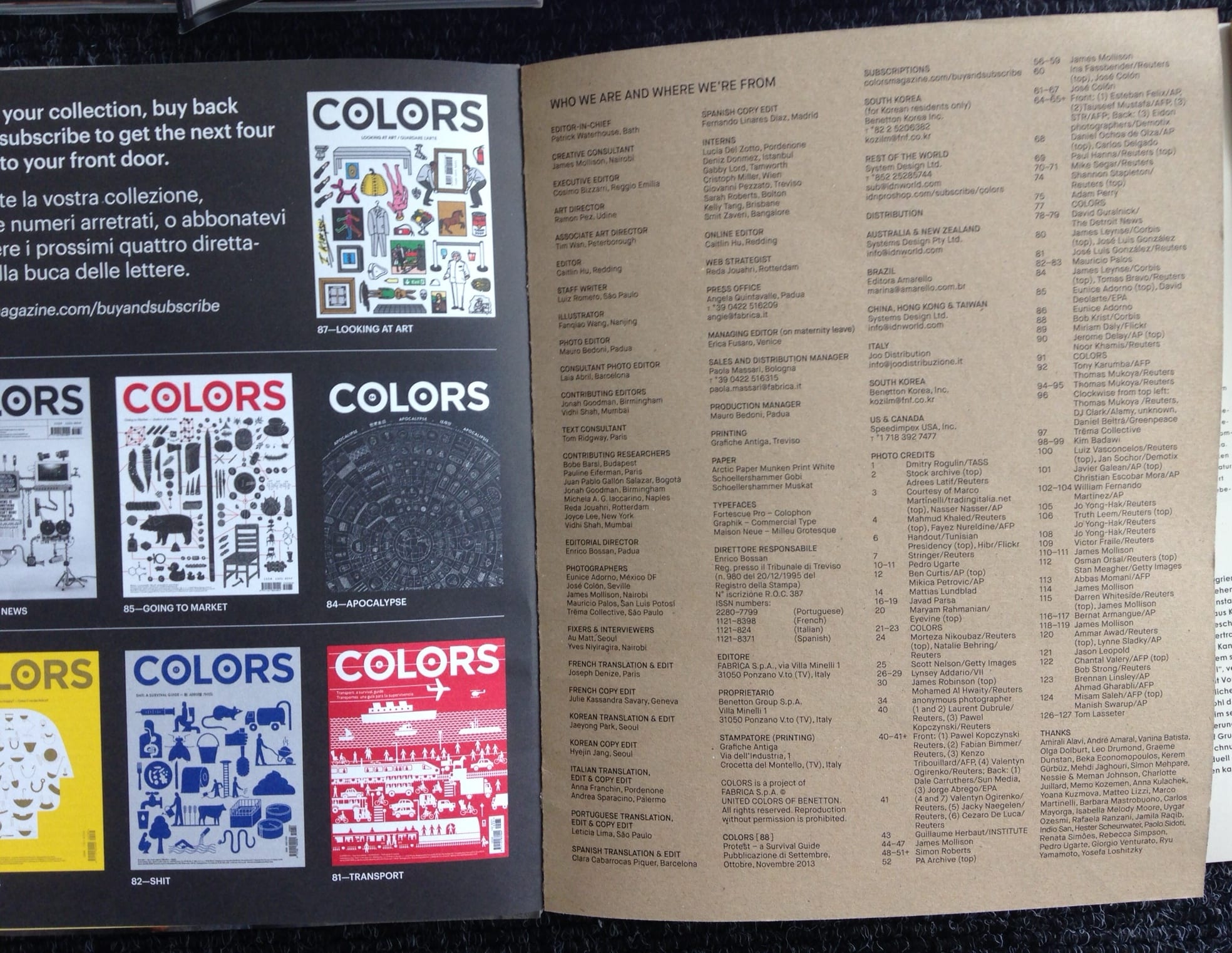
Photo 05-03-2014 11 43 03

– Colors  –

in this magazine the credits are on the very last page at the back. I like this idea, as it’s easy to find, but I also like when magazines have it placed with the contents page, as this is where you would expect to find the credits page. Hierarchy here is done by line spacing and alternating between capital letters and lowercase. This is a simple idea. I like it but I wouldn’t want to produce a credits page quite as simple. But it shows how even subtle changes create a clear hierarchy.
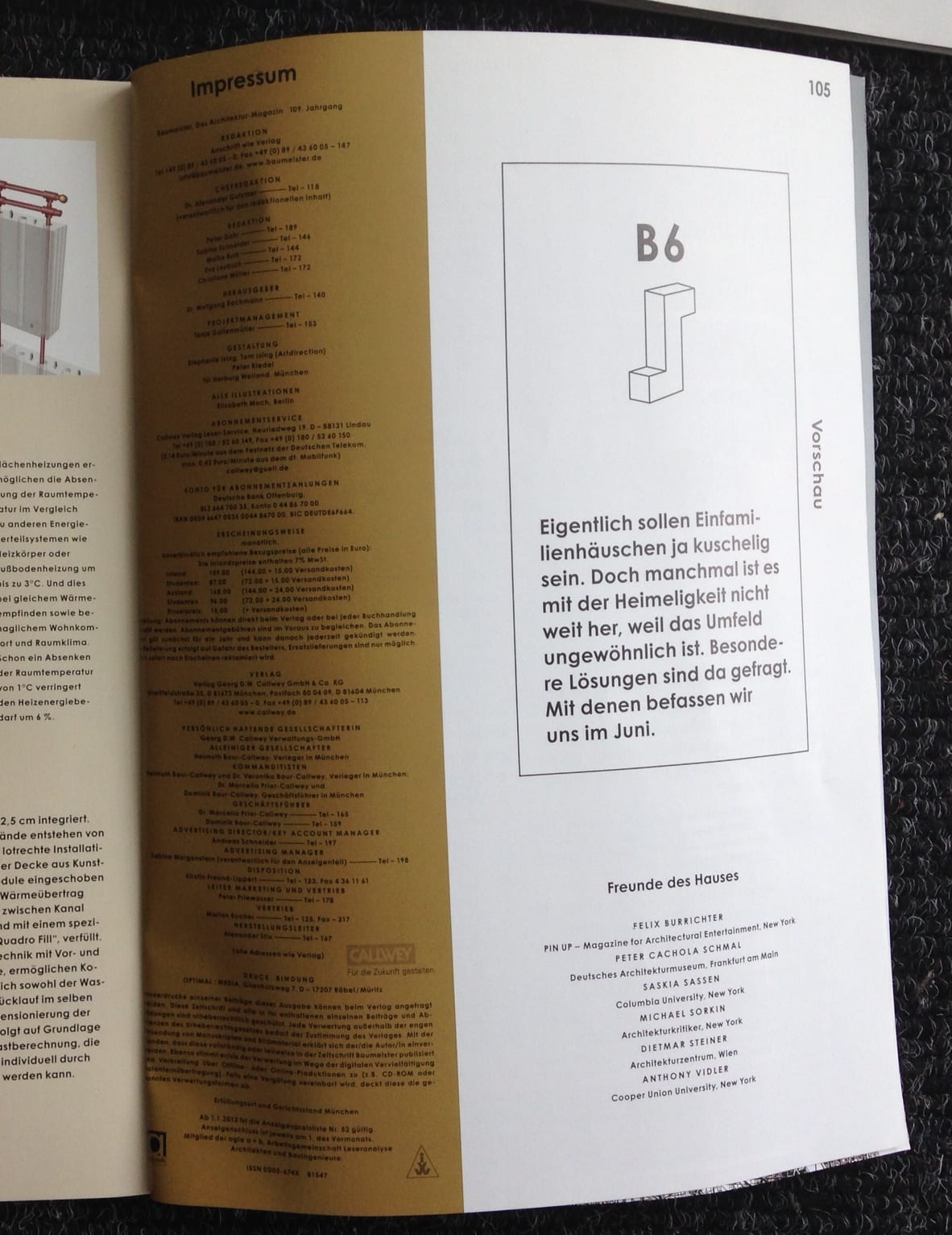
Photo 05-03-2014 11 43 08

– Bau Meister –

This layout is very similar to Vogue’s design. Although in comparison, Bau Meister’s looks quite wordy and harder to read. But I like how each section is separated using spacing.

Looking at these credits/contribution page designs has helped me think about how I will put this pages together, in content and design. Most stick to a conventional approach with subtle changes specific to their magazine. This is not a page to over-design or be experimental with, but just place what needs to be on the page, as this is in essence a reference page. I will consider the approaches used above when designing the credits/contributions page.

Art Direction

The Art Directors Handbook of Professional Magazine Design is a great book on how to do magazine design, with many great examples. It’s helped me think deeper about how I go about designing magazines, which I hope to apply to my design and art directing.

Sketching:

  • It’s important to sketch ides and layouts, but it helps to read the text your designing for and have a precise concept too.
  • Things to think about when using photography: which pictures should you put first, is there a logical order, will they be grouped and how, do the colours go together, is the sequence too repetitive, does it add something new???

Layout variations:

  • The choice of opening picture sets the mood for the rest, and the typography has a decisive influence on this mood. (Important to remember!)

Grid systems:

  • The number and width of columns influence the character of a magazine.
  • The right layout of columns is immensely important for the structure of a magazine page.
  • Lines should have roughly sixty characters = better readability.
  • The content should also influence what layout you chose.
  • Here are examples of how different magazines have used grid systems well in various ways (page 19):

Scan 84


Source: ‘The Art Directors Handbook of Professional Magazine Design: Classic Techniques and Inspirational Approaches’ – Horst Moser (Thames and Hudson, London)

Deeper Magazine

‘A mock publication design for a Luxury fashion magazine.’ by Aakansha Kukreja

Deeper Deeper 2 Deeper 3

this publication is very minimal yet bold and quite surreal too.  I really like the composition and the art direction, with clear use of the grid throughout. There is a clear overall style and design ethos, which is coherant throughout, including use of space, type faces and images. The cover has great use of white space and is quite inviting. Although I like the minimal style and want to use it, I don’t want it to be this plain, using brighter colours and more interesting images too.

Source: Aakansha Kukreja 

Monster Children Magazine

Monster Children Magazine is a quarterly lifestyle publication with a focus on surfing, skating, art, music, photography, and more…

Monster children magazine Monster children magazine 2 Monster children magazine 3Monster children magazine 4

Although the covers are varied issue to issue, within each issue is the style is coherent. Something different about this magazine is that they sometimes play with the orientation of type and image. Also the magazine is landscape, which works well with the images used. The type is often experimental, which lifts the spreads from quite ordinary to visually engaging.

Also the two designs with women on provoke potential thoughts & ideas linking with the chosen theme of the magazine.

Sources: Image 1 & 2 – issue #41 & #40 covers, Image 3 – issue #35, Image 4 – spread.

Pilot Magazine

Pilot Magazine 3 Pilot Magazine 2 Pilot Magazine

These images are taken from Issue 6 of Pilot Magazine.

Pilot magazine uses a lot of overlapping in its design. This is done very well and adds to the aesthetics of the design. It’s quite simple with use of colour and in its style, but this works very well and accompanied by black and white photographcs, the colours are bold and engaging. As the deisgn is simple, the bold, decorative typeface (used for titles in the spreads) doesn’t clutter or over shadow the rest, but work in harmony with it.

Source: Blogspot…

Anthony Neil Dart

Anthony Neil Dart is a designer who’s designed many magazines. I’ve looked at some of his designs that interest me and inspire ideas of our magazine design project.

Anthony Neil Dart - Metode 2 Anthony Neil Dart - Metode

Metode

These designs are both for Metode magazine and use contrasting black and white photography with brightly coloured shapes to create intriguing cover designs, accompanied by a few lines of text. I like the composition of these designs and the contrast is engaging. I would like to try these attention grabbing techniques and contemporary ideas with my project.


Anthony Neil Dart - Barcelona Anthony Neil Dart - Barcelona 2

Barcelona – Show us your type  Exhibit 2010

These two designs again use bold colours with black and white photography. The bright yellow and turquoise colours really stand out against the black and white and the type hierarchy is done very well. There is also a bit of a surreal look to these covers, which I think works quite well.

Source: Anthony Neil Dart on Behance

Magazine Spread design

Some examples of magazine spread design I like:


springfield-lookbooksspringfield-lookbooks2springfield-lookbooks3springfield-lookbooks4springfield-lookbooks5

Design of seasonal lookbooks for Springfield by Luis B Hernandez.

I love the minimalistic, clean-cut style in these spreads. they are very readable and eye-grabbingly simple. Also, the page numbering is done very differently to conventional magazines, in quite a contemporary, yet aesthetically pleasing way. This style may be considered for the magazine.

Source: Luis B Hernandez


RoAndCo_LoefflerRandall_Branding_05-1299-xxx_q85RoAndCo_LoefflerRandall_Branding_06-1299-xxx_q85

Loeffler Randall by Ro and Co

These spreads are not for a magazine, but part of a branding and packaging brief. The design again is quite contemporary and minimal. I like this style as it’s not too cluttered and attention grabbing, as it’s unlike the ‘in your face’ covers magazines often have. The contents uses collage and handwritten type, looking more authentic and friendly, and contrasts the clean cut cover.

Source: Ro and Co Studio


Magazine covers using the same Masthead design

For the group magazine project, all 6 of us must produce a front cover using the same Masthead design. So I have looked at some examples of

blend_magazine_coverblend_magazine_cover2

magazines that use the same masthead design, yet keep each cover exciting and different to the last…


Blend magazine (Dutch, established 2004, alternative lifestyle media)

Blend magazine have an obvious cover style as their magazine has developed, helping readers to recognise them instantly. It’s quite a contemporary and modern themed cover, using bright colours with black and white photographs of women to attract their audience.

Source: http://cadenceandclementine.blogspot.co.uk/2012/01/blend.html

gia-issue-five-march-2011-matilda-starz-by-milen-radev gia-issue-seven-may-2011 gia-8-summer-2011


GIA magazine 

Gia magazine has various themes/titles, yet keep to the same layout and style theme on the cover of each issue. Bold colours behind photographs of posed women is clearly a consistent cover theme.

Source: http://art8amby.wordpress.com/tag/gia-magazine/